Code
library(sf)
library(gstat)
library(tidyverse)
library(terra)
library(tidyterra)
library(automap)We often want to estimate phenomena at locations where we do not have measurements. Geostatistics is the field that we use to make (hopefully) accurate and reliable models of spatial data. We will use these models for prediction. We can use both deterministic and probabilistic models. This chapter focuses on probabilistic methods. Kriging is a probabilistic method that finds spatial pattern and predicts unknown values based on that spatial pattern. Unlike IDW, kriging generates a measure of uncertainty allowing us to estimate confidence in the predictions.
The gstat(Pebesma and Graeler 2026) package is your friend. And I’m going to plot in ggplot via tidyverse(Wickham 2023) with sf(Pebesma 2026), terra(Hijmans 2026) and tidyterra(Hernangómez 2023). We’ll also use automap(Hiemstra et al. 2008) for automatic variogram fitting.
library(sf)
library(gstat)
library(tidyverse)
library(terra)
library(tidyterra)
library(automap)IDW is a deterministic interpolation method. That is, it relies on a specified mathematical formula that is not a function of the statistical relationship among the known points. This method has no error term associated with it and in fact isn’t really geostatistical in a strict sense. Now, you might like to have no error in your estimation, but just because IDW doesn’t spit out an error term doesn’t mean that no error exists. A true geostatistical technique not only produces a prediction surface but also provides some measure of the accuracy of the predictions. Recall how the names in the IDW objects we calculated had a blank column (var1.var)? That’s where the error surface will be in addition to the predictions (var1.pred) as we move forward with a probabilistic approach to interpolation called Kriging.
The method is named after Danie Krige, a South African mining engineer who developed distance-weighted averaging to estimate gold grade distributions from borehole samples at the Witwatersrand reef complex in the 1950s. The Witwatersrand Basin is the world’s largest known gold repository. The French mathematician Georges Matheron later formalized the theoretical framework in 1960. So yes, kriging started as a way to find gold. The verb is “to krige” and you will see it both capitalized and not in the literature. Both are fine.
Kriging is a geostatistical method of interpolation that uses spatial autocorrelation, and it works best when there is strong autocorrelation in the data. When kriging we use the distance between sample points (and sometimes direction) to explain variation in a variable. We then fit a mathematical model to a specified number of points (or points within a certain distance) to determine the output value for each location.
The approach makes heavy use of variograms, which we introduced in the Global Autocorrelation chapter. They are how we determine the parameter \(\lambda\) in the formula for kriging:
\[\hat{Z}(s_0)=\sum_{i=1}^n \lambda_i Z(s_i)\]
where \(\hat{Z}\) will be an estimate of a variable at a spatial location \(s_0\) where we haven’t measured \(Z\) and \(s_i\) a location, \(i\), where we have measured \(Z\). There are \(n\) measurements. Analogous to the \(w\) terms for IDW, \(\lambda_i\) is a weight for the measured value at location \(s_i\). With IDW the weight was a deterministic function of distance. With kriging, we use the distance between the measured points and the prediction location as well as the overall spatial structure of the measured points themselves. That spatial structure is the spatial autocorrelation measured by the variogram. Let’s review variograms.
Fitting a variogram is also called structural analysis and it is where we calculate the squared difference between the values of pairs of measured points. In the variogram we set this as \(\gamma = (z_i-z_j)^2/2\). We then plot \(\gamma\) against distance and we have a variogram cloud. In practice the number of pairs (dyads) to calculate and plot gets very large. For \(n\) points there are \(n \cdot (n-1) / 2\) pairs. So, instead of plotting each pair we average \(\gamma\) by distance bins. This is the empirical semivariogram.
We will demonstrate a variogram with the Meuse River data. Here we load meuse2 (the point measurements) and meuse.grid2 (the prediction grid), make a new variable by logging the lead column and plot them. This is the same setup we used in the IDW chapter. See the appendix for details on both datasets.
# load
meuse2 <- readRDS("data/meuse2.Rds")
meuse.grid2 <- readRDS("data/meuse.grid2.Rds")

# make a variable to work with
meuse2$logLead <- log(meuse2$lead)
# make into sf
meuseSf <- st_as_sf(meuse2, coords = c("x", "y")) %>%
  st_set_crs(value = 28992)

meuseGridSf <- st_as_sf(meuse.grid2,
  coords = c("x", "y"),
  crs = st_crs(meuseSf)
)
meuseGridSf
Simple feature collection with 3089 features and 9 fields
Geometry type: POINT
Dimension: XY
Bounding box: xmin: 178500 ymin: 329660 xmax: 181500 ymax: 333700
Projected CRS: Amersfoort / RD New
First 10 features:
soil ffreq elev_m slope_deg aspect_deg tpi twi landcover
2 1 1 31.77303 2.9904907 298.57710 0.0103604794 6.548735 40
3 1 1 31.48208 0.4433831 38.99447 -0.0023341179 9.436335 30
4 1 1 31.49518 0.8556243 337.61689 -0.0021061897 10.007915 30
5 1 1 32.66366 5.4758474 287.62243 0.0182695389 5.671510 40
6 1 1 32.47068 1.3287795 55.89479 0.0010542870 8.017003 10
7 1 1 31.88524 0.7232355 15.40584 -0.0040280819 12.395674 40
8 1 1 32.36620 2.2267571 310.21836 -0.0041952133 7.633476 30
9 1 1 33.22409 4.1998876 286.46689 0.0206255913 6.431416 40
10 1 1 33.20650 0.8437299 61.19775 0.0001220703 8.316219 40
11 1 1 32.86385 0.9081502 57.88412 0.0022110939 9.335344 40
river_dist_m geometry
2 47.48153 POINT (181140 333700)
3 72.94615 POINT (181180 333700)
4 98.41078 POINT (181220 333700)
5 52.86416 POINT (181100 333660)
6 78.32878 POINT (181140 333660)
7 103.79340 POINT (181180 333660)
8 129.25803 POINT (181220 333660)
9 56.16095 POINT (181060 333620)
10 83.71141 POINT (181100 333620)
11 109.17603 POINT (181140 333620)ggplot(data = meuseSf) +
geom_sf(aes(fill = logLead),
size = 4,
shape = 21, color = "white", alpha = 0.8
) +
scale_fill_continuous(type = "viridis", name = "log(ppm)") +
labs(title = "Lead concentrations") +
theme_minimal()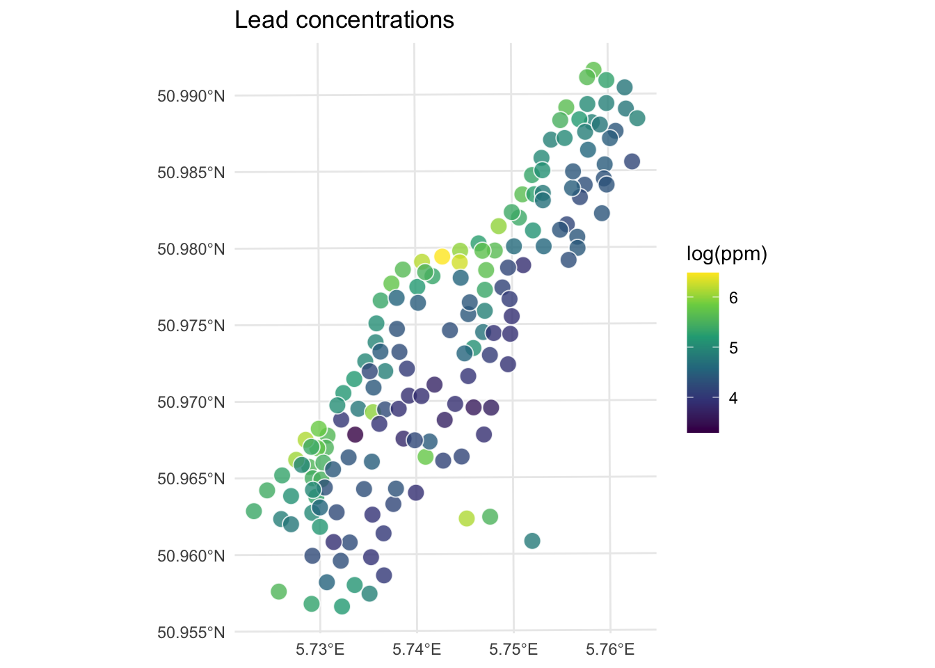
We will use the variogram function in gstat. Look back at the autocorrelation module for review as needed.
leadVar <- variogram(logLead ~ 1, meuseSf)
plot(leadVar,
  pch = 20, cex = 1.5, col = "black",
  ylab = expression("Semivariance (" * gamma * ")"),
  xlab = "Distance (m)", main = "Lead concentrations (log(ppm))"
)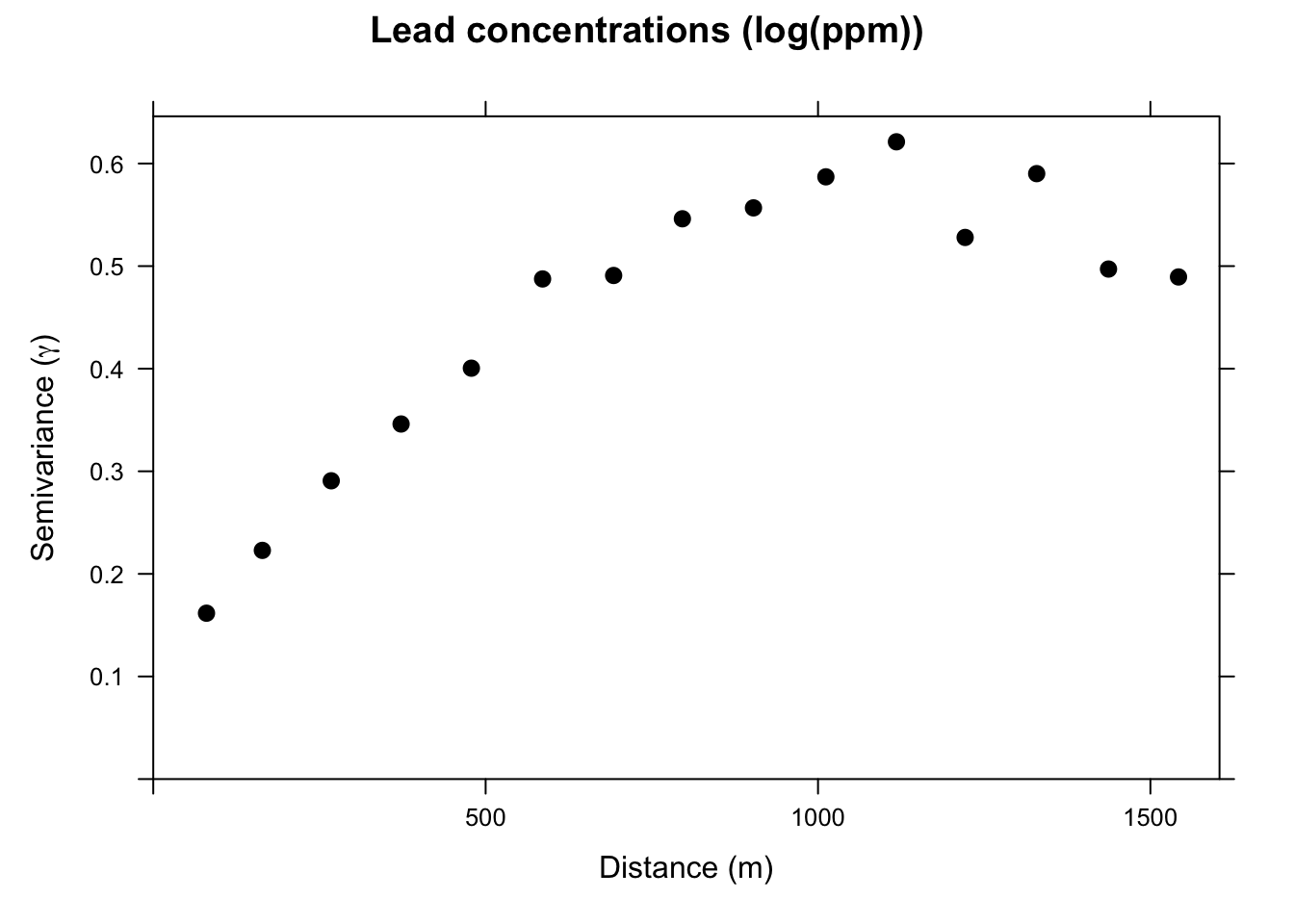
This is the sample, or empirical, semivariogram. We interpret it as measurements that are closer together (left on the x-axis) have similar values (low values of \(\gamma\)). As we move to pairs further apart (right on the x-axis) the semivariogram increases; values are more dissimilar and thus have a higher value of \(\gamma\). Our next job is going to be to fit a model to the points on the variogram. Before we do that, let’s appreciate the three terms for describing the variogram.
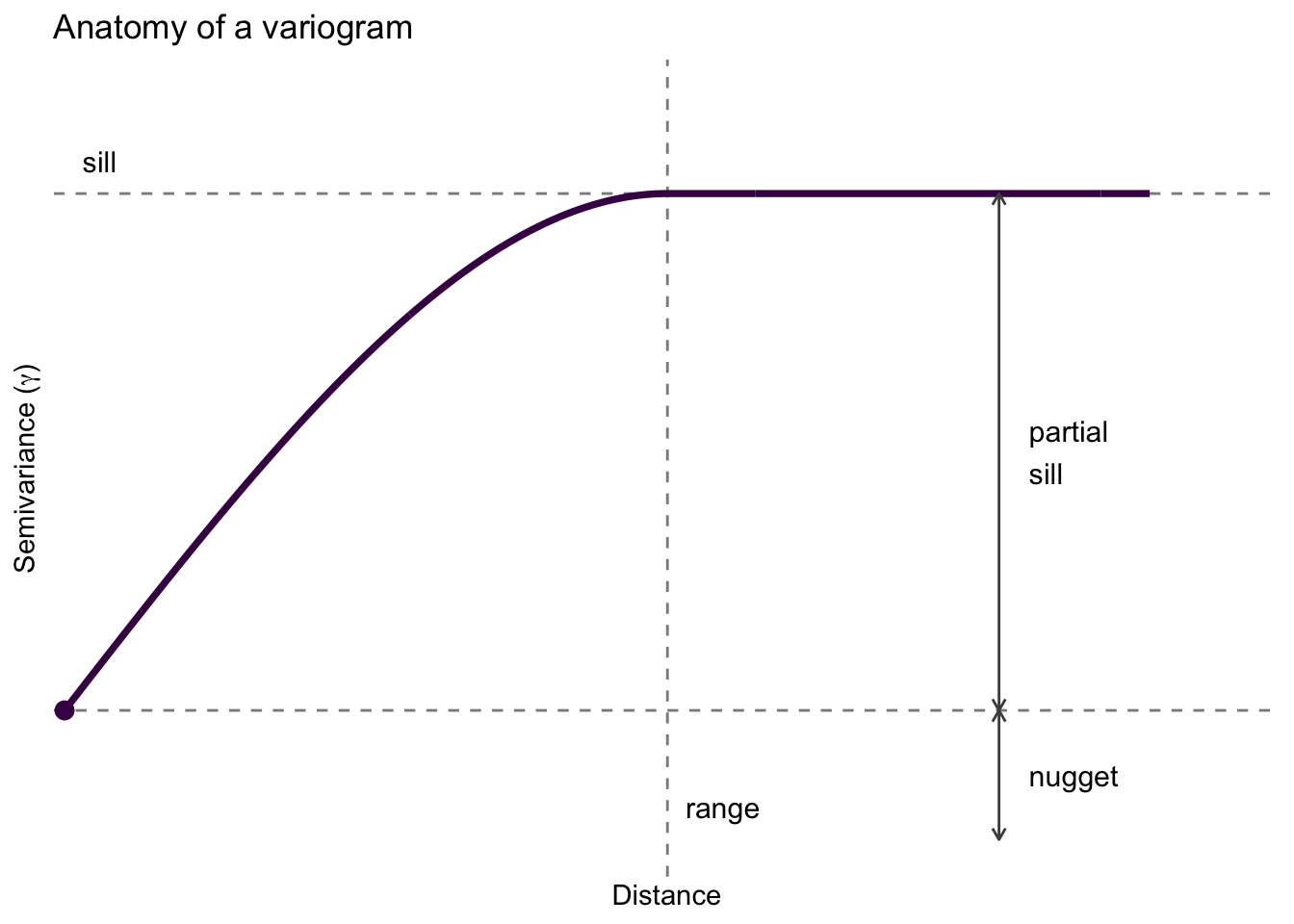
psill.If there is no structure (no correlation) and the variable is therefore a purely random variable, the variogram will be flat with a nugget effect.
After plotting the sample variogram we can then fit a statistical model to the points. The model is a continuous estimate of \(\gamma\) as a function of distance: \(\hat{\gamma}=f(d)\).
We will fit two different functions, a spherical model and an exponential model. The text has descriptions of the various functions. In practice, we tend to look at the general shape of the plot and then choose a mathematical model that fits.
The code below hands vgm a set of starting guesses for the partial sill, range, and nugget. Why guess at all? Because fitting a variogram model isn’t a one-shot calculation. fit.variogram uses weighted least squares to nudge the three parameters around until the model curve sits as close as it can to the empirical points, and like any iterative optimizer it has to start somewhere. We read those starting values straight off the empirical plot: the height where the points level off is roughly the sill, the distance where they flatten is roughly the range, and where the curve would meet the y-axis is roughly the nugget. Give the algorithm a sensible place to begin and it takes the fit from there.
# note our initial estimates for the partial sill, range, and nugget.
sphericalModel <- vgm(psill = 0.5, model = "Sph", range = 750, nugget = 0.05)
sphericalFit <- fit.variogram(object = leadVar, model = sphericalModel)
sphericalFit # look at the fitted values
model psill range
1 Nug 0.1095742 0.000
2 Sph 0.4560318 1002.626This is a terrible table to look at, but it only has a few numbers in it. There are two rows because gstat treats the nugget and the spherical part as two separate model components stacked together. The first row, Nug, is the nugget: its psill entry (0.11) is the nugget value and its range is fixed at zero because a nugget has no spatial extent. The second row, Sph, is the spherical part: its psill (0.46) is the partial sill and its range (1003 meters) is the range. Add the two psill values together and you have the sill. It took me a long time to be able to parse this gstat output but it sort of makes sense after a while I guess.
Let’s look at it.
plot(leadVar,
  model = sphericalFit, pch = 20, cex = 1.5, col = "black",
  ylab = expression("Semivariance (" * gamma * ")"),
  xlab = "Distance (m)", main = "Lead concentrations (log(ppm))",
  sub = "Points: Empirical, Line: Spherical Model"
)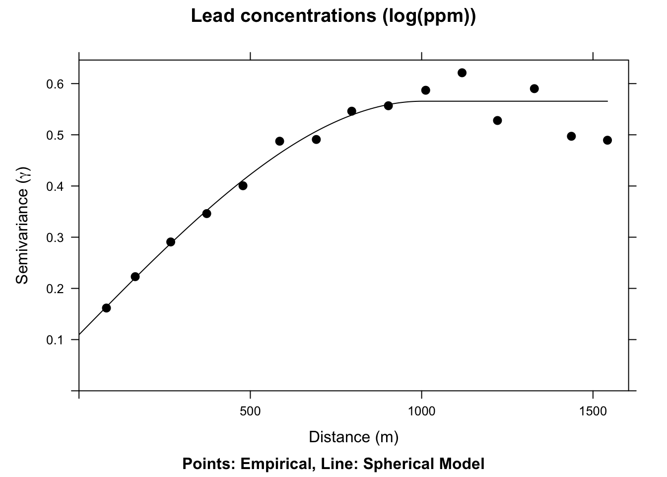
We now have a fitted, theoretical, variogram model to the data in the sphericalFit object. This object took our estimates of the partial sill, range, and nugget and found the best fits from those estimates using non-linear regression. The final parameters are pretty close to our estimates from the plot. E.g., the fitted nugget is 0.11 and the range is 1002.63. If we gave initial estimates way outside the realm of possibility the function wouldn’t be able to fit the model. But if the data are well behaved it converges on the best fit pretty easily. If you are too scared to estimate initial values in vgm the function will estimate them for you. See Details under ?fit.variogram for how those are calculated. E.g., in this application if you try sphericalModel <- vgm(model="Sph",nugget=TRUE) the fit.variogram algorithm converges without initial estimates.
The actual function for the spherical model is:
\[\hat{\gamma}(d)= b + C_0 \left(1.5\left(\frac{d}{r}\right) - 0.5 \left(\frac{d^3}{r^3}\right)\right)\]
where \(b\) is the nugget, \(C_0\) is the partial sill, \(d\) is the distance, and \(r\) is the range. Note the \(r^3\) in the denominator of the second term, not \(r\). The cubic term is what gives the spherical model its characteristic shape: it rises steeply at short distances and flattens out as it approaches the sill at distance \(r\), after which \(\hat{\gamma}\) is constant.
The spherical model above is very commonly used and has nice theoretical properties, using all three classic parameters of the variogram. We could, if we liked, fit some other models. An exponential model would fit well here too.
# note our initial estimates for the sill, range, and nugget
exponentialModel <- vgm(psill = 0.5, model = "Exp", range = 750, nugget = 0.05)
exponentialFit <- fit.variogram(object = leadVar, model = exponentialModel)
plot(leadVar,
  model = exponentialFit, pch = 20, cex = 1.5, col = "black",
  ylab = expression("Semivariance (" * gamma * ")"),
  xlab = "Distance (m)", main = "Lead concentrations (log(ppm))",
  sub = "Points: Empirical, Line: Exponential Model"
)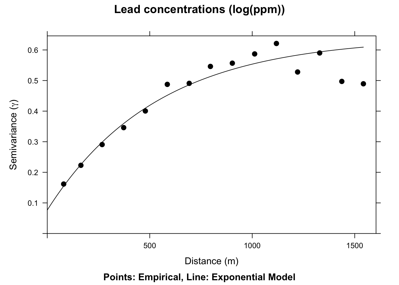
This model is \(\hat{\gamma}(d)=b + C_0(1-e^{-d/a})\) where \(a=r/3\) and other terms are as above. Unlike the spherical model, the exponential never quite reaches the sill. It approaches asymptotically. For many data sets both models fit about equally well, and choosing between them comes down to visual inspection and, ultimately, cross-validation skill.
We have a fitted variogram model now. That is \(\hat{\gamma}(d)\), an estimate of spatial structure at any distance. Here is our kriging formula again:
\[\hat{Z}(s_0)=\sum_{i=1}^n \lambda_i Z(s_i)\]
How do we get to the weights (\(\lambda\))? From the variogram model. The guts of this calculation involve a little matrix algebra to fully work through, but conceptually it is pretty simple: \[ \lambda = \Gamma^{-1} g \]
where \(\Gamma\) is a matrix of the semivariances for all sampled point pairs, predicted as a function of their Euclidean distances using the fitted variogram model, and \(g\) is a vector of predicted semivariances between the unknown point and each measured point, calculated the same way. Once we have \(\lambda\) we can interpolate (predict) over a surface for any location where we don’t have \(Z\).
Like we did with IDW, let’s walk through this calculation with a contrived example.
Here is a small data set of five points. We have spatial coordinates (\(x\) and \(y\)) and some measured variable (\(z\)).
toyDat <- data.frame(
  x = c(1, 3, 1, 4, 5),
  y = c(5, 4, 3, 5, 1),
  z = c(100, 105, 105, 100, 115)
)
toyDat
x y z
1 1 5 100
2 3 4 105
3 1 3 105
4 4 5 100
5 5 1 115toyPlot <- ggplot() +
geom_point(data = toyDat, aes(x = x, y = y, size = z)) +
lims(x = c(0, 6), y = c(0, 6)) +
coord_equal() +
theme_minimal()
toyPlot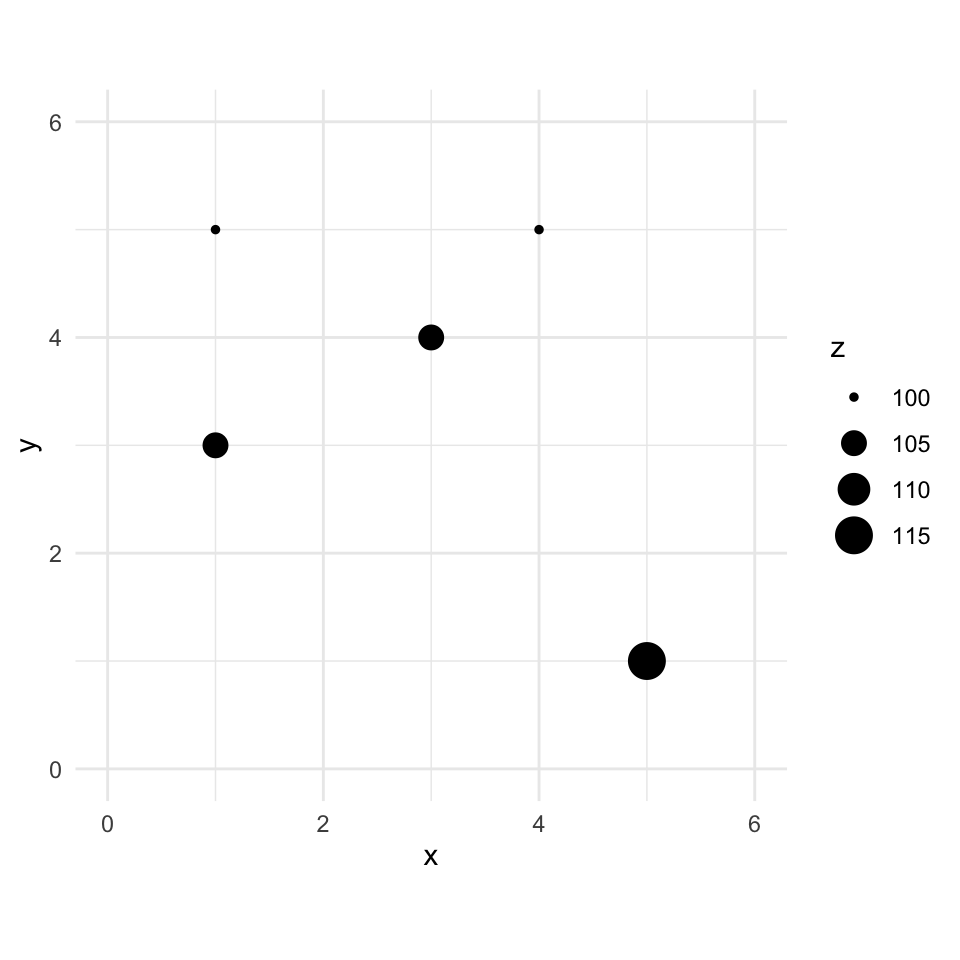
Let’s imagine a point \(x=2\) and \(y=4\) where we don’t know \(z\) and add that to the plot.
toyPlot +
  # crosshair reticle marking the location we want to predict
  annotate("segment", x = 1.4, xend = 2.6, y = 4, yend = 4, color = "#21908C", linewidth = 0.6) +
  annotate("segment", x = 2, xend = 2, y = 3.4, yend = 4.6, color = "#21908C", linewidth = 0.6) +
  annotate("point", x = 2, y = 4, shape = 1, size = 13, color = "#21908C", stroke = 1) +
  annotate("point", x = 2, y = 4, shape = 21, fill = "#21908C", color = "white", size = 2.5, stroke = 0.6) +
  annotate("text", x = 2.55, y = 4.6, label = "s[0]", parse = TRUE, color = "#21908C", size = 5, hjust = 0, fontface = "italic")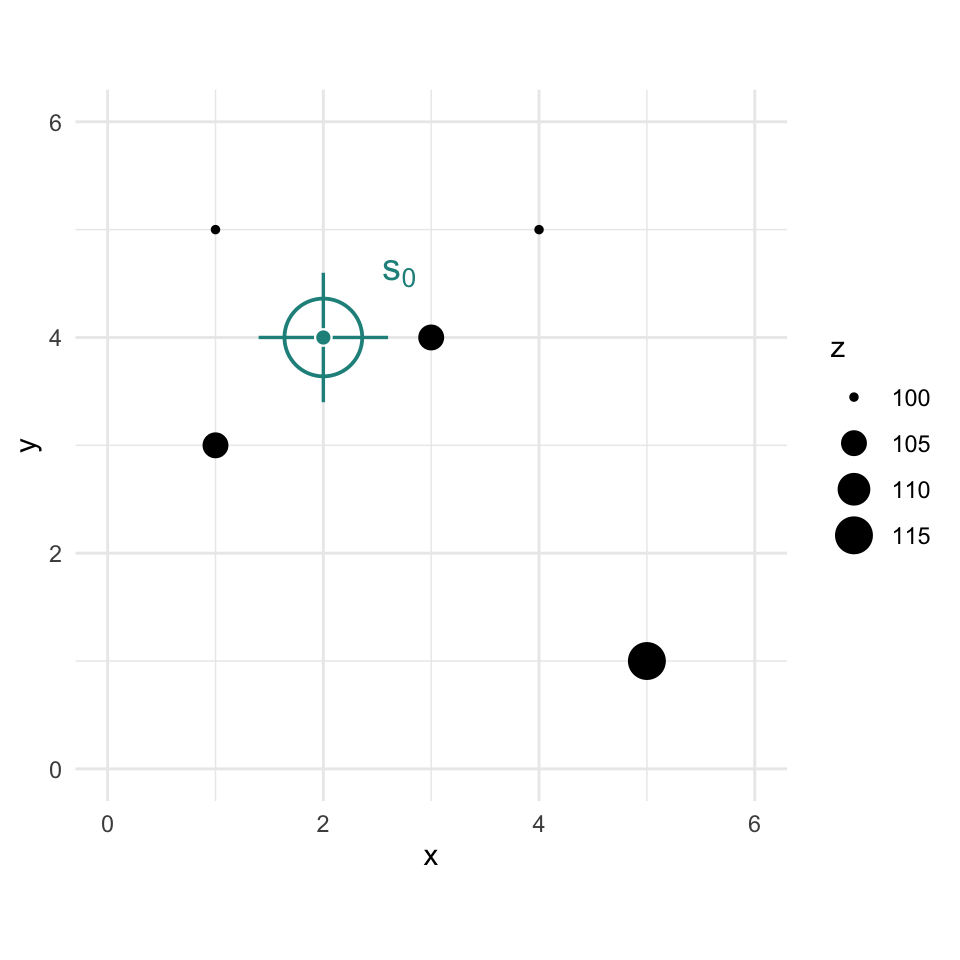
We are now going to use kriging as a way to get an estimate of that point with a missing value of \(z\). Since we are estimating it we call it \(\hat{Z}\) and we know the location as \(s_0\) so we call this \(\hat{Z}(s_0)\). We’ll follow the notation above.
The Euclidean distance to our unknown point from each of the known points is a vector:
\[\mathbf{d_i} = \left[\begin{array} {rr} 1 & 1.414\\ 2 & 1.000\\ 3 & 1.414\\ 4 & 2.236\\ 5 & 4.243 \end{array}\right]\]
To get \(\hat{Z}(s_0)\) we apply \(\lambda = \Gamma^{-1} g\) from above. Now, these five data points don’t actually make a nice variogram. So let’s suspend disbelief for a moment and say we fit a spherical model with nugget \(= 0\), partial sill \(= 10\), and range \(= 6\). Those aren’t fitted values from this tiny dataset, just reasonable numbers for a worked example.
\[\hat{\gamma}(d) = 10\left(1.5\left(\frac{d}{6}\right) - 0.5\left(\frac{d}{6}\right)^3\right) \quad \text{for } d \leq 6\]
First we can calculate \(g\) for the point we want to interpolate by plugging each distance \(d_i\) into the variogram model:
\[\mathbf{g} = \left[\begin{array} {rr} 1 & 3.470\\ 2 & 2.477\\ 3 & 3.470\\ 4 & 5.331\\ 5 & 8.839 \end{array}\right]\]
Now, let’s get \(\Gamma\). First, here is the distance matrix between all the measured points:
\[\mathbf{d} = \left[\begin{array} {rrrrr} ~ & 1 & 2 & 3 & 4 \\ 2 & 2.236 & ~ & ~ & ~ \\ 3 & 2.000 & 2.236 & ~ & ~ \\ 4 & 3.000 & 1.414 & 3.606 & ~ \\ 5 & 5.657 & 3.606 & 4.472 & 4.123 \end{array}\right]\]
We apply the same spherical variogram model to the distances between all measured points to get \(\Gamma\):
\[\mathbf{\Gamma} = \left[\begin{array} {rrrrr} ~ & 1 & 2 & 3 & 4 \\ 2 & 5.331 & ~ & ~ & ~ \\ 3 & 4.815 & 5.331 & ~ & ~ \\ 4 & 6.875 & 3.470 & 7.929 & ~ \\ 5 & 9.952 & 7.929 & 9.110 & 8.685 \end{array}\right]\]
We now need the inverse of \(\Gamma\). Inverting a matrix bigger than say 2x2 is not something I want to do by hand. Inverting a 5x5 matrix by hand would take me all day and I’d definitely screw it up. If you can’t recall how to invert a matrix, any linear algebra text will walk you through it. In R you can use the solve function (or ginv in the MASS package) to invert a matrix.
\[\mathbf{\Gamma^{-1}} = \left[\begin{array} {rrrrr} ~ & 1 & 2 & 3 & 4 & 5 \\ 1 & -0.1322 & 0.0322 & 0.0805 & 0.0376 & 0.0183 \\ 2 & 0.0322 & -0.2308 & 0.0547 & 0.1164 & 0.0167 \\ 3 & 0.0805 & 0.0547 & -0.1340 & -0.0017 & 0.0367 \\ 4 & 0.0376 & 0.1164 & -0.0017 & -0.1475 & 0.0404 \\ 5 & 0.0183 & 0.0167 & 0.0367 & 0.0404 & -0.0546 \end{array}\right]\]
And \(\lambda = \Gamma^{-1} g\): \[\mathbf{\lambda_i} = \left[\begin{array} {rr} 1 & 0.2626\\ 2 & 0.4985\\ 3 & 0.2652\\ 4 & -0.0165\\ 5 & -0.0353 \end{array}\right]\]
You’ll notice that points 4 and 5 have negative weights. With IDW, every point gets a positive weight that simply shrinks with distance. Kriging is more sophisticated: it considers the spatial structure among all the measured points at once. Points 4 and 5 are far from the prediction location, so their semivariances in \(g\) are large and their influence on the prediction is already small. But they’re also located in a part of the space that the closer points (1, 2, and 3) already “cover” informationally. The kriging system figures out that including points 4 and 5 with even a small positive weight would introduce a slight bias, so it assigns them tiny negative weights to correct for that. This is sometimes called a screening effect. The weights are small and don’t change the estimate much, and it isn’t a sign that something went wrong.
[1] 100.739Giving the final prediction: \[\hat{Z}(s_0)=0.2626(100)+0.4985(105)+0.2652(105)-0.0165(100)-0.0353(115) \approx 100.74\]
The matrix notation can be sort of tedious but hopefully you’ve gotten the idea: because of the theoretical variogram model we can estimate \(\hat{\gamma}\) for any distance \(d\) and use that information, along with the distance matrix among the known points, to predict \(Z\) at any location.
This will look a lot like what we did with IDW but we will use krige instead. And krige wants a fitted variogram model to be passed in. So, using the variogram from above we can do this.
leadVar <- variogram(logLead ~ 1, meuseSf)
# with initial gueses at the parameters psill, range, and nugget
leadModel <- vgm(psill = 0.6, model = "Sph", range = 750, nugget = 0.05)
# or try to let the estimation happen without initial guesses, same result
leadModel <- vgm(model = "Sph", nugget = TRUE)

leadFit <- fit.variogram(object = leadVar, model = leadModel)
leadGstat <- gstat(
  formula = logLead ~ 1, locations = meuseSf,
  model = leadFit
)
leadKrigeSf <- predict(leadGstat, newdata = meuseGridSf)
[using ordinary kriging]leadKrigeSfSimple feature collection with 3089 features and 2 fields
Geometry type: POINT
Dimension: XY
Bounding box: xmin: 178500 ymin: 329660 xmax: 181500 ymax: 333700
Projected CRS: Amersfoort / RD New
First 10 features:
var1.pred var1.var geometry
2 5.406841 0.2724001 POINT (181140 333700)
3 5.343480 0.2854597 POINT (181180 333700)
4 5.279198 0.3003649 POINT (181220 333700)
5 5.486278 0.2238744 POINT (181100 333660)
6 5.415401 0.2377063 POINT (181140 333660)
7 5.339935 0.2536512 POINT (181180 333660)
8 5.266665 0.2701756 POINT (181220 333660)
9 5.562294 0.1801611 POINT (181060 333620)
10 5.496279 0.1894106 POINT (181100 333620)
11 5.408148 0.2084089 POINT (181140 333620)Note that leadKrige is a sf object that has the predicted surface var1.pred but there is another surface in there too, var1.var, which contains the variance around those predictions. Let’s take a look at the predictions first and then spend some time with the variance surface.
Here is the prediction surface. Note how we specify what attribute we want to plot via leadKrige["var1.pred"].
I’ll use the little function from the IDW chapter to get a rast object from the sf object. Remember, this is one of the reasons to write a function in the first place. Define it once, reuse it across chapters.
sf2Rast <- function(sfObject, variableIndex = 1) {
  # coerce sf to a data.frame
  dfObject <- data.frame(st_coordinates(sfObject),
    z = as.data.frame(sfObject)[, variableIndex]
  )
  # coerce data.frame to SpatRaster
  rastObject <- rast(dfObject, crs = crs(sfObject))

  names(rastObject) <- names(sfObject)[variableIndex]

  return(rastObject)
}

leadKrigeRast <- sf2Rast(leadKrigeSf)

leadKrigeRast
class : SpatRaster
size : 102, 76, 1 (nrow, ncol, nlyr)
resolution : 40, 40 (x, y)
extent : 178480, 181520, 329640, 333720 (xmin, xmax, ymin, ymax)
coord. ref. : Amersfoort / RD New (EPSG:28992)
source(s) : memory
name : var1.pred
min value : 3.749342
max value : 6.174216# and plot
ggplot() +
geom_spatraster(data = leadKrigeRast, mapping = aes(fill = var1.pred), alpha = 0.8) +
scale_fill_continuous(type = "viridis", name = "log(ppm)", na.value = "transparent") +
labs(title = "Lead concentrations") +
theme_minimal()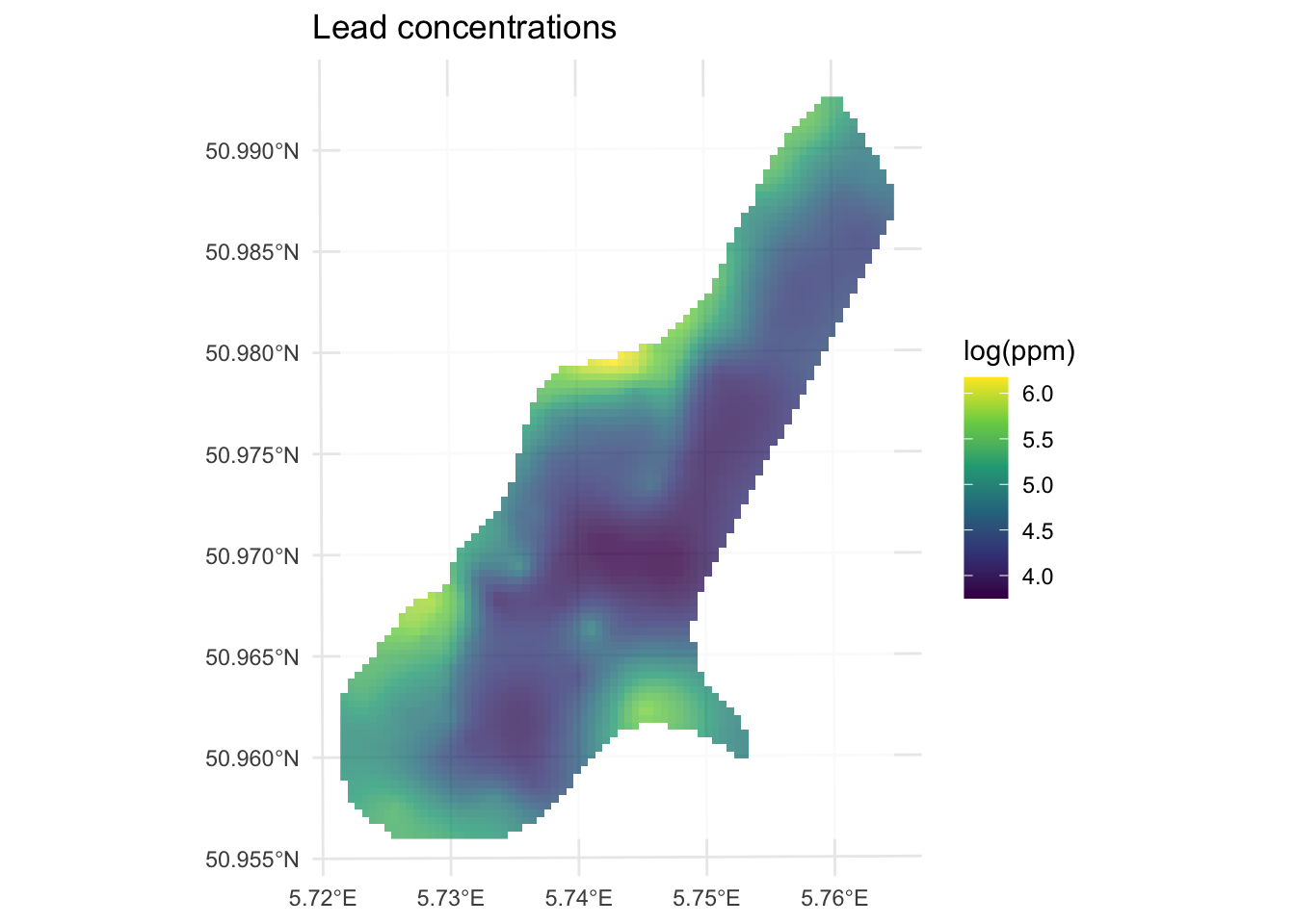
Now let’s look at the variance around those predictions. Note we take the square root of var1.var to get the uncertainty in the same units as var1.pred.
leadKrigeSf$var1.var.sqrt <- sqrt(leadKrigeSf$var1.var)

leadKrigeRast <- sf2Rast(leadKrigeSf, variableIndex = 4)
leadKrigeRast
class : SpatRaster
size : 102, 76, 1 (nrow, ncol, nlyr)
resolution : 40, 40 (x, y)
extent : 178480, 181520, 329640, 333720 (xmin, xmax, ymin, ymax)
coord. ref. : Amersfoort / RD New (EPSG:28992)
source(s) : memory
name : var1.var.sqrt
min value : 0.388124
max value : 0.650392# and plot
ggplot() +
geom_spatraster(data = leadKrigeRast, mapping = aes(fill = var1.var.sqrt), alpha = 0.8) +
scale_fill_continuous(type = "viridis", name = "log(ppm)", na.value = "transparent") +
labs(title = "Variance of lead concentrations") +
theme_minimal()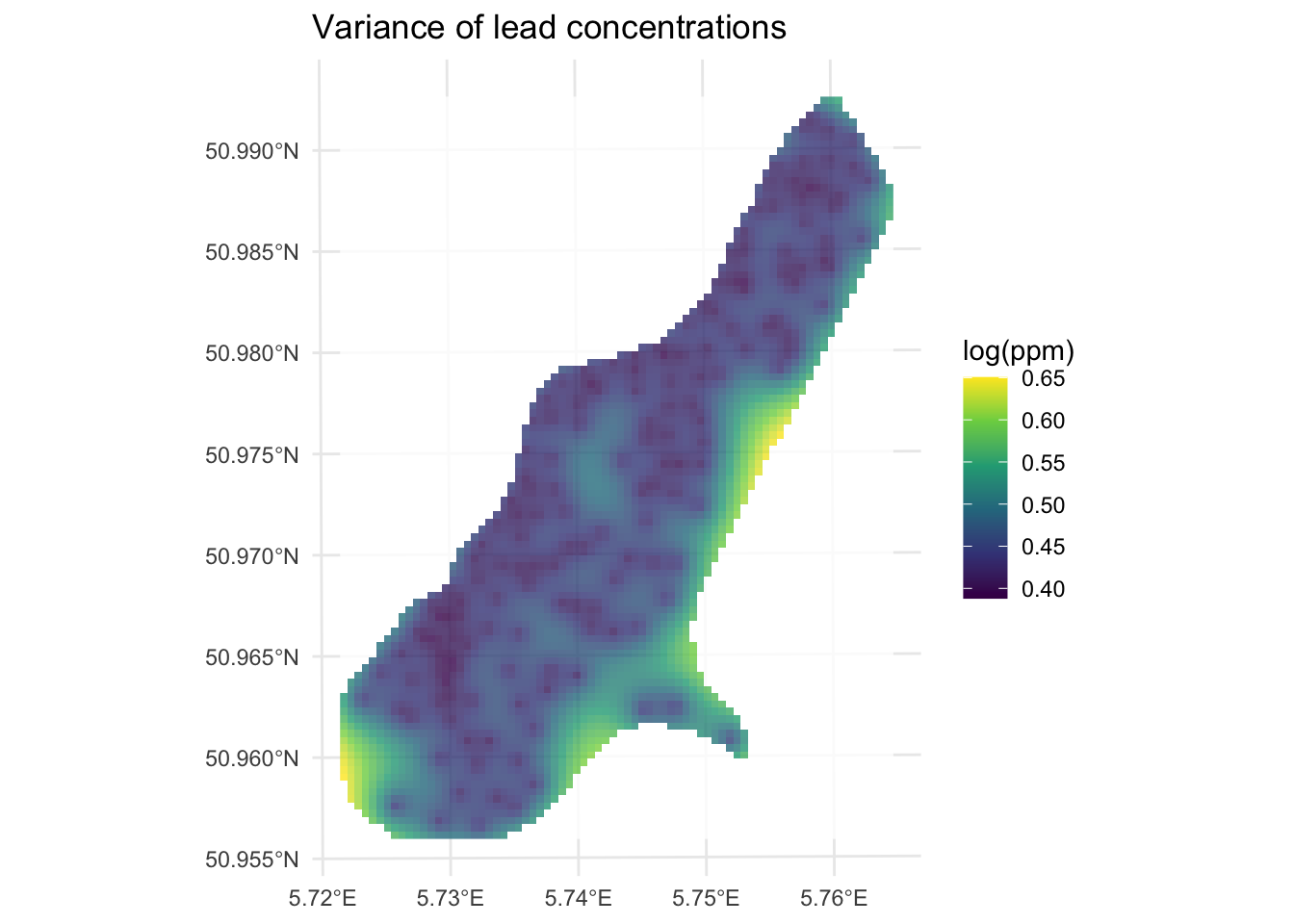
Look at the spatial pattern in that variance surface. Uncertainty is lowest near the measured points and highest at the edges of the study area where observations are sparse or absent. Compare this to the locations of your sample points in meuseSf and you should see the correspondence pretty clearly. This is one of the most useful things kriging gives you: not just a prediction surface, but a map of where you should trust that surface and where you should be skeptical. IDW (and TPS) will happily interpolate across a data gap without telling you it’s doing so. The variance in kriging helps flag weak areas of the surface.
The variance surface is more than just a map of sample density, though sample density is a big driver of it. The variogram models we’ve been fitting (spherical, exponential, and others) are more than pretty lines we use to get a continuous estimate of \(\hat{\gamma}\) as a function of distance. They have some of the same properties as statistical distributions do in probability theory. In particular, variograms are empirical estimates of the covariance of Gaussian processes. Because the model variogram gives the mean squared difference between values based on their location, we can use it to derive the uncertainty around each prediction. The variance at any prediction location is a function of how well that location is “covered” by the surrounding observations, weighted by the fitted spatial covariance structure.
What this means practically is that kriging variance increases when (a) the prediction location is far from any measured points, (b) the measured points nearby are themselves clustered rather than well-spread, and (c) the sill of the variogram is large, meaning the variable is highly variable across the study area. At very large distances from all data, the variance approaches the sill, which is your best estimate of how variable the field is when you have no local information at all.
The underlying theory goes deeper than we will cover here. Diggle’s “Model-based Geostatistics” will drag you through it if you want. Bivand’s chapter has more on this too. I walk through it in the Kriging Variance By Hand aside.
Above I showed you the spherical and the exponential variogram models. Those are commonly used, as are the Gaussian and the Matérn models. But there are many other options. A whole slew, actually, most of which I’ve never used. Look at this:
vgm() short long
1 Nug Nug (nugget)
2 Exp Exp (exponential)
3 Sph Sph (spherical)
4 Gau Gau (gaussian)
5 Exc Exclass (Exponential class/stable)
6 Mat Mat (Matern)
7 Ste Mat (Matern, M. Stein's parameterization)
8 Cir Cir (circular)
9 Lin Lin (linear)
10 Bes Bes (bessel)
11 Pen Pen (pentaspherical)
12 Per Per (periodic)
13 Wav Wav (wave)
14 Hol Hol (hole)
15 Log Log (logarithmic)
16 Pow Pow (power)
17 Spl Spl (spline)
18 Leg Leg (Legendre)
19 Err Err (Measurement error)
20 Int Int (Intercept)gstat knows 20 different possible curves you can fit to your data. E.g.,
show.vgms(models = c("Exp", "Mat", "Gau", "Sph"))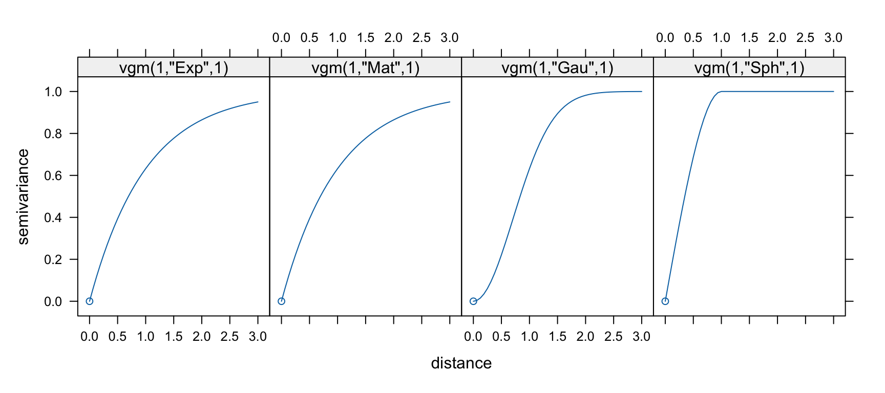
The four models plotted above give you a sense of why the choice matters. The spherical model reaches the sill at a finite distance and stays there, which is appropriate when you believe the variable has a well-defined correlation length. The exponential model approaches the sill asymptotically, implying some small correlation at any distance, which suits variables that never fully decorrelate. The Gaussian model has an S-shaped approach to the sill and goes to zero slope at the origin, which implies a very smooth, continuous underlying process. The Matérn family includes both of those as special cases and is more flexible, at the cost of one extra parameter.
In practice, a few things constrain which models are valid at all. The variogram must be non-negative everywhere, and it must produce a covariance matrix that is positive semi-definite (that is matrix-speak for “the variances this system produces can never come out negative.”). That second condition is what makes the kriging system solvable and ensures the predicted variances come out non-negative. This is why you can’t just draw any curve through the empirical variogram and call it a model. The parametric families in gstat all satisfy these conditions by construction, which is a good reason to stick with them rather than trying to invent your own.
Beyond that, choosing among the valid options comes down to looking at the empirical variogram, thinking about the physical process you’re modeling, and comparing cross-validation skill. There is no one-size-fits-all approach.
Everything we have done in this chapter is ordinary kriging (OK), which is what krige does when you write formula = logLead~1. The ~1 means “intercept only,” no covariates, just estimate the mean from the data and let the variogram do the rest. It is the right default for most situations, but it is worth knowing what else is out there.
Simple kriging (SK) assumes the mean of the process is known rather than estimated from the data. In practice that assumption is almost never defensible, so SK sees limited use outside of simulation studies and textbooks. If you are curious how the math differs from OK, the Kriging Variance By Hand aside works through both side by side. In gstat you get SK by passing beta = mean(dat$z) to krige.
Universal kriging (UK) and regression kriging (RK) both handle the situation where your response variable has a large-scale spatial trend driven by covariates, elevation gradients, distance-to-river effects, and so on. OK assumes the mean is constant across the study area (stationarity). If that assumption is badly violated, OK will struggle. UK folds the trend and the spatial structure into one system of equations. RK does it in two steps: fit an OLS regression on covariates first, then krige the residuals. The two approaches tend to give similar predictions in practice, but RK lets you inspect each step separately, which is usually worth the trouble. We cover RK in the next module. In gstat, UK looks like formula = logLead~dist, where dist is a covariate available at both your sample points and your prediction grid.
Anisotropic kriging relaxes the assumption that spatial correlation is the same in all directions. If your variable has stronger autocorrelation along a river valley than across it, for example, a standard isotropic variogram will misrepresent that structure. You can model anisotropy by fitting an elliptical rather than circular variogram, via the anis argument to vgm. It adds complexity and you need enough data to justify it, but for strongly directional processes it can matter.
You could spend a whole semester on kriging alone. Think of the pleasures involved!
The IDW chapter showed an example of using the built-in cross validation function. We can do the same with kriging. Instead of a straight call to krige we can call krige.cv for either k-fold or leave-one-out cross validation (LOOCV). It defaults to LOOCV so the predicted values are from the time they were left out the model.
leadKrigeLOOCVSf <- krige.cv(
  formula = logLead ~ 1,
  locations = meuseSf,
  model = leadFit, verbose = FALSE
)
leadKrigeLOOCVSf
Simple feature collection with 164 features and 6 fields
Geometry type: POINT
Dimension: XY
Bounding box: xmin: 178605 ymin: 329714 xmax: 181390 ymax: 333611
Projected CRS: Amersfoort / RD New
First 10 features:
var1.pred var1.var observed residual zscore fold
1 5.402571 0.2277973 5.700444 0.29787270 0.624103170 1
2 5.473044 0.2199374 5.624018 0.15097361 0.321922586 2
3 5.233697 0.2180910 5.293305 0.05960821 0.127640125 3
4 5.077189 0.2520550 4.753590 -0.32359848 -0.644553277 4
5 4.794539 0.2134651 4.762174 -0.03236554 -0.070051822 5
6 4.584552 0.2571416 4.919981 0.33542860 0.661475719 6
7 4.970576 0.2088842 4.882802 -0.08777385 -0.192049137 7
8 5.253444 0.2072102 5.010635 -0.24280892 -0.533407471 8
9 4.886148 0.1786532 4.890349 0.00420153 0.009940359 9
10 4.589513 0.1984181 4.382027 -0.20748612 -0.465798826 10
geometry
1 POINT (181072 333611)
2 POINT (181025 333558)
3 POINT (181165 333537)
4 POINT (181298 333484)
5 POINT (181307 333330)
6 POINT (181390 333260)
7 POINT (181165 333370)
8 POINT (181027 333363)
9 POINT (181060 333231)
10 POINT (181232 333168)# CV R2 and RMSE
rsq <- cor(leadKrigeLOOCVSf$observed, leadKrigeLOOCVSf$var1.pred)^2
rmse <- sqrt(mean((leadKrigeLOOCVSf$observed - leadKrigeLOOCVSf$var1.pred)^2))
c(rsq = rsq, rmse = rmse) rsq rmse
0.6192935 0.4141229 The LOOCV R\(^2\) is 0.619 and the RMSE is 0.414 which we get from the observed vs predicted values. But note all the fields we get from the krige.cv function. We get the prediction and prediction variance of the cross-validated data points and we also get the observed values. We also get the residuals (observed minus predicted), the z-score (the residual divided by kriging standard error), and the fold (in this case we have as many folds as rows in meuse because it is LOOCV).
You’ll find it anyway, so let’s get the cat out of the bag.
Like other angry old men, I like to describe a bucolic youth spent milking at 4AM, walking to school in the snow, programming F77 in vi, and doing all my GIS with Arc on the command line. Kids these days like to do their geostatistics in ArcGIS by clicking “next, next, next, finish” and plotting their map without ARCPLOT. One of the many reasons I like using R is that you get to do things like fit variograms by hand the same way the pioneers did when they had to cross the prairie. But you can, if you like, automatically fit a variogram using the automap library which has a lot of nice wrappers for the gstat functions like fit.variogram.
leadVar <- autofitVariogram(formula = logLead ~ 1, input_data = meuseSf)
summary(leadVar)
Experimental variogram:
np dist gamma dir.hor dir.ver id
1 17 59.33470 0.1270576 0 0 var1
2 39 86.73182 0.1905754 0 0 var1
3 126 130.83058 0.1487020 0 0 var1
4 171 176.60188 0.2540911 0 0 var1
5 198 226.70319 0.2378083 0 0 var1
6 810 338.36102 0.3395189 0 0 var1
7 957 502.89504 0.4191339 0 0 var1
8 1580 712.92647 0.5180130 0 0 var1
9 1500 961.00617 0.5738388 0 0 var1
10 1301 1212.86100 0.5675023 0 0 var1
11 1517 1504.85947 0.4954516 0 0 var1
Fitted variogram model:
model psill range
1 Nug 0.09182989 0.0000
2 Sph 0.46323373 941.6887
Sums of squares betw. var. model and sample var.[1] 2.920612e-05plot(leadVar)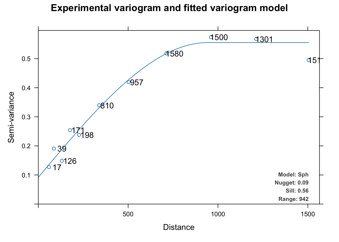
This automatically fits and plots a variogram like fit.variogram but instead of using user-supplied initial estimates for the model and the parameters, autofitVariogram makes these estimates based on the data and then calls fit.variogram. The automatic fitting above chose a spherical model like we did above but it tried all the models (exponential, Gaussian, Matérn, etc.) as part of the process.
The biggest difference is that autofitVariogram does the bins quite differently than gstat’s default behavior with variogram. Instead of equal widths, autofitVariogram creates bins of unequal widths. It passes these as the boundaries argument to variogram. You can look at the code for details (getAnywhere(autofitVariogram)) but the spirit is to try to get more leverage on the shortest distances to help estimate the wiggliest part of the variogram curve, especially the nugget. I think it makes sense.
Note that this plot (which is invoked for objects of class autofitVariogram) plots the number of point pairs at that distance as well as adds the model terms as a legend. You can look at the code for this plot via getAnywhere(plot.autofitVariogram) if you are curious.
And just to complete the whole automation thing, you can automatically apply cross validation as well. Since autoKrige.cv calls krige.cv to do a lot of the work, it defaults to LOOCV as above.
leadAutoKrigeLOOCV <- autoKrige.cv(
  formula = logLead ~ 1, input_data = meuseSf,
  verbose = c(FALSE, FALSE)
)
summary(leadAutoKrigeLOOCV)
[,1]
mean_error -0.002369
me_mean -0.0004967
MAE 0.2996
MSE 0.1692
MSNE 0.8531
cor_obspred 0.7901
cor_predres 0.04327
RMSE 0.4113
RMSE_sd 0.6117
URMSE 0.4113
iqr 0.4022 # R2
cor(leadAutoKrigeLOOCV$krige.cv_output$observed, leadAutoKrigeLOOCV$krige.cv_output$var1.pred)^2[1] 0.6242166Here we get a LOOCV R\(^2\) of 0.6242 which is very (very) close to what we got with the cross validation we did manually above.
Use the tools in automap with caution however. Beware the black box.
Recall that IDW and TPS gave us a prediction surface with no uncertainty attached. Every grid cell got a number and that was that. Kriging gives us the same prediction surface, but also the variance surface we just looked at, and that second surface is where probability theory earns its keep. Imagine you’re deciding where to put additional soil sampling stations to reduce uncertainty in your lead concentration map. With IDW you have no principled way to answer that question, because IDW has no model of uncertainty to begin with. With kriging, you look at the variance surface and put your next sample where the variance is highest. Or imagine you need to flag grid cells where the predicted lead concentration exceeds a regulatory threshold: with a variance surface you can attach a probability to that exceedance rather than just a point estimate. The deterministic methods we covered earlier are fast and intuitive, but they borrow nothing from probability theory, so there is no statistically grounded way to quantify how much you should trust the predictions. Kriging trades some of that simplicity for something useful: a map of your own ignorance.
Return to the California precipitation data from the IDW chapter. This time, krige the surface rather than use IDW.
# precip point data
prcpCA <- readRDS("data/prcpCA.rds")
# empty grid to interpolate into
gridCA <- readRDS("data/gridCA.rds")

prcpCAsf <- prcpCA %>%
  st_as_sf(coords = c("X", "Y")) %>%
  st_set_crs(value = 3310)

prcpCAsf %>% ggplot() +
  geom_sf(aes(fill = ANNUAL, size = ANNUAL),
    color = "white",
    shape = 21, alpha = 0.8
  ) +
  scale_fill_continuous(type = "viridis", name = "mm") +
  labs(title = "Total Annual Precipitation") +
  scale_size(guide = "none")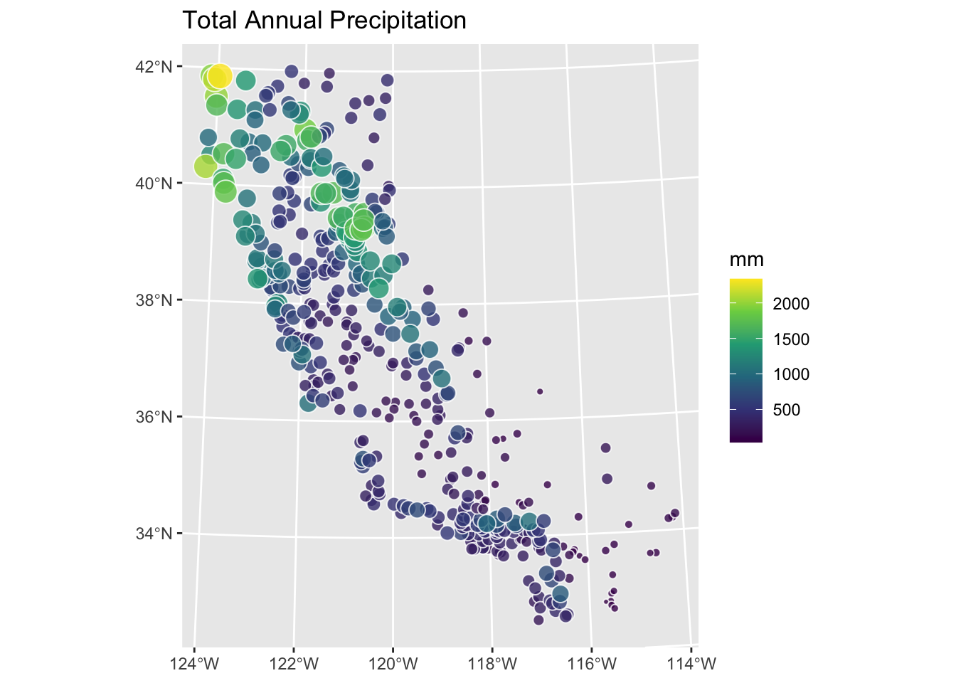
Fit the variogram manually using variogram, vgm, and fit.variogram. Skip automap for this one. Compare at least two variogram models. Assess the surface using cross-validation and interpret what you find. How does the kriged surface compare to the IDW surface you made earlier? Does the kriging variance surface (var1.var) tell you anything useful about where you should trust the predictions?
Bivand (2008) chapter 8, sections 8.4 and 8.5, covers kriging theory and implementation in R in detail. Fortin et al. (2016) sections 4.3 to 4.5 provide a more accessible treatment of the same material. Both are worth having at hand when fitting variograms for the first time.