Code
library(sf)
library(tidyverse)
library(spdep)
library(tmap)Space matters: Spatial pattern lets us understand process. Global Moran’s I tells you whether spatial autocorrelation exists across your study area and perhaps at what distances. Local Indicators of Spatial Association (LISA) tell you where. LISA lets us go from a single number that summarizes the entire map to a map of where the clustering and the outliers actually live.
This module builds directly on the Spatial Autocorrelation chapter. Make sure you are comfortable with Moran’s I and how spatial weights matrices work before diving in.
Same cast as the autocorrelation chapter: sf(Pebesma 2026), tidyverse(Wickham 2023), tmap(Tennekes 2025), and spdep(Bivand 2026).
library(sf)
library(tidyverse)
library(spdep)
library(tmap)Think back to what global Moran’s I gives you. One number. For the entire study area. That number can be positive, negative, or close to zero, and it summarizes the overall tendency for similar values to cluster together or disperse. We often bin Moran’s I into distances but that’s just a sleight of hand in order to get at the spatial scale of the whole study area.
But what if your study area has a hot spot of high values in one corner, a cold spot of low values in another, and a bunch of spatial noise in between? The global statistic averages all of that together. The hot spot and cold spot might be driving most of the signal, or the noise might be drowning it out. You cannot tell from the single number which it is, or where any of it is happening.
This matters practically. Say you are mapping soil lead contamination across an old industrial site. You want to know where the worst contamination is clustered and not just whether the overall dataset is autocorrelated. Or if you are mapping bird richness you want to identify the biodiversity hotspots, not just confirm that richness is spatially structured in general.
Before getting into the mechanics of local I, let’s build some intuition using a tool called the Moran scatterplot. This is worth understanding because it is the conceptual bridge from global to local.
We will use the Meuse River data.
meuse2 <- readRDS("data/meuse2.Rds")
meuseSf <- st_as_sf(meuse2, coords = c("x", "y")) %>%
  st_set_crs(value = 28992)
meuseSf$log_lead <- log(meuseSf$lead)
We need to define what “neighbor” means before we can compute anything. For LISA we use k-nearest neighbors, the \(k\) locations closest to each point in space. Here we use \(k=8\), meaning each location’s neighborhood is its 8 nearest points. There is nothing magical about \(k=8\); it is a reasonable default for a dataset this size that gives each location enough neighbors to get a stable estimate without pulling in points that are too far away.
The spdep syntax for this is a three-step pipeline and yes, it is bewildering until you have seen it a few times.
knn <- knearneigh(meuseSf, k = 8)
nb <- knn2nb(knn)
wList <- nb2listw(nb, style = "W")
knearneigh finds the 8 nearest neighbors for each point and returns a raw neighbor table. knn2nb converts that table into a neighbor list object (nb) which is spdep’s internal format for storing who is next to whom. nb2listw takes that neighbor list and turns it into a weights list object (listw) that the rest of spdep can actually use. I think about it as: find neighbors, formalize neighbors, weight neighbors.
The style = "W" argument is important. It row-standardizes the weights, meaning each location’s weights sum to one. If a location has 8 neighbors, each one gets a weight of 1/8. The practical effect is that the spatial lag (the weighted average of neighbors’ values) is a simple average of those 8 neighbors. This makes the Moran scatterplot interpretable and is the standard choice for LISA.
The Moran scatterplot works like this. We standardize the variable (call it \(z\)) so it has mean zero and standard deviation one. Then we compute the spatial lag of \(z\) at each location: the weighted average of \(z\) at that location’s neighbors. We plot \(z\) on the x-axis and the spatial lag on the y-axis. Every point on that scatterplot is a location in the data.
# standardize log lead
meuseSf$z <- as.vector(scale(meuseSf$log_lead))

# compute the spatial lag: weighted average of neighbors' z values
meuseSf$lag_z <- lag.listw(wList, meuseSf$z)

ggplot(meuseSf, aes(x = z, y = lag_z)) +
  geom_hline(yintercept = 0, linetype = "dashed", color = "grey50") +
  geom_vline(xintercept = 0, linetype = "dashed", color = "grey50") +
  geom_point(alpha = 0.7) +
  geom_smooth(
    method = "lm", formula = y ~ x - 1,
    se = FALSE, color = "firebrick"
  ) +
  labs(
    x = "Standardized log lead (z)",
    y = "Spatial lag of z",
    title = "Moran scatterplot: log lead, Meuse River"
  )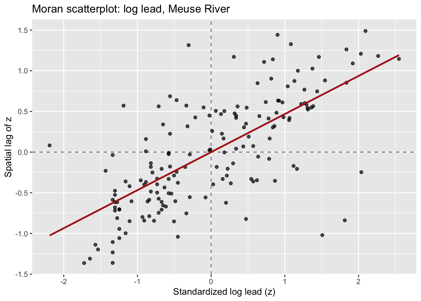
Look at the four quadrants this creates:
Now here is the cool bit! The slope of the regression line through the origin is global Moran’s I. You can verify that:
# slope of the Moran scatterplot
moranSlope <- coef(lm(lag_z ~ z - 1, data = as.data.frame(meuseSf)))
moranSlope
z
0.4676669 # global Moran's I
moran.test(meuseSf$log_lead, wList)$estimate[1]Moran I statistic
0.4676669 They match. So cool. Global Moran’s I is the average tendency across all points to fall in the HH and LL quadrants rather than the HL and LH quadrants. Each individual point’s contribution to that slope is its local Moran’s I.
Let’s make this a little more concrete. Local Moran’s I for location \(i\) is:
\[I_i = z_i \sum_j w_{ij} z_j\]
where \(z_i = (y_i - \bar{y})/s\) is the standardized value at location \(i\), and \(\sum_j w_{ij} z_j\) is the spatial lag, the weighted average of standardized values at \(i\)’s neighbors. With row-standardized weights, this simplifies nicely: \(I_i\) is just the product of \(z_i\) and its spatial lag.
If that product is large and positive, location \(i\) is either a high-value location surrounded by high-value neighbors (HH) or a low-value location surrounded by low-value neighbors (LL). Either way, it is contributing to positive spatial autocorrelation. If the product is negative, it is a spatial outlier: a high value surrounded by lows, or vice versa.
The sum of all local \(I_i\) values is proportional to global Moran’s \(I\). Local \(I\) is a decomposition of the global statistic, not a separate method that happens to share a name.
Each local \(I_i\) comes with a p-value, answering the question: could this value have arisen by chance if the data had no spatial structure? The cleanest way to get at that is conditional randomization: hold the value at location \(i\) fixed, permute the values at all other locations many times, recompute \(I_i\) each time, and ask how often a permuted \(I_i\) is more extreme than the one you actually observed. We will use localmoran_perm() from spdep, which runs those permutations for us. There is also an analytical localmoran() that gets the p-value from a normal approximation instead of permuting. It is faster, but local statistics are exactly the situation where the normal approximation is shakiest (small neighborhoods, skewed data), so the permutation version is the safer default.
One important caveat: you are testing one hypothesis per location. With 164 locations in the Meuse data, running tests at \(\alpha = 0.05\) would produce about 8 false positives even if there were no spatial structure at all. A common and practical fix is to use a stricter threshold (\(\alpha = 0.01\) or even \(0.001\)) for the local tests. You can also use p.adjust() to apply a multiple comparisons correction, but for exploratory mapping, the stricter threshold is often good enough.
Before running LISA on real data, let’s plant a known hot spot in simulated data and confirm that we can find it. This is a recurring move throughout this book. If a method cannot detect a pattern we deliberately created, we should not trust it on data where we do not know the answer.
I will make an 8x8 grid of locations. All locations get values drawn from a standard normal distribution, except a 3x3 block in one corner which gets values drawn from a normal distribution centered at 4. That block is our planted hot spot.
nSide <- 8
gridPts <- expand.grid(
  x = 1:nSide,
  y = 1:nSide
)
gridPts$z <- rnorm(nrow(gridPts))

# plant the hot spot: upper-right 3x3 corner
hotIdx <- gridPts$x >= 6 & gridPts$y >= 6
gridPts$z[hotIdx] <- rnorm(sum(hotIdx), mean = 4, sd = 0.5)

gridSf <- st_as_sf(gridPts, coords = c("x", "y"))
Map it:
ggplot(gridSf) +
  geom_sf(aes(color = z), size = 6) +
  scale_color_viridis_c(name = "z") +
  labs(title = "Simulated data with planted hot spot")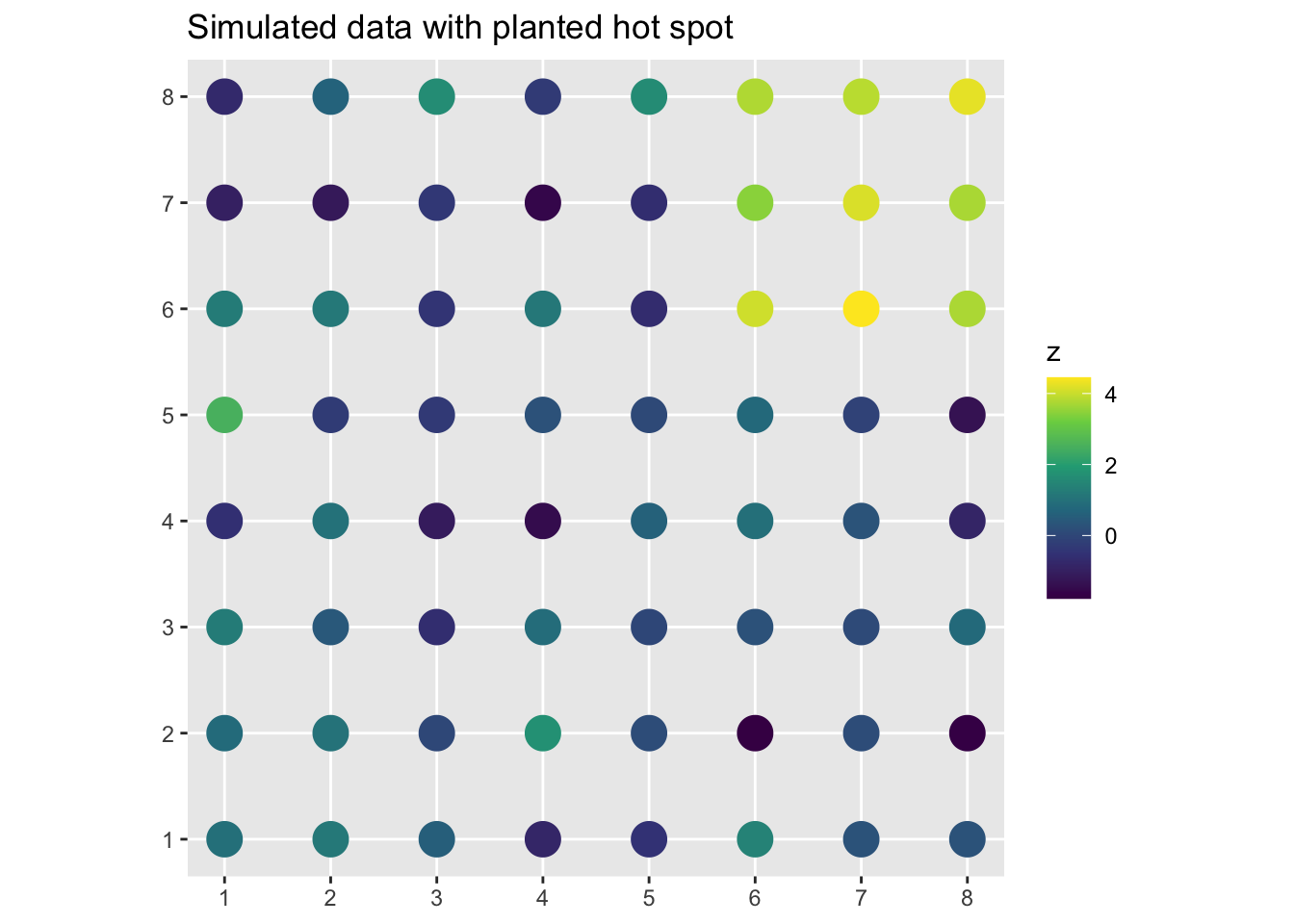
You can see the bright cluster in the upper right. What does global Moran’s I say?
knnSim <- knearneigh(gridSf, k = 4)
nbSim <- knn2nb(knnSim)
wListSim <- nb2listw(nbSim, style = "W")
moran.test(gridSf$z, wListSim)
    Moran I test under randomisation

data:  gridSf$z
weights: wListSim

Moran I statistic standard deviate = 6.1083, p-value = 5.035e-10
alternative hypothesis: greater
sample estimates:
Moran I statistic       Expectation          Variance
      0.490062410      -0.015873016       0.006860379
Moran’s I is significantly positive. That’s good, but it doesn’t tell us where. Now run LISA:
lisaSim <- localmoran_perm(gridSf$z, listw = wListSim, nsim = 999)
head(lisaSim)
Ii E.Ii Var.Ii Z.Ii Pr(z != E(Ii))
1 0.043231877 -0.0009101101 0.007755544 0.5012400 0.6162022
2 0.032914763 0.0002764683 0.025655173 0.2037699 0.8385333
3 0.007733561 0.0003954111 0.001871795 0.1696123 0.8653150
4 0.137964509 0.0060046241 0.212884635 0.2860025 0.7748762
5 0.440512856 0.0087739219 0.140763064 1.1507391 0.2498396
6 -0.331612910 0.0002056536 0.048657369 -1.5042720 0.1325114
Pr(z != E(Ii)) Sim Pr(folded) Sim Skewness Kurtosis
1 0.582 0.291 0.4199816 0.15917409
2 0.806 0.403 0.3178554 -0.09428003
3 0.904 0.452 -0.3404120 -0.26046664
4 0.846 0.423 -0.4319712 0.17621562
5 0.228 0.114 -0.4124630 -0.06639755
6 0.090 0.045 0.5719994 0.33516929localmoran_perm returns a matrix with one row per location. Ii is the local Moran’s I value for that location, the number we actually care about. The next block of columns (E.Ii, Var.Ii, Z.Ii, and Pr(z != E(Ii))) is the analytical version of the test: the expected value, variance, z-score, and normal-approximation p-value. The columns ending in Sim are the ones from the permutations, and Pr(z != E(Ii)) Sim is the permutation p-value, asking how often a reshuffled \(I_i\) is more extreme than the observed one. For now we just need Ii and that permutation p-value, so let’s pull those out and attach them to our sf object.
gridSf$Ii <- lisaSim[, "Ii"]
gridSf$pval <- lisaSim[, "Pr(z != E(Ii)) Sim"]
We can build a little cluster classification now to map. We need the standardized variable and its spatial lag to assign each location to a quadrant, then use the p-value to flag non-significant ones.
zSim <- as.vector(scale(gridSf$z))
lagSim <- lag.listw(wListSim, zSim)

sig <- 0.05
gridSf$cluster <- case_when(
  zSim > 0 & lagSim > 0 & gridSf$pval < sig ~ "High-High",
  zSim < 0 & lagSim < 0 & gridSf$pval < sig ~ "Low-Low",
  zSim > 0 & lagSim < 0 & gridSf$pval < sig ~ "High-Low",
  zSim < 0 & lagSim > 0 & gridSf$pval < sig ~ "Low-High",
  TRUE ~ "Not significant"
)

ggplot(gridSf) +
  geom_sf(aes(color = cluster), size = 6) +
  scale_color_manual(
    values = c(
      "High-High"       = "#d7191c",
      "Low-Low"         = "#2c7bb6",
      "High-Low"        = "#fdae61",
      "Low-High"        = "#abd9e9",
      "Not significant" = "grey80"
    )
  ) +
  labs(
    title = "LISA cluster map: simulated data",
    color = "Cluster type"
  )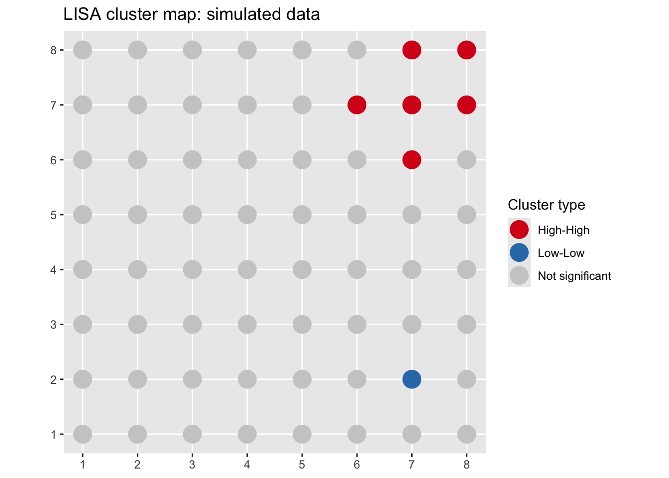
The HH cluster is exactly where we planted it. I used \(\alpha = 0.05\) here to keep the demo simple. With only 64 locations and one obvious planted signal the multiple-comparison worry is minor, but on the real data below we tighten it.
Now let’s run LISA on the log lead data where we actually want to learn something.
lisa <- localmoran_perm(meuseSf$log_lead, listw = wList, nsim = 999)
head(lisa)
Ii E.Ii Var.Ii Z.Ii Pr(z != E(Ii))
1 0.7858150369 4.819374e-03 2.502228e-01 1.56129564 0.11845401
2 0.7699598570 7.747388e-04 1.965941e-01 1.73478510 0.08277888
3 0.3240171316 -2.051203e-02 7.602322e-02 1.24954778 0.21146479
4 -0.0105962926 -2.301006e-05 7.297043e-05 -1.23775985 0.21580512
5 -0.0003489204 -9.805248e-05 1.504010e-05 -0.06468742 0.94842288
6 -0.0461552136 -5.273113e-03 6.325696e-03 -0.51401885 0.60723881
Pr(z != E(Ii)) Sim Pr(folded) Sim Skewness Kurtosis
1 0.110 0.055 0.05100420 0.01435512
2 0.082 0.041 0.05364300 0.06931068
3 0.238 0.119 0.03181501 -0.24053644
4 0.244 0.122 -0.08012361 -0.06715771
5 0.922 0.461 -0.05242678 -0.42007865
6 0.640 0.320 0.24861143 0.03594413Same columns as before, and again we’ll use the permutation p-value, Pr(z != E(Ii)) Sim, for the cluster map.
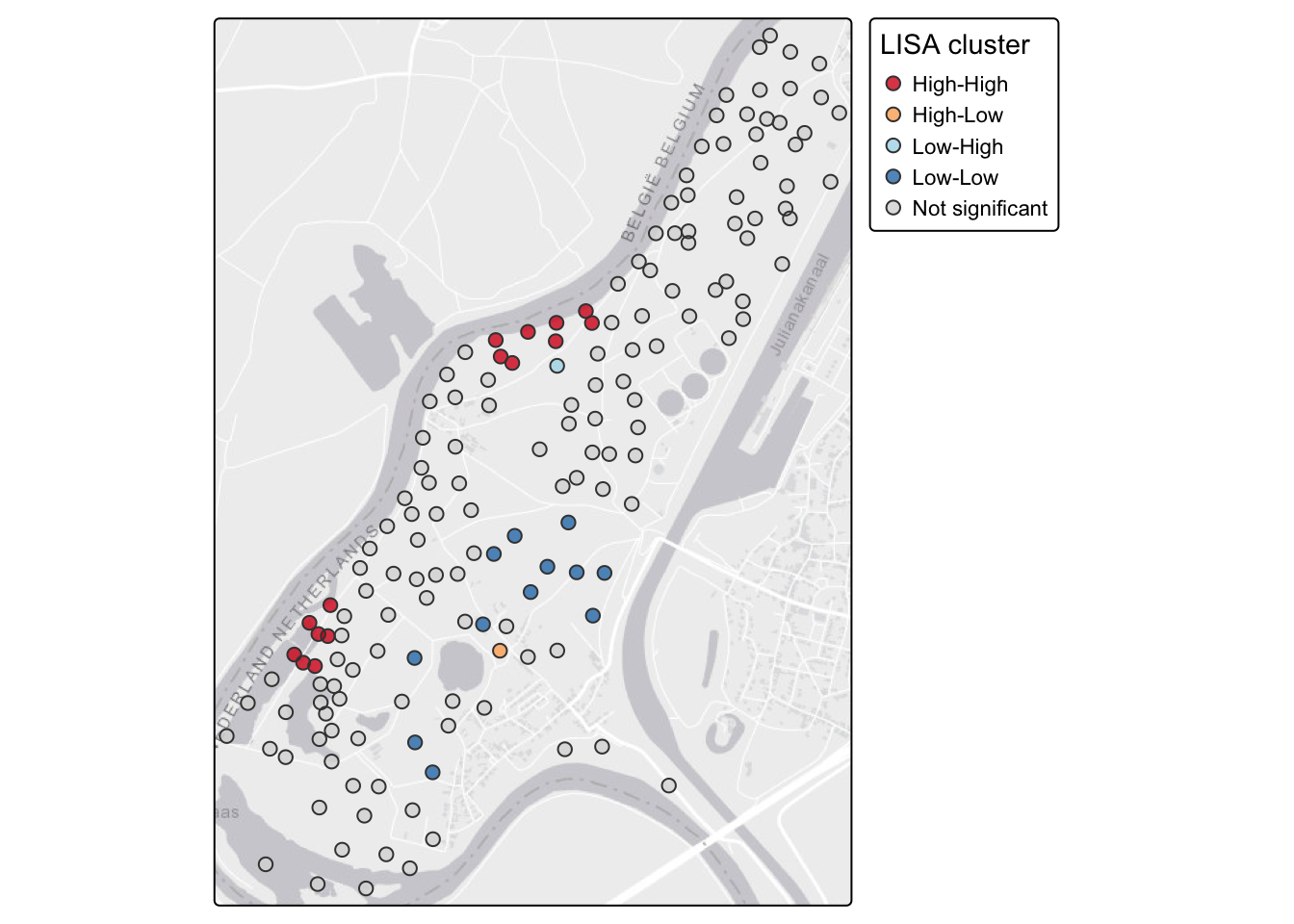
Let’s attach the results to our sf object and build the cluster map. Using \(\alpha = 0.01\) here given the multiple testing issue.
meuseSf$Ii <- lisa[, "Ii"]
meuseSf$pval <- lisa[, "Pr(z != E(Ii)) Sim"]

sig <- 0.01
meuseSf$cluster <- case_when(
  meuseSf$z > 0 & meuseSf$lag_z > 0 & meuseSf$pval < sig ~ "High-High",
  meuseSf$z < 0 & meuseSf$lag_z < 0 & meuseSf$pval < sig ~ "Low-Low",
  meuseSf$z > 0 & meuseSf$lag_z < 0 & meuseSf$pval < sig ~ "High-Low",
  meuseSf$z < 0 & meuseSf$lag_z > 0 & meuseSf$pval < sig ~ "Low-High",
  TRUE ~ "Not significant"
)

table(meuseSf$cluster)
      High-High        High-Low        Low-High         Low-Low Not significant
             15               1               1              12             135
Now map it. We’ll draw the clusters with tmap, pulling in a basemap so you can see how the pattern sits relative to the river.
tmap_mode("plot")
tm_basemap("Esri.WorldGrayCanvas") +
  tm_shape(meuseSf) +
  tm_symbols(
    fill = "cluster",
    fill.scale = tm_scale_categorical(
      values = c(
        "High-High"       = "#d7191c",
        "Low-Low"         = "#2c7bb6",
        "High-Low"        = "#fdae61",
        "Low-High"        = "#abd9e9",
        "Not significant" = "#d9d9d9"
      )
    ),
    size = 0.5,
    fill_alpha = 0.8,
    fill.legend = tm_legend(title = "LISA cluster")
  )
We’re drawing this statically with tmap_mode("plot") so it renders the same way to both the HTML and PDF versions of the book. A static map travels to print; an interactive one doesn’t. If you’re at the console and want to click individual points to read their values, switch to tmap_mode("view") and rerun the exact same tm_* code. You’ll get an interactive Leaflet map with a slippy basemap, and everything else stays the same.
Compare this to the global Moran’s I you computed in the last chapter. Log lead is positively autocorrelated overall, which was the message from the global statistic. The LISA map tells you where: the HH cluster near the river is driving most of that signal. The LL locations are farther from the river where contamination is lower. That spatial pattern maps directly onto the physical process of flood deposition from the Meuse, so it is more than a statistical artifact. High-lead sediment gets deposited close to the channel, and both the contamination and its spatial coherence decay with distance.
Local Moran’s I is not the only local statistic you’ll meet. The other common one is Getis-Ord \(G_i^*\), which is what ArcGIS labels “Hot Spot Analysis” (it files local Moran’s I under “Cluster and Outlier Analysis”). The difference is worth knowing. \(G_i^*\) asks whether the values in a location’s neighborhood add up to more or less than you’d expect by chance, so it flags hot spots and cold spots by intensity. What it does not give you is the outlier categories. There is no HL or LH in \(G_i^*\), because it is built on the local sum rather than the cross-product \(z_i z_j\) that makes local Moran’s I notice a value disagreeing with its neighbors. If all you want is “where are the highs and lows,” \(G_i^*\) is clean and easy to read. If you also care about the misfits, you want local Moran’s I. spdep computes it with localG().
It can also be useful to map \(I_i\) directly, not just the cluster category. This gives you a continuous view of where clustering is strongest.
ggplot(meuseSf) +
  geom_sf(aes(color = Ii), size = 2.5) +
  scale_color_gradient2(
    low = "#2c7bb6", mid = "white", high = "#d7191c",
    midpoint = 0,
    name = expression(I[i])
  ) +
  labs(title = "Local Moran's I: log lead, Meuse River") +
  theme_minimal()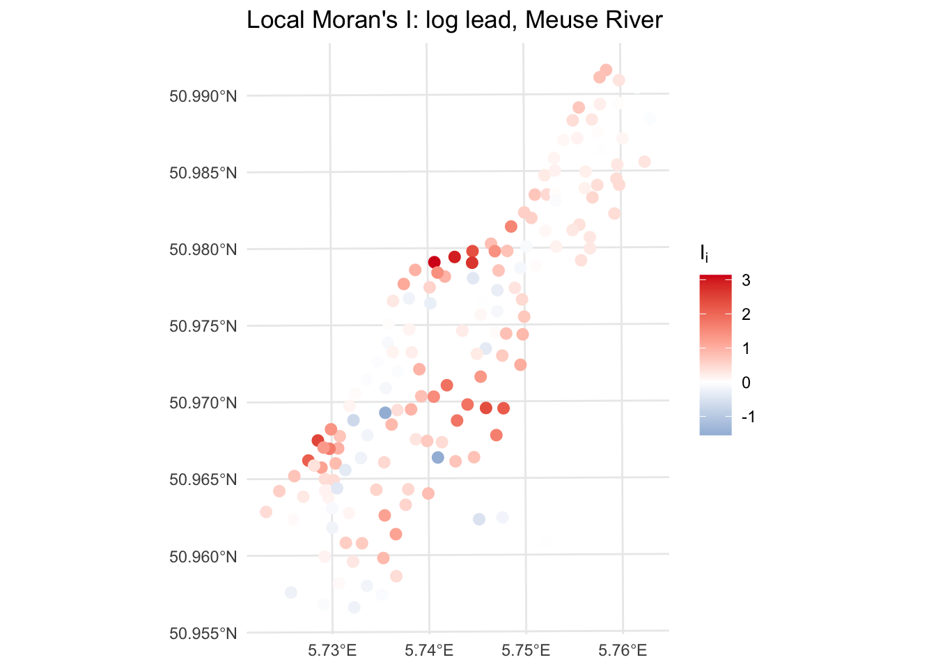
Locations with strongly positive \(I_i\) are in coherent clusters, either HH or LL. Locations with negative \(I_i\) are spatial outliers. Near-zero values are, statistically speaking, uninteresting.
The HL and LH categories tend to get overlooked in favor of the hot spots and cold spots. That would be a mistake. A high-value location surrounded by low-value neighbors, an HL outlier, is asking you a question about process. Why is that location different from everywhere around it? Did something happen there? Is it a sampling artifact? Is there a local source or sink that your coarser-grained understanding of the system doesn’t account for?
In the lead data, an HL outlier would be a location with high lead concentrations in an area that is otherwise clean. That is worth a field visit. It might be an old refuse pile, a spill site, or a measurement error. You wouldn’t find it by looking at the global statistics or even the raw map without this kind of formal local analysis.
Not every spatial outlier has a good story. Some are noise. But the ones that do are often worth chasing down, and LISA is what surfaces them for investigation.
LISA takes a global measure and makes it local. You go from “there is spatial structure in this variable” to “here is where that structure lives, and here is where the exceptions are.” Hot spots and cold spots tell you where the signal is concentrated. Spatial outliers tell you where something is off, and those are often the most ecologically interesting locations in the dataset.
From here the book shifts to prediction. We’ve been describing spatial structure; now we’re going to use it. Interpolation methods like IDW and kriging take what you know at sampled locations and estimate values everywhere else. The variogram you met in the autocorrelation chapter is about to become a lot more useful.
Load the birdRichnessMexico.rds data from the previous chapter.
birdsSf <- readRDS("data/birdRichnessMexico.rds")The previous chapter described the global spatial autocorrelation in bird richness using Moran’s I and variograms. Now take the next step and decompose that global signal locally.
Build a k-nearest-neighbor weights matrix with \(k = 8\) and row-standardize it.
Make a Moran scatterplot for nSpecies. Eyeball the four quadrants. Where do most of the points fall?
Run localmoran and build a LISA cluster map. Use \(\alpha = 0.01\).
The global analysis showed that richness is highly structured in space. The LISA map tells you where that structure is concentrated. Does the pattern of HH and LL clusters correspond to what you’d expect from Mexican biogeography? Think about where the species-rich areas of Mexico are and what drives them.
Are there any spatial outliers, HL or LH locations, that catch your eye? Pick one and offer a plausible ecological or geographic explanation for why that location might differ from its neighbors.
Think about what you would have missed by stopping at the global Moran’s I. How does the LISA map change or sharpen the story? This comparison, global statistic to local decomposition, is the kind of thing that belongs in a methods and results section when you are reporting spatial analysis.
Anselin (1995) is the original paper introducing LISA. Sections 1 through 3 are worth the effort. The conceptual motivation for why a global statistic is insufficient, and the four categories of local spatial association, are laid out clearly even if the full mathematical treatment is dense.
Getis and Ord (1992) introduces the \(G_i\) and \(G_i^*\) statistics. Read it for the hot-spot view that sits alongside local Moran’s I, especially since it is the engine behind the hot-spot tools in desktop GIS.
Fortin et al. (2016) is a compact overview of spatial autocorrelation, global and local both, and a good place to see how the pieces fit together without wading through a full textbook.
Dormann et al. (2007) surveys how spatial autocorrelation gets handled across ecological analyses. It is less about LISA specifically and more about why you should care, which is a useful frame for deciding when local structure is worth chasing.