Code
library(sf)
library(tidyverse)
library(tmap)
library(gstat)
library(ncf)
library(spdep)
library(fields)Space matters: Spatial pattern lets us understand process. Where point patterns ask whether locations themselves are clustered or random, autocorrelation asks how a measured quantity (e.g., lead in soil, snow depth, bird diversity) varies across space and at what scale that variation operates. The methods in this chapter summarize that structure across the whole study area. Next module, we will ask where in the study area the structure is concentrated.
Before diving in, make sure you’re comfortable with distance matrices. If you need a refresher, work through the Distance Matrices aside. Also, check out the rant about correlation and regression in the Correlation is not Regression aside
Ok. Quite a few new packages this time. We’ve got our standards like sf(Pebesma 2026), tidyverse(Wickham 2023) and the mapping package tmap(Tennekes 2025). But we are going to pull in some of the heavy hitters in terms of spatial analysis gstat(Pebesma and Graeler 2026), ncf(Bjornstad 2026), and spdep(Bivand 2026) as we get deeper into spatial tools. We’ll also pull in fields(Nychka et al. 2025) to interpolate a surface later on.
library(sf)
library(tidyverse)
library(tmap)
library(gstat)
library(ncf)
library(spdep)
library(fields)We covered point patterns already and that was fun and interesting in the kind of way studying logic is interesting. Quantifying spatial pattern by just looking at points alone is all well and good if you are counting trees. Recall that Ripley’s K requires you to have a completely enumerated point pattern so you’d need to count every tree. Few environmental data sets I encounter are point patterns. Alas.
But what if your variable of interest isn’t as well behaved as a forest stem plot or a map of star positions? And what if you want to know the magnitude of correlation in a continuous variable as it varies in space? For instance, you might want to measure metal deposition in snow on Mt. Baker. You could lay out a nice grid and sample that. You might run a transect up the mountain. Or you might give bags to skiers heading into the back/side/slack country and tell them to take a sample when the spirit moved them (citizen dirtbag science). These types of sampling schemes are more common in most environmental fields and are not point patterns. But all would have good information and likely have interesting spatial structure.
This chapter starts quantifying spatial structure for a variety of data types.
The idea that spatial pattern is worth measuring goes back at least to Alex Watt. In his 1947 presidential address to the British Ecological Society, “Pattern and process in the plant community,” Watt described vegetation as a shifting mosaic of patches, each one caught at a different phase of the same cycle: a gap opens, regenerates, matures, breaks down, and opens again (Watt 1947). The community as a whole holds more or less steady even though every patch in it is always changing.
This is the reading Dean Urban keeps coming back to (Urban 2023). Process is the thing we care about, but process is usually the thing we can’t watch directly. It’s too slow, or it plays out over too large an area, or it already happened before we showed up. Pattern is what we can measure. So we lean on the pattern to tell us about the process behind it.
The catch is that the step from pattern back to process is rarely clean. The same pattern can arise from more than one process, so pattern is a clue rather than a verdict. Quantifying spatial structure tells you there is something to explain. It does not, on its own, tell you what.
Environmental data are typically characterized by a pattern: observations from nearby locations are more likely to have similar magnitude than by chance alone. This is spatial autocorrelation and the first challenge we have with environmental data is to quantify the magnitude, intensity, and extent of spatial structure in the data.
The two tools covered here are variograms and global Moran’s I.
You already know about correlation. If I give you a scatter plot of air temperature on the x-axis and ice cream sales on the y-axis, you know what to do with that. You’ve got two variables, call them \(A\) and \(B\), measured across some set of observations, and you’re asking whether high values of \(A\) tend to go with high values of \(B\). Pearson’s \(r\) puts a number on that.
Now here’s the twist. What if both axes are the same variable?
That’s not a typo. Autocorrelation is what you get when you correlate a variable with a version of itself but just measured somewhere else. The “auto” means self. You’re asking: does the value of \(z\) at one location tell me something about the value of \(z\) at a nearby location?
Think about soil lead. If I know the lead concentration at one spot is high, does that help me guess the concentration 50 meters away? 200 meters? 1000 meters? If the answer is yes at short distances, the data are spatially autocorrelated. That correlation should decay as you move farther away. So at some point, knowing the lead here tells you nothing about lead over there.
So the conceptual move is this: instead of plotting \(A\) vs \(B\), you plot \(z_i\) vs \(z_j\), where \(i\) and \(j\) are two locations. You do that for every pair of points in your data set. If nearby pairs cluster in the upper right and lower left of that scatter plot (both high or both low), you’ve got positive spatial autocorrelation. If nearby pairs tend toward opposite corners (one high, one low), that’s negative autocorrelation. And if the scatter looks like a shotgun blast, there’s no pattern.
The distance between \(i\) and \(j\) is what makes this spatial. Rather than asking about the correlation across the whole data set at once, we ask: what does the correlation look like at 100m? At 500m? At 1km? That distance-dependence is the whole game.
The two tools we’ll use (variograms and Moran’s I) are both trying to describe that relationship between geographic distance and the similarity of values. They approach it differently, but they’re answering the same question.
Let me make this concrete with a tiny data set. Eight stations along a transect, spaced 100m apart. At each station we measure some variable (e.g., soil nitrogen, temperature). The point is we have one variable measured at eight locations.
I’m keeping this example in one dimension, like stations strung out along a line, because it’s the easiest way to see the logic. But nothing about the math requires it. When we get to some real data below, each point has both an \(x\) and a \(y\) coordinate, and the distance between two points is just the familiar Euclidean distance \(d_{ij} = \sqrt{(x_i - x_j)^2 + (y_i - y_j)^2}\). The pairing logic is identical. More points, more pairs, same idea.
transect <- data.frame(
  x = seq(0, 700, by = 100),
  z = c(10, 12, 11, 13, 5, 4, 6, 5)
)
Here’s what it looks like along the transect:
ggplot(transect, aes(x = x, y = z)) +
  geom_line() +
  geom_point(size = 4) +
  labs(x = "Location (m)", y = "z") +
theme_minimal()![]()
Values are high on the left end and low on the right. Nearby stations look similar to each other.
Now the key question: how do we turn one column of data into two things we can correlate? We make pairs. For every pair of stations \(i\) and \(j\) we record their distance and both their values of \(z\).
# Step 1: compute all pairwise distances between stations.
# dist() returns a distance object; we convert it to a plain matrix
# so we can index into it like a spreadsheet.
Dmat <- as.matrix(dist(transect$x))

# Step 2: we only want each pair once (i,j is the same pair as j,i),
# so we pull out just the upper triangle of the distance matrix.
# upper.tri() returns a logical matrix with TRUE above the diagonal, FALSE elsewhere.
DmatUpperTri <- upper.tri(Dmat)

# Step 3: find the row and column positions of those TRUE cells.
# Each row of idx is one pair: idx[,1] is the i station, idx[,2] is the j station.
idx <- which(DmatUpperTri, arr.ind = TRUE)

# Step 4: build the pairs data frame.
# For each pair, grab the z value at station i, the z value at station j,
# and the distance between them from the matrix.
pairsDf <- data.frame(
  zi   = transect$z[idx[, 1]], # z at station i
  zj   = transect$z[idx[, 2]], # z at station j
  dist = Dmat[DmatUpperTri] # distance between i and j
)
pairsDf
zi zj dist
1 10 12 100
2 10 11 200
3 12 11 100
4 10 13 300
5 12 13 200
6 11 13 100
7 10 5 400
8 12 5 300
9 11 5 200
10 13 5 100
11 10 4 500
12 12 4 400
13 11 4 300
14 13 4 200
15 5 4 100
16 10 6 600
17 12 6 500
18 11 6 400
19 13 6 300
20 5 6 200
21 4 6 100
22 10 5 700
23 12 5 600
24 11 5 500
25 13 5 400
26 5 5 300
27 4 5 200
28 6 5 100Study pairsDf and look back up at the plot:
That gives us \(n(n-1)/2 = 28\) pairs. Now we can ask: for short-distance pairs, do high values of \(z_i\) go with high values of \(z_j\)? What about far-apart pairs?
# compute r for each group to use as labels in the plot
corLabels <- pairsDf %>%
  filter(dist <= 100 | dist > 200) %>%
  mutate(group = ifelse(dist <= 100, "Close (≤ 100m)", "Far (≥ 200m)")) %>%
  group_by(group) %>%
  summarise(r = round(cor(zi, zj), 2)) %>%
  mutate(label = paste0("r = ", r))

pairsDf %>%
  filter(dist <= 100 | dist > 200) %>%
  mutate(group = ifelse(dist <= 100, "Close (≤ 100m)", "Far (≥ 200m)")) %>%
  ggplot(aes(x = zi, y = zj)) +
  geom_point(size = 3) +
  geom_text(
    data = corLabels, aes(label = label),
    x = Inf, y = Inf, hjust = 1.1, vjust = 1.5
  ) +
  facet_wrap(~group) +
  labs(x = expression(z[i]), y = expression(z[j])) +
theme_minimal()![]()
In the close pairs panel, high values of \(z_i\) go with high values of \(z_j\). That’s positive spatial autocorrelation. In the far pairs panel the scatter looks like a shotgun blast meaning knowing \(z_i\) tells you nothing about \(z_j\).
That scatter of \(z_i\) vs \(z_j\) is the conceptual core of everything we’re doing in this module. Variograms and Moran’s I are two more rigorous ways of quantifying what you can already see in those plots. They frame the question differently though: Moran’s I measures similarity (do nearby pairs have similar values?), while the variogram measures dissimilarity (how different are nearby pairs, on average?). Same underlying question, opposite sign. One quick note on Moran’s I specifically: it isn’t exactly Pearson’s \(r\), but the intuition holds. It’s a weighted version that accounts for the spatial arrangement of points rather than treating all pairs equally. More on that below.
Let’s use the Meuse River data to illustrate the idea behind autocorrelation. This is a classic spatial data set that has coordinate data (a plain data.frame) with measurements on metal concentrations in soils as well as some other soil variables. We will return to these data again and again. It’s a classic data set. Look at the help file for more details as well as the projection info. The site is in the Netherlands on the border with Belgium. Someday I’ll visit this site after so many years of working with these data.
We use meuse2, a trimmed and updated version of the classic Meuse dataset, rather than the older sp::meuse. See the appendix for how it was built.
meuse2 <- readRDS("data/meuse2.Rds")
class(meuse2)
[1] "data.frame"head(meuse2) x y cadmium copper lead zinc om
1 181072 333611 11.7 85 299 1022 13.6
2 181025 333558 8.6 81 277 1141 14.0
3 181165 333537 6.5 68 199 640 13.0
4 181298 333484 2.6 81 116 257 8.0
5 181307 333330 2.8 48 117 269 8.7
6 181390 333260 3.0 61 137 281 7.8We can transform the data.frame to a sf object by specifying the coordinates and the projection information.
meuseSf <- st_as_sf(meuse2, coords = c("x", "y")) %>%
  st_set_crs(value = 28992)
Before we go any further, let’s log-transform lead and add it as a column. Lead concentrations in soil are right-skewed with a handful of hotspot values near the river being much larger than the rest of the data. Both the variogram and Moran’s I involve squared deviations from the mean, so those few extreme values end up dominating the result. You wind up describing the spatial arrangement of your outliers rather than the general structure in the data. Log-transforming stabilizes the variance and gives both methods a fairer look at the whole dataset. We’ll use log_lead throughout.
meuseSf$log_lead <- log(meuseSf$lead)Now let’s map the lead concentration in the soils. This is our first map with tmap, the mapping package we’ll lean on throughout the book. tmap builds a map up in layers: a basemap for context, then a shape, then instructions for how to draw it. Here we lay down some tiles, add the Meuse stations, and draw them as bubbles sized and colored by lead.
tmap_mode("plot")
tm_basemap("Esri.WorldGrayCanvas") +
  tm_shape(meuseSf) +
  tm_bubbles(
    size = "lead",
    fill = "lead",
    fill.scale = tm_scale_intervals(values = "viridis"),
    fill_alpha = 0.7,
    fill.legend = tm_legend(title = "Lead (ppm)"),
    size.legend = tm_legend(title = "Lead (ppm)")
  )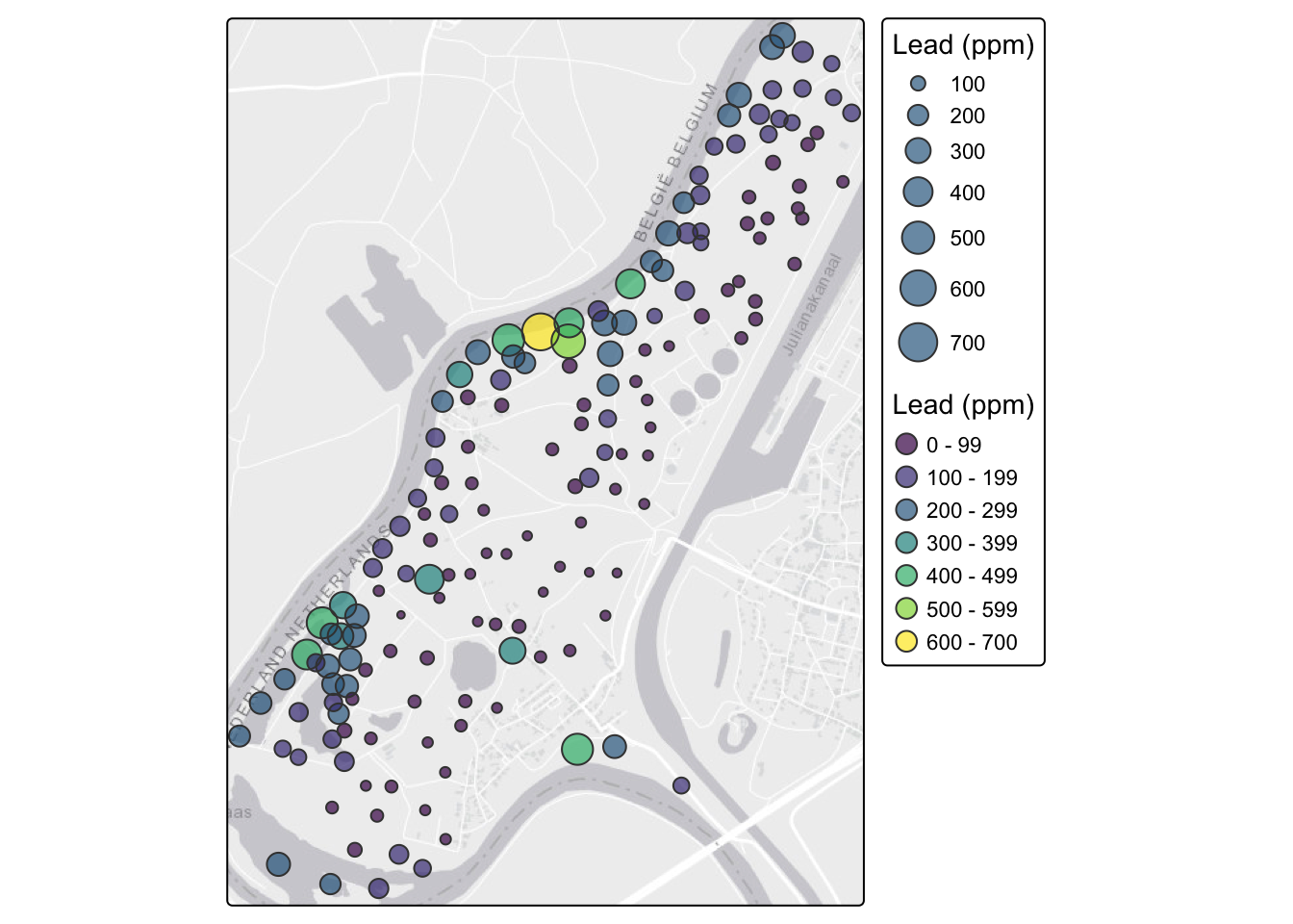
With the river in the basemap you can see right away that the high lead values hug the Meuse. That makes sense: the metals are deposited by river flooding.
We’re drawing this statically with tmap_mode("plot") so it renders the same way to both the HTML and PDF versions of the book. A static map travels to print; an interactive one doesn’t. If you’re at the console and want to pan and zoom, switch to tmap_mode("view") and rerun the exact same tm_* code. You’ll get an interactive Leaflet map with a slippy basemap, and everything else stays the same. It’s addictive.
Let’s consider the simplest measure of spatial autocorrelation by calculating something called a semivariogram. We will use the gstat library to do so but could calculate this a few different ways as there are several variogram functions in R.
In this approach, we quantify spatial autocorrelation by examining the data set one pair of points at a time. The easiest way of getting a first blush of how autocorrelated spatial data are is by calculating and plotting a semivariogram. We do this by measuring the distance between two locations (recall Euclid!) and plotting the squared difference between the values of some variable (\(z\)) at that distance. We call this mass of points a semivariogram cloud. So we have \(n(n-1)/2\) elements in a distance matrix and for two points \(i\) and \(j\) we calculate the distance via \(d_{ij}=\sqrt{(x_j-x_i)^2 + (y_i-y_j)^2}\) where \(x\) and \(y\) are the coordinates of the points and we plot that distance against the squared difference of the variable (\(z\)) as \((z_i - z_j)^2\). A note on notation: the actual semivariogram estimator is \(\hat{\gamma}(h) = \frac{1}{2N(h)}\sum(z_i - z_j)^2\), where the factor of \(\frac{1}{2}\) and the averaging over \(N(h)\) pairs in a distance bin are what give us the binned variogram. The cloud skips that averaging and just plots the raw squared differences which is why the y-axis scale drops dramatically when you go from cloud to binned.
Thus, if pairs of points that are close together in space also have a smaller squared difference they are spatially autocorrelated. Typically, as points become farther away from each other the squared difference increases. At some distance, the squared difference levels out and the data tend to be uncorrelated.
Now we will make and plot the variogram using log_lead. Think of the variogram as a measure of environmental distance with respect to Euclidean (geographic) distance.
leadVarCloud <- variogram(log_lead ~ 1, locations = meuseSf, cloud = TRUE)
plot(leadVarCloud,
     pch = 20, cex = 1.5, col = "black", alpha = 0.1,
     ylab = expression(Semivariance ~ (gamma)),
     xlab = "Distance (m)", main = "Log lead concentrations"
)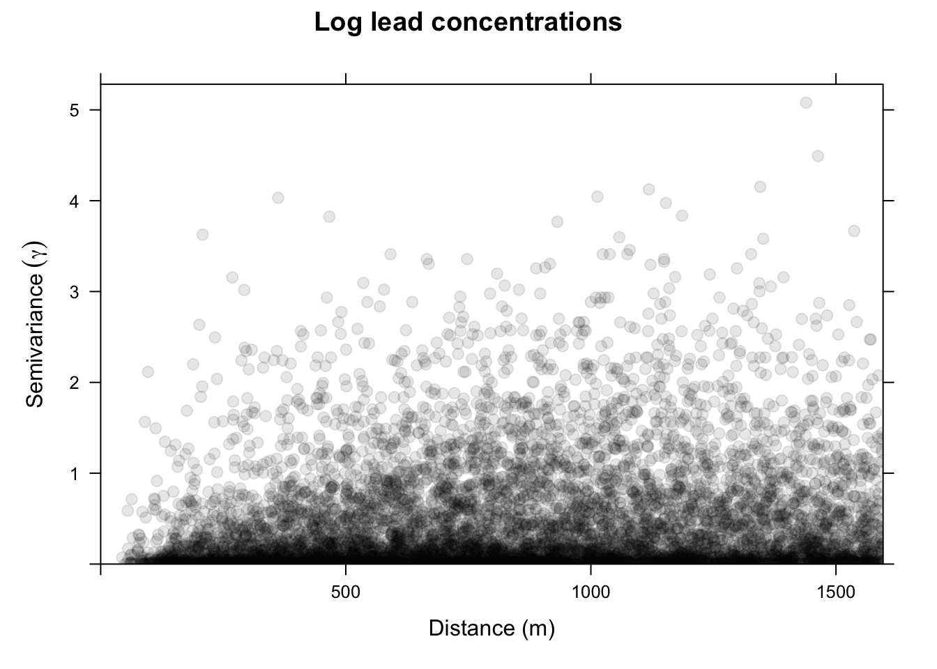
On the x-axis of the plot is the distance between the locations, and on the y-axis is the difference of their log lead values squared. That is, each dot in the variogram represents a pair of locations, not the individual locations on the map. This is a bit messy. Typically, we don’t look at the cloud of points but rather get an average model value at a few distances and the variogram function is conservative in looking at distances within a safe range.
leadVar <- variogram(log_lead ~ 1, locations = meuseSf, cloud = FALSE)
plot(leadVar,
     pch = 20, cex = 1.5, col = "black",
     ylab = expression(Semivariance ~ (gamma)),
     xlab = "Distance (m)", main = "Log lead concentrations"
)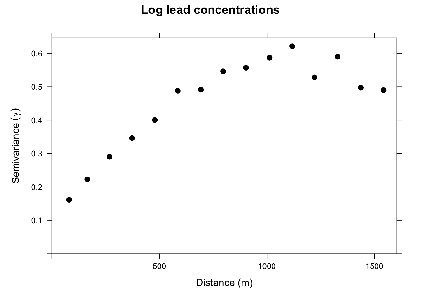
This is a lot cleaner. Note the change in the y-axis range. We got rid of an awful lot of noise by averaging the \(\gamma\) values. Just by eyeballing this we would likely think that log lead concentrations in this data set are autocorrelated out to a distance of about 750m because \(\gamma\) is small at distances less than 750m. The next step is to fit a curve (model) to the variogram, which lets us estimate \(\gamma\) for any distance. We will cover that in the Kriging chapter.
~1 construct?You might be wondering about the log_lead~1 in the call to variogram above. Reasonable. Recall that the ~ notation is integral to R’s approach to statistical modeling, allowing you to specify what’s on the left-hand side of the model and what’s on the right. E.g., lm(y~x) specifies a linear model where y is as a linear function of x. The ~1 means intercept-only: no predictor variables, just a constant. So lm(y~1) predicts y from its mean and nothing else.
Consider our example with log lead above and look at the output for this linear model.
summary(lm(log_lead ~ 1, data = meuseSf))
Call:
lm(formula = log_lead ~ 1, data = meuseSf)

Residuals:
     Min       1Q   Median       3Q      Max
-1.47349 -0.53887 -0.01574  0.53768  1.71378

Coefficients:
            Estimate Std. Error t value Pr(>|t|)
(Intercept)  4.76933    0.05251   90.83   <2e-16 ***
---
Signif. codes:  0 '***' 0.001 '**' 0.01 '*' 0.05 '.' 0.1 ' ' 1

Residual standard error: 0.6724 on 163 degrees of freedom
You can see it has only an intercept term (no slope). The Estimate for the intercept is the mean of meuseSf$log_lead and the Std. Error is its standard error.
mean(meuseSf$log_lead)[1] 4.769326sd(meuseSf$log_lead) / sqrt(nrow(meuseSf))[1] 0.05250534So, when we use variogram above as variogram(log_lead~1, locations = meuseSf) we are asking for the autocorrelation of log lead with no other predictor variables. Later chapters cover ways of assessing spatial structure in the presence of predictors, but for now we leave it as an intercept-only model.
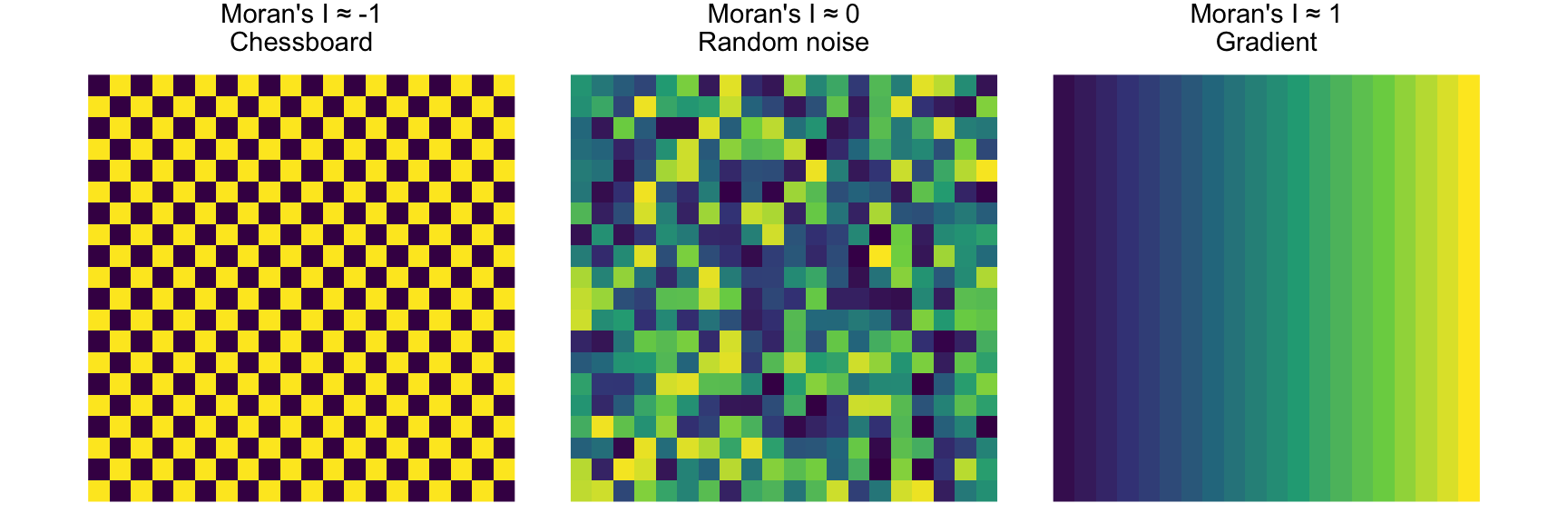
Variograms are nifty tools, but it would be nice to work with a technique that gave us more familiar numbers. Fortunately, there are other methods of measuring spatial autocorrelation beyond the variogram. Spatial autocorrelation is trickier than temporal autocorrelation because it is multi-dimensional and multi-directional. Bivand (2008) covers Geary’s C as an entry point. The statistic used more commonly is global Moran’s I which is close to the inverse of Geary’s C (but is not identical). Values of Moran’s I greater than zero indicate positive spatial autocorrelation and values below zero indicate negative autocorrelation. Values range from minus one (perfect dispersion like a chessboard) to values near one (strong clustering or gradients). A zero value indicates spatial randomness.
Moran’s I is defined as:
\[I= \frac{N}{\sum_i \sum_j w_{ij}}~\frac{\sum_i \sum_j w_{ij}(Z_i-\bar{Z})(Z_j-\bar{Z})}{\sum_i(Z_i-\bar{Z})^2}\]
where \(N\) is the number of observations at \(i\) and \(j\), \(Z\) is the variable being measured, and \(W\) is a matrix of weights (e.g., the inverse of the distance between points).
Reading this through I can hear those that are paying attention saying, “Wait, what about this weights thing?” Good! We can use weights to give some elements more or less influence on a statistic than other elements in the same set. So for instance, elements that we want to have less influence can be multiplied by a scalar from zero to one. Unweighted elements can be multiplied by one and elements that we might want to give extra weight to can be multiplied by a number greater than one. We do this in practice with the weights matrix \(W\). We will see how this works below.
Moran’s I has the lovely property that its values can be transformed to Z-scores for hypothesis testing. Thus, Moran’s Z-scores greater than 1.96 or smaller than −1.96 would indicate significant spatial autocorrelation at alpha of 0.05. This is handy. We can also test the significance of Moran’s I by bootstrapping.
First though we have to figure out how to make R give us what we want. There are two packages that I use to do Moran’s I. The first is spdep which is powerful but has super-weird syntax and data structures until you get used to them. But it’s really flexible in how you calculate and use the weights matrix. The second is ncf which is a little more intuitive but not as flexible. We’ll use both.
spdepLet’s use the spdep library and calculate Moran’s I for a different variable from the Meuse River data. The syntax for doing Moran’s I with spdep is a little hard to get used to because of the object structure the library uses but I like it because the way \(W\) is specified is explicit.
Let’s demonstrate Moran’s I using logged lead values from the Meuse River data. And we will use a weight matrix (\(W\)) that is made of the inverse of the Euclidean distance between points. Inverse distance is only one way of creating spatial weights. Other common ways include looking only at a certain number of neighbors (K nearest neighbors) or looking only at neighbors within a fixed distance band. More on that below.
OK, here is Moran’s I for the logged values of lead using an inverse distance weights matrix:
# coordinates and the full pairwise distance matrix; we reuse Dmat below
coords <- st_coordinates(meuseSf)
Dmat <- as.matrix(dist(coords))
# inverse-distance weights, with the diagonal set to 0 instead of Inf
W <- 1 / Dmat
diag(W) <- 0
# convert the weights matrix to a weights list object
# so spdep is happy
wList <- mat2listw(W)
# calculate I
moran.test(meuseSf$log_lead, wList)
    Moran I test under randomisation

data:  meuseSf$log_lead
weights: wList

Moran I statistic standard deviate = 12.619, p-value < 2.2e-16
alternative hypothesis: greater
sample estimates:
Moran I statistic       Expectation          Variance
      0.121940297      -0.006134969       0.000103010
The results from this indicate that log lead values are positively autocorrelated when we use \(W\) as inverse distances. This means that measurements of log lead that are close in space will be associated with each other. Note that this is looking across all the points because we are calculating a weights matrix that uses all the points. In practice, points more than 1000 m apart don’t have much influence because \(W < 0.001\) at those distances, though every element of \(W\) counts for something. You could draw this if you thought about it, but here is the relationship between distance and inverse distance:
# flatten the distance matrix and the inverse distances (W) into vectors
x <- as.vector(Dmat)
y <- as.vector(W)
ggplot() +
  geom_line(aes(x = x[x > 0], y = y[x > 0])) +
  labs(x = "Distance (m)", y = "Inverse distance (aka W)") +
  lims(x = c(0, 1500)) +
  theme_minimal()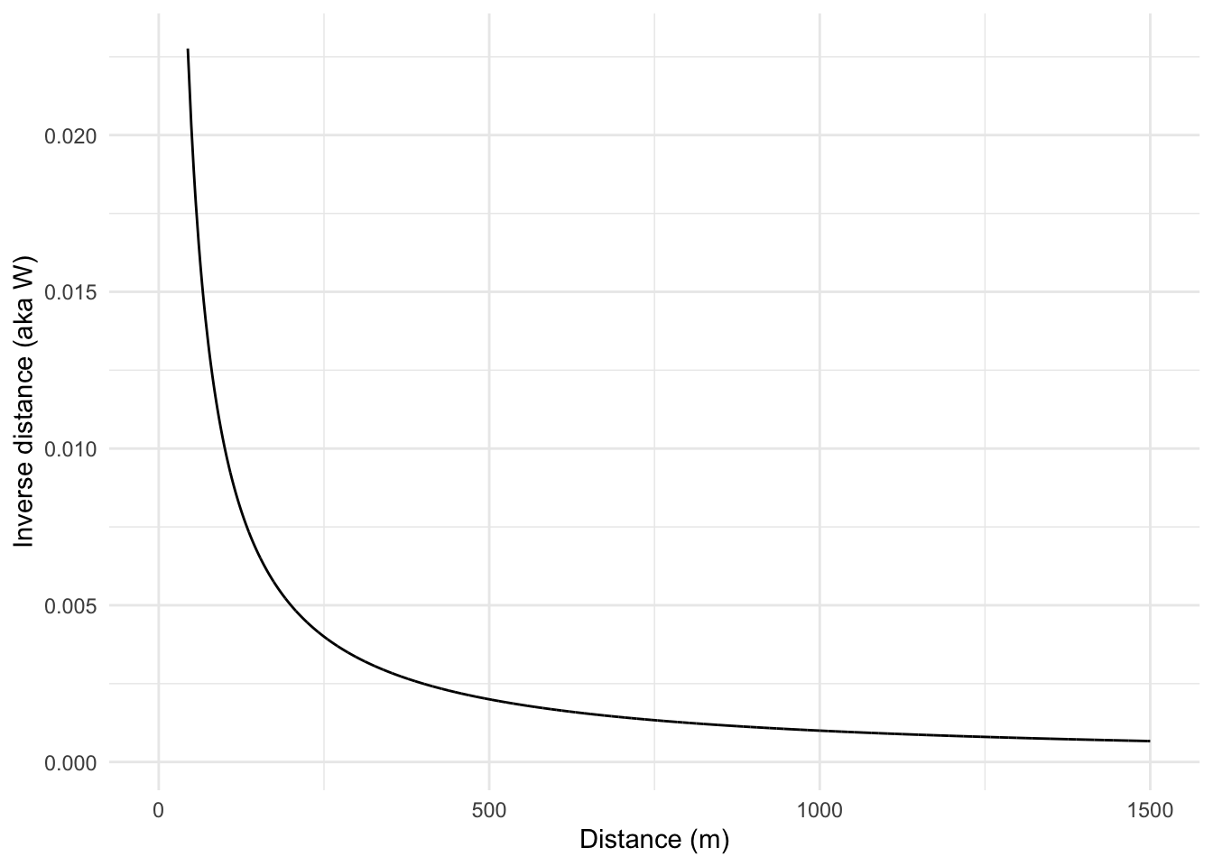
If we want to we could calculate a weights matrix explicitly by looking at distance. E.g., here we will make \(w_{ij}=1\) when \(d_{ij}<100\) and \(w_{ij}=0\) when \(d_{ij}\geq100\)
# reuse Dmat from above; start from an empty weights matrix
W <- matrix(0, ncol = ncol(Dmat), nrow = nrow(Dmat))
# set some values to 1 using a logical mask of Dmat < 100
W[Dmat < 100] <- 1
# convert the weights matrix to a weights list object
# so spdep is happy
wList <- mat2listw(W)
# calculate I
moran.test(meuseSf$log_lead, wList)
    Moran I test under randomisation

data:  meuseSf$log_lead
weights: wList

Moran I statistic standard deviate = 9.5718, p-value < 2.2e-16
alternative hypothesis: greater
sample estimates:
Moran I statistic       Expectation          Variance
      0.807152037      -0.006134969       0.007219385
Note that Moran’s I is quite large when using only points within 100m of each other. Let’s look at only points between 500 and 1000 m of each other.
# make an empty weights matrix of the right dimensions
W <- matrix(0, ncol = ncol(Dmat), nrow = nrow(Dmat))
# set some values to 1
W[Dmat > 500 & Dmat <= 1000] <- 1
# convert the weights matrix to a weights list object
# so spdep is happy
wList <- mat2listw(W)
# calculate I
moran.test(meuseSf$log_lead, wList)
    Moran I test under randomisation

data:  meuseSf$log_lead
weights: wList

Moran I statistic standard deviate = -5.0962, p-value = 1
alternative hypothesis: greater
sample estimates:
Moran I statistic       Expectation          Variance
    -0.0846203165     -0.0061349693      0.0002371842
Now we can see that points far away from each other (between 500m and 1000m) are not correlated. So, by using \(W\) cleverly, we can determine the distances where autocorrelation occurs and where it does not.
A single global Moran’s I answers one question: does autocorrelation exist? But it doesn’t tell you at what scale the structure operates. Is the dependence playing out at 100 m or 1000 m? Those are very different stories ecologically, and a single number buries the difference. The correlogram answers the scale question by plotting \(I\) as a function of distance \(d\). Where \(I(d)\) is large and positive you have strong spatial dependence at that scale. Where it drops to zero you have found the effective range of autocorrelation, the distance beyond which knowing a value here tells you nothing about a value there. That is the same information captured by the range parameter of a fitted variogram, just approached from the similarity direction rather than the dissimilarity direction.
I like to look at Moran’s I in a correlogram by distance like we did with the variogram and in a way that is conceptually very similar to the Ripley’s K function. We can do this as above by calculating Moran’s I in different distance bands. That is, if we stratify the weights \(W\) by distance we can plot Moran’s I as a function of distance. I’m going to do this by brute force in a loop which is ugly. What happens below is that I create a vector of distances from 0 to 1500 m in increments of 100 m. The loop will step through that vector and create a weights matrix so that \(W\) will equal one if points are within the specified distance and zero otherwise. Then I’ll calculate Moran’s I and save the result.
So here is a Moran’s I correlogram by distance, 0 to 1500 m in 100 m bins:
distanceInterval <- 100
distanceVector <- seq(0, 1500, by = distanceInterval)
n <- length(distanceVector)
# make an object to hold results
res <- data.frame(midBin = rep(NA, n - 1), I = rep(NA, n - 1))
for (i in 2:n) {
  # reuse Dmat; 1 inside the current distance band, 0 otherwise
  W <- matrix(0, ncol = ncol(Dmat), nrow = nrow(Dmat))
  W[Dmat >= distanceVector[i - 1] & Dmat < distanceVector[i]] <- 1
  # convert the weights matrix to a weights list object
  # so spdep is happy
  wList <- mat2listw(W)
  # calculate I
  res$I[i - 1] <- moran.test(meuseSf$log_lead, wList, zero.policy = TRUE)$estimate[1]
  # centered distance bin
  res$midBin[i - 1] <- distanceVector[i] - distanceInterval / 2
}
ggplot(data = res, mapping = aes(x = midBin, y = I)) +
  geom_hline(yintercept = 0, linetype = "dashed") +
  geom_line() +
  geom_point(size = 3) +
  labs(x = "Distance (m)", y = "Moran's I") +
  theme_minimal()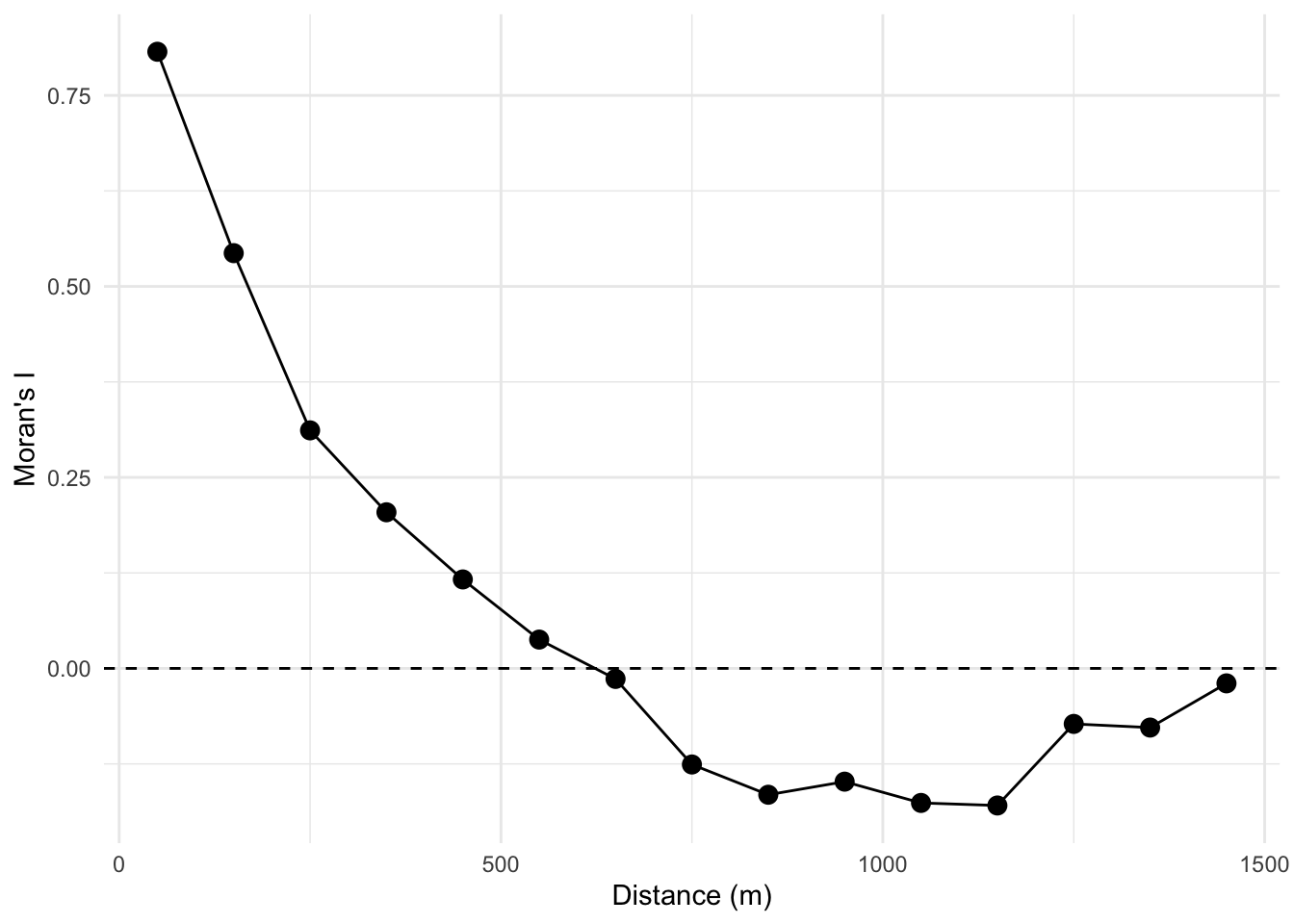
Take a look at the loop. The indexing is pretty convoluted! But will let you see, hopefully, how we can make the \(W\) matrix do our bidding by setting distances we specify to either zero or one and thus let us calculate Moran’s I as a function of distance.
Looking at the figure, we see that log lead values are autocorrelated for a few hundred meters and then fall off. Again, this is conceptually similar to both the Ripley’s K figure and the variograms above. If we wanted to we could have saved the p-values and colored them by significance. But that would be even more cumbersome than it is already. Don’t fret too much! There are automated ways of going about this that we will see in the next section.
We are working with point data here. And I typically work with either point data or raster data. But a lot of spatial analysis deals with polygons and it’s pretty common in those cases to think about spatial structure in terms of neighboring polygons as opposed to thinking about distance. I’m not going to go into this much. Bivand spends a lot of time on it in the reading but I’ll give a quick example.
Often, and especially with areal data, we calculate the weights matrix using just the correlation between the \(k\) closest neighbors and usually set \(k=8\) (there is nothing magical about eight, it is a loose kind of rule).
It’s tempting to write this as a single nested line, but that buries three different functions inside one another. Let’s take them one at a time instead:
# knearneigh finds the k nearest neighbors of each point
knn <- knearneigh(meuseSf, k = 8)
# knn2nb turns those into a neighbor (nb) object
nb <- knn2nb(knn)
# nb2listw turns the nb object into the weights list moran.test wants
wList <- nb2listw(nb)
# now we can calculate I
moran.test(meuseSf$log_lead, wList)
    Moran I test under randomisation

data:  meuseSf$log_lead
weights: wList

Moran I statistic standard deviate = 13.054, p-value < 2.2e-16
alternative hypothesis: greater
sample estimates:
Moran I statistic       Expectation          Variance
      0.467666922      -0.006134969       0.001317438
Three functions are doing the work, and the object types matter as you chain them. knearneigh tells you the \(k\) nearest neighbors for each point, knn2nb turns those into a neighbor object (nb), and nb2listw turns the nb object into the weights list that moran.test wants. Spelled out one step at a time it’s not so bad, though the parade of object types takes some getting used to. (The very smart people that made this had good reasons for doing what they did!)
But what do we see here? If we use the eight nearest neighbors to calculate spatial autocorrelation the value of Moran’s I is quite high. Near is like near when it comes to log lead. Kind of cool. If we looked at 16 neighbors we’d see Moran’s I declining, and with 32 neighbors it declines further. More neighbors, greater distances, declining values. See where I’m going with this?
n <- 7
res <- data.frame(k = 2^(1:n), I = rep(NA, n))
for (i in 1:n) {
  nb <- knn2nb(knearneigh(meuseSf, k = 2^i))
  res$I[i] <- moran.test(meuseSf$log_lead, nb2listw(nb))$estimate[1]
}
ggplot(data = res, mapping = aes(x = k, y = I)) +
  geom_hline(yintercept = 0, linetype = "dashed") +
  geom_line() +
  geom_point(size = 3) +
  labs(x = "K neighbors", y = "Moran's I") +
  theme_minimal()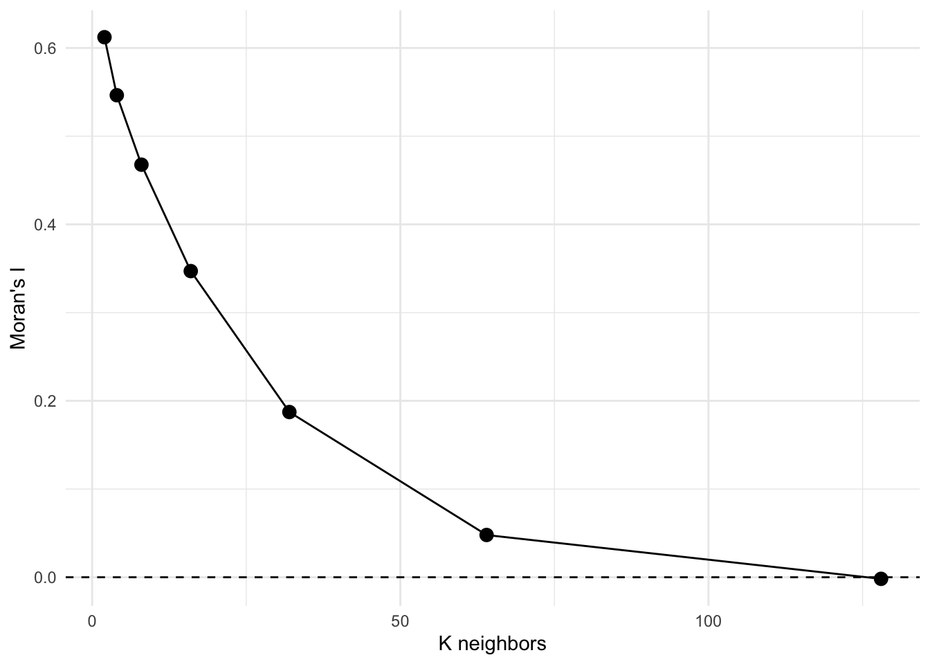
That’s a Moran’s I correlogram by the number of neighbors. Because these are points, I prefer to look at Moran’s I in a correlogram by distance (like we did above) but if we had to deal with polygonal data, we’d likely use this approach. See the text for more info.
ncfThe spdep(Bivand 2026) library is fantastic but doesn’t produce the correlogram in the way we often see it with Moran’s I by distance (\(I=f(d)\)). The ncf(Bjornstad 2026) library does this out of the box.
There are two functions we will look at to do this. One uses distance categories and one makes a continuous function.
Let’s grab the x, y, and z data from meuseSf for convenience.
meuseX <- st_coordinates(meuseSf)[, 1]
meuseY <- st_coordinates(meuseSf)[, 2]
meuseLead <- meuseSf$log_leadFirst the discrete plot of Moran’s I by distance categories:
leadI <- correlog(
  x = meuseX, y = meuseY, z = meuseLead,
  increment = 100, resamp = 100, quiet = TRUE
)
plot(leadI, xlim = c(0, 1500))
abline(h = 0, lty = "dashed")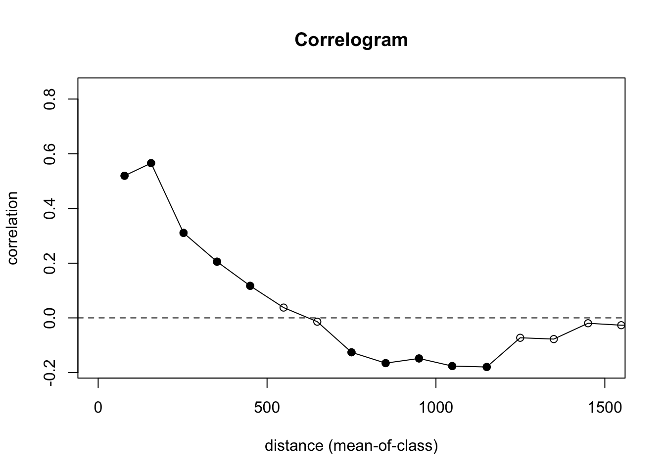
Let’s look at what is going on here. We are calculating \(I=f(d)\) and using 100 m increments. We are also doing significance testing with 100 bootstrap replicates of the data to test a null hypothesis of CSR. In the plot, the points are colored by whether or not autocorrelation is significantly different from zero in that distance class using a nominal (two-sided) 5%-level. This is a slightly fancier version of what we did in the loop above. And the syntax is much easier to follow.
We still see the same result we did above with positive autocorrelation out to distances of about 500 m, very slight negative autocorrelation around 1000 m, and CSR otherwise. The distance where \(I\) drops to zero (around 500 m here) is the effective range of spatial dependence. If that number looks familiar, it should: it is the same range you estimated from the variogram. The variogram and the correlogram are two views of the same underlying structure, one measuring dissimilarity and one measuring similarity.
Oh, one more thing. Remember how the point pattern functions in spatstat were very careful about not letting you run into edge effects? And variogram is that way too. The correlog function is not so careful! It’s more libertarian in its approach.
Here is the whole data set in the default plot.
plot(leadI)
abline(h = 0, lty = "dashed")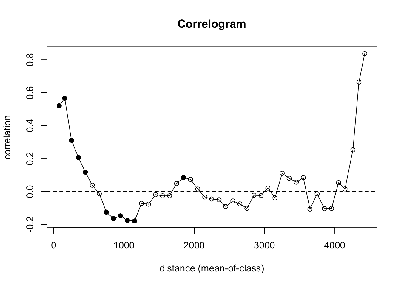
That’s nutty. There are so few pairs of points to compare at longer distances that you get a bunch of nonsense (hence the non-significant values with high values of I). We need to truncate the analysis. Let’s look at how we can get a safe distance that should mitigate edge effects.
Let’s look at the extent of the distances in the data. The coordinates span about 2800 m by 3900 m:
max(meuseX) - min(meuseX)[1] 2785max(meuseY) - min(meuseY)[1] 3897The furthest point-to-point distance is about 4400 m.
meuseD <- dist(cbind(meuseX, meuseY))
max(meuseD)
[1] 4440.764So we want to look at distances out to about 4400/3 or about 1500 m. Beyond that we will run into a low number of pairwise comparisons and get into edge issues.
Yet, the correlog function is happy to let you calculate Moran’s I out to those irresponsible distances (e.g., look at tail(leadI$mean.of.class)). That’s why I truncated my plot with xlim. Again in general, you want to look at distances less than 1/3 of the max span of your points.
Oh, one more thing for the ggplot crowd. Note that all the data for the correlogram is stored in an easy to access fashion in the leadI object. You can roll your own plot in you want in ggplot. And unlike the default plot above, we can control the alpha level for plotting the significance from the permutation test. E.g.,
data.frame(
  n = leadI$n,
  I = leadI$correlation,
  d = leadI$mean.of.class,
  p = leadI$p
) %>%
  mutate(Significant = p < .01) %>%
  ggplot() +
  geom_hline(yintercept = 0, linetype = "dashed") +
  geom_path(aes(x = d, y = I, group = 1, color = Significant), size = 1) +
  geom_point(aes(x = d, y = I, fill = Significant), size = 5, pch = 21) +
  lims(x = c(0, 1500), y = c(-0.6, 0.6)) +
  scale_fill_manual(values = c("grey", "darkgreen")) +
  scale_color_manual(values = c("grey", "darkgreen")) +
  labs(
    x = "Distance (m)", y = "Moran's I",
    title = "Autocorrelation of log(Lead)", subtitle = "Crit value of p<0.01"
  ) +
  theme_minimal()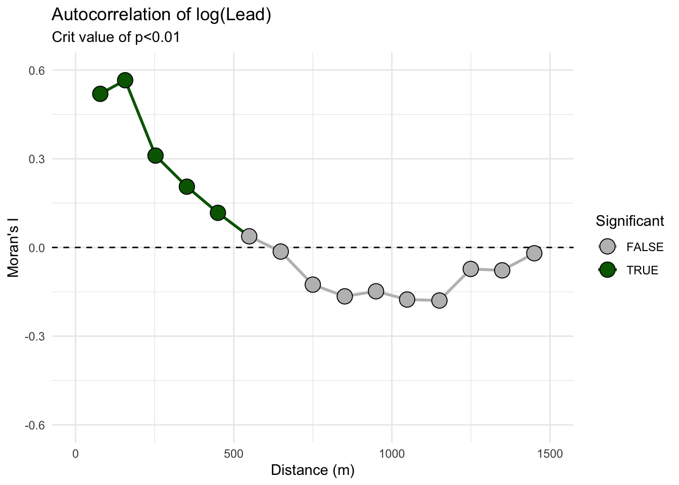
Remember! R will (almost always) do what you want if you try.
What we did above was with field data, right? By now, you all know that I love making examples with simulated data. Below I’m going to show you four different simulated surfaces. Each is a 100 x 100 grid (10,000 cells) and each has a different pattern on it. The units don’t really matter but I’ve labeled them as meters. The height of the surface can be whatever you like to imagine. Elevation, nitrogen, tree density, etc. Those units range from zero to a max of about one but there is a little added noise (random normal noise with a mean of zero and a standard deviation of 0.1) to make things just a tiny bit fuzzy. We will look at the data and then at the correlogram. It’s illustrative, at least I think so. The code is pretty gnarly to generate these surfaces so I’ve hidden it (of course all the code is on the GitHub repo if you want to see it).
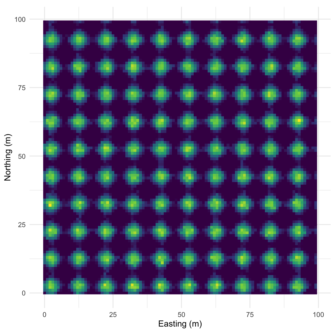
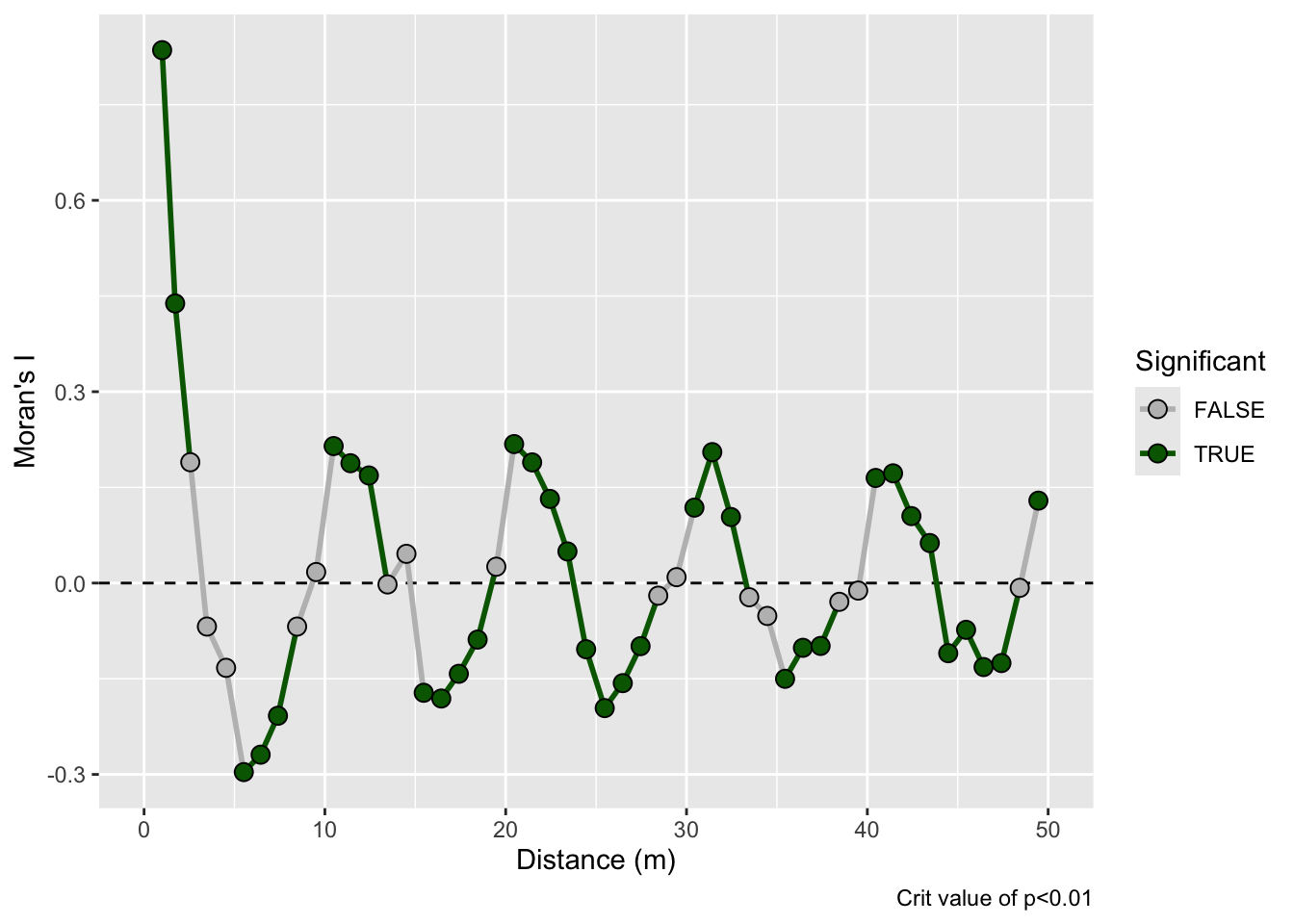
This pattern is made from sine waves so that there are 25 bumps on the surface arranged 5x5. The brighter the color the “taller” the bump.
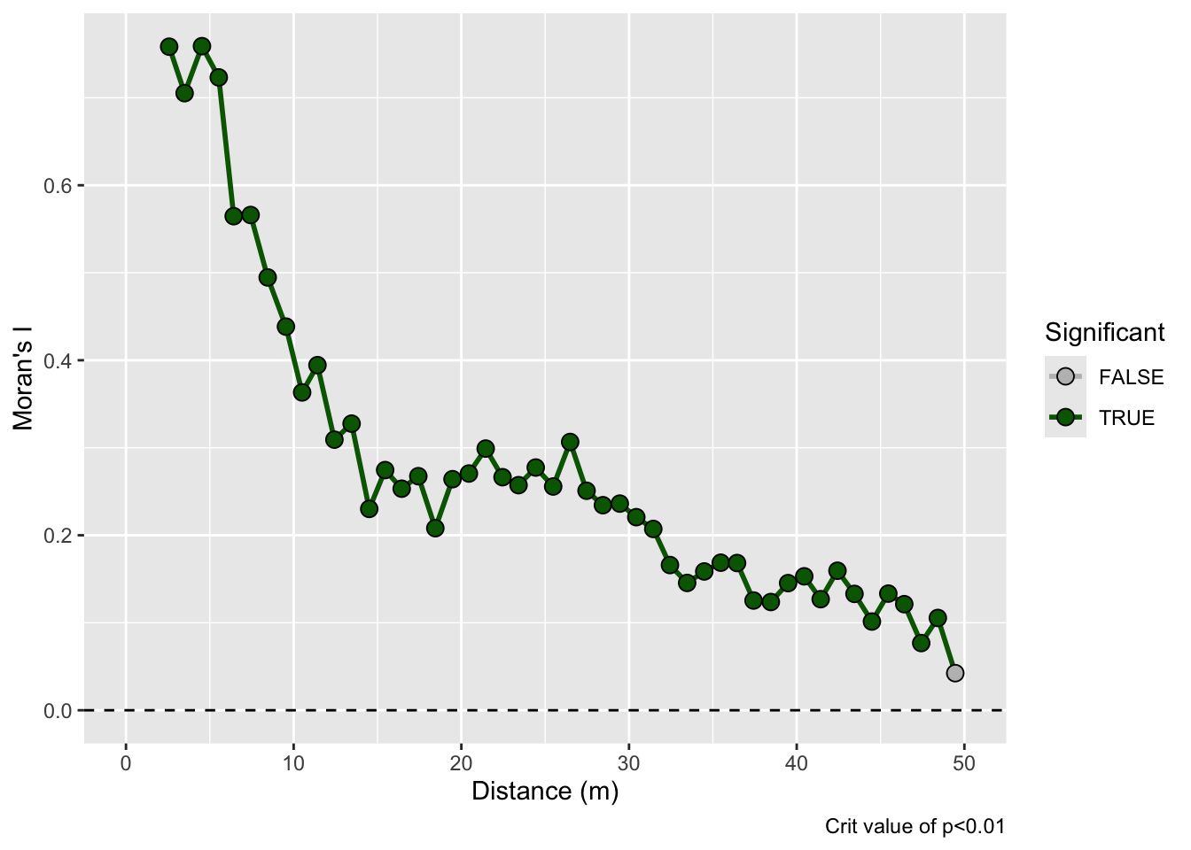
And here is the correlogram. Note extremely high values of Moran’s I (~1) at short distances (inside the bump radius) and the repeating pattern that tells you the distance between the bumps. Also note the magnitude of Moran’s I and that I’m truncating Moran’s I conservatively at 50 m.
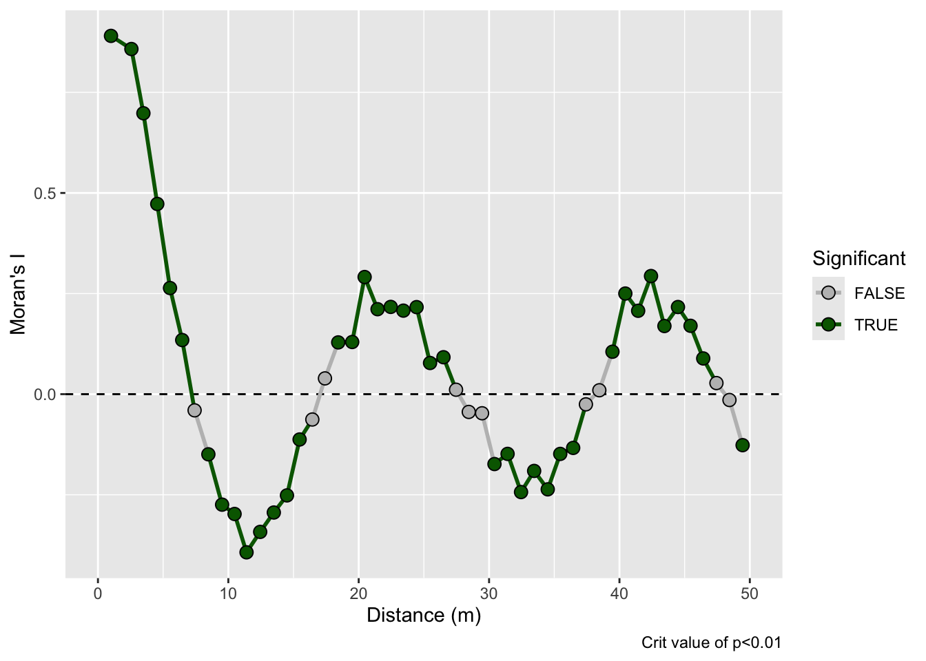
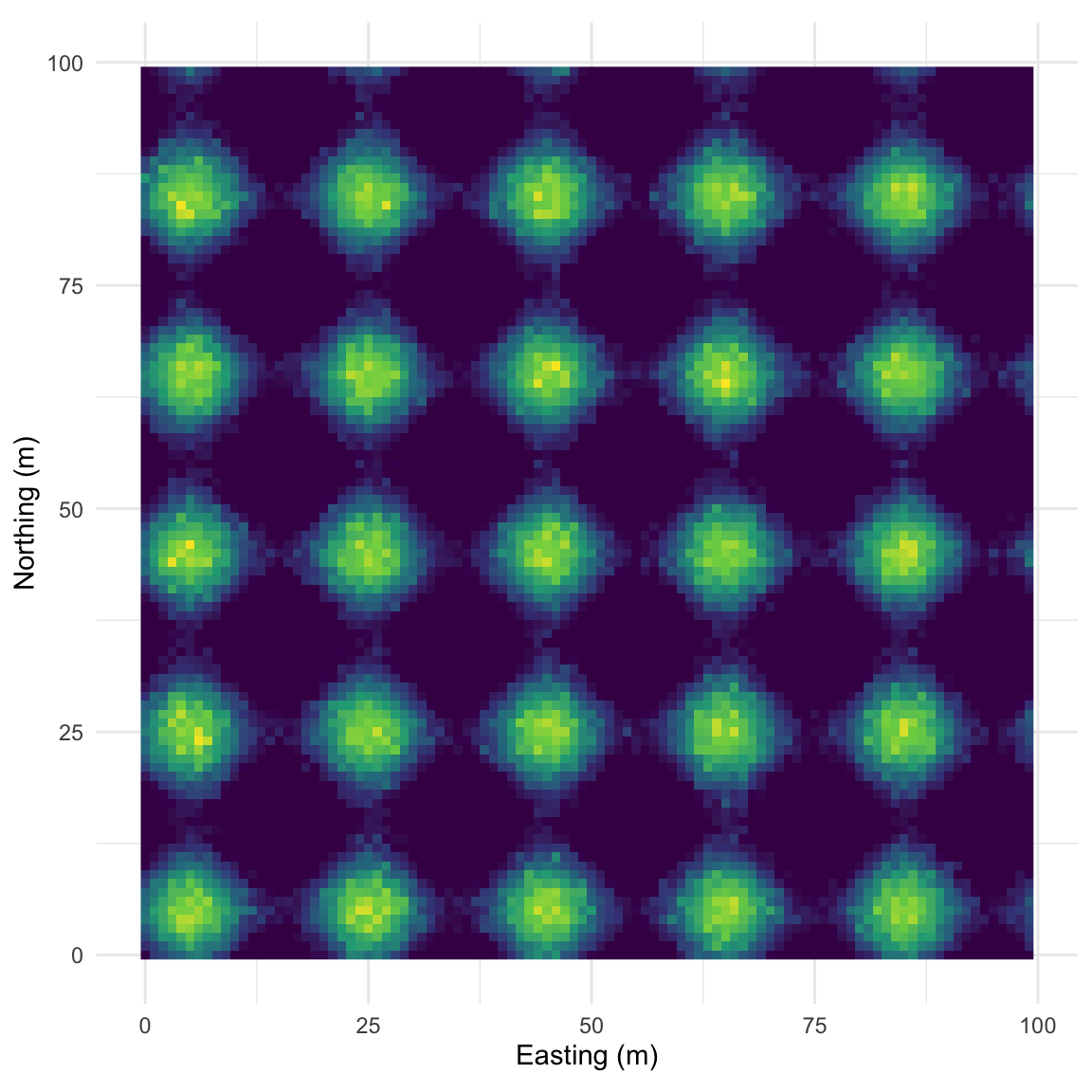
Let’s intensify this uniform pattern to 100 (10x10) bumps.
Map:
And the correlogram. Compare it to the example above and note how you can see the repeating pattern in the distances between peaks.
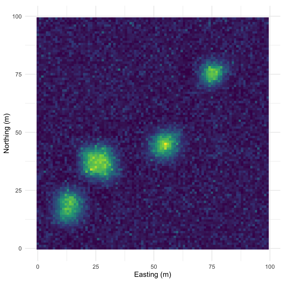
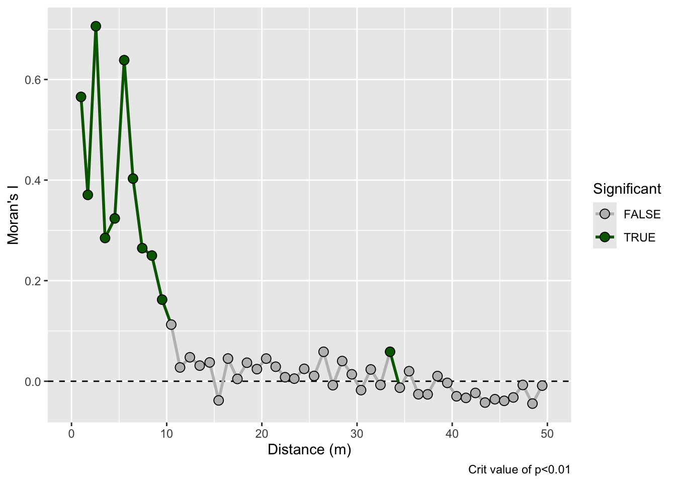
That example above is ridiculously contrived of course. Here is something closer to what field data looks like but with a very clear pattern of homogeneity. Note the intensity of the pattern in Moran’s I. The width of the shoulder can give an idea of the variability in the repeated units.
Map:
Correlogram:
On this surface I’ve taken the random bump map above and added a gradient in the x direction. This is probably the most boring and most important example. Many, many environmental data sets occur on gradients. The gradient (elevation, moisture, latitudinal) can be overwhelming. As we see here the gradient makes the bumps disappear in the correlogram. This isn’t “bad” but it is something to be aware of as we contemplate signals and noise.
Map:
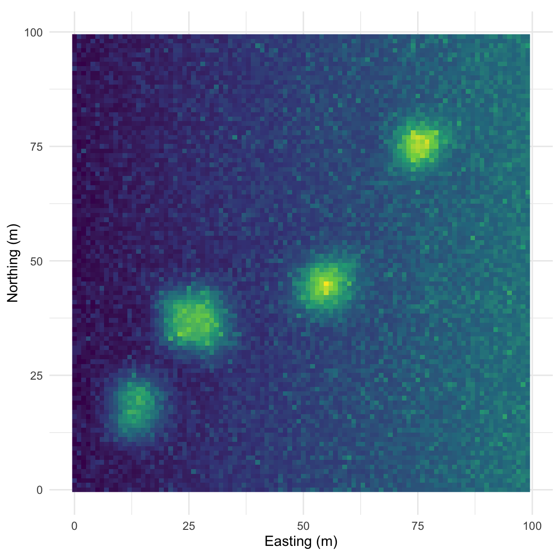
Correlogram:
You could imagine detrending this final surface with a model and then replotting Moran’s I. That is, if you modeled z~x, you could take the residuals from that model and remove the gradient. If you did that you’d wind up with the random bumps scenario or something very close to it.
You will find spline.correlog in the ncf package and you will be tempted to run it. Go ahead. It fits a spline smoother through the Moran’s I values rather than binning them, giving you a continuous curve instead of discrete points.
leadI <- spline.correlog(
  x = meuseX, y = meuseY, z = meuseSf$log_lead,
  resamp = 100, xmax = 1500, quiet = TRUE
)
plot(leadI)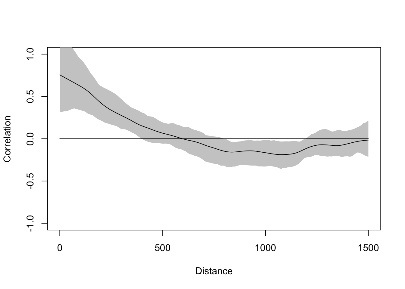
The grey band is a bootstrap confidence envelope, not a significance test. In correlog, the permutation test asks: could this Moran’s I value at this distance bin have arisen by chance? The bootstrap envelope in spline.correlog asks something different: given the uncertainty in the spline estimate, where might the true curve plausibly fall? Where the envelope crosses zero you can’t confidently say the correlation is different from zero, but that is not the same as saying it isn’t. The envelope also tends to be wide, especially at longer distances, and that width reflects actual uncertainty in the estimate rather than a problem with your data.
The continuous version is not more correct than the discrete one. Think of it as a different look at the same structure, one that can be useful for spotting subtleties that binning smooths over. Just know what you’re looking at.
Which brings up significance more broadly. The permutation tests in correlog flag individual distance bins, which feels clean. But each bin is tested independently, so the usual multiple comparison problem applies, and some of those flagged points will be noise. Don’t read too much into a single significant spike. Look instead for consistent signal across a range of distances. A pattern that holds across several lags is a pattern worth taking seriously. One that pops up at 400 m and disappears at 500 m probably isn’t.
You now have two tools for measuring spatial dependence in a continuous variable: the variogram and the correlogram. They’re asking the same question from slightly different angles. The variogram focuses on variance between pairs; the correlogram focuses on correlation. Both tell you whether nearby values are more similar than distant ones, and how far that similarity extends.
Moran’s I gives you a single number summarizing that structure globally. It’s a useful diagnostic as it’s asking “is there signal here worth modeling?” but it stops just when things get interesting. Two datasets can have identical Moran’s I values and look nothing alike spatially. That’s what the next chapter addresses. LISA breaks the global statistic apart and maps where the structure lives: the hot spots, cold spots, and spatial outliers. If this chapter made you ask “is there spatial structure?”, the next one makes you ask “where?”
The file birdRichnessMexico.rds contains an sf object with bird species richness at locations across Mexico. The column nSpecies is the number of bird species occurring within a kilometer of each location. The data are projected using the North America Albers Equal Area Conic centered on Mexico (SR-ORG:38), which gives units in kilometers. The dataset also contains several WorldClim bioclimatic variables (mean annual precipitation, temperature range, and others) but we’re not using them here. They come back in the SAR chapter, where richness gets a proper regression treatment.
library(tmap)
birdsSf <- readRDS("data/birdRichnessMexico.rds")

tmap_mode("plot")
tm_basemap("OpenStreetMap") +
  tm_shape(birdsSf) +
  tm_symbols(fill = "nSpecies",
             fill.scale = tm_scale_continuous(values = "-brewer.rd_bu", midpoint = 250),
             fill_alpha = 0.7,
             size = 0.7)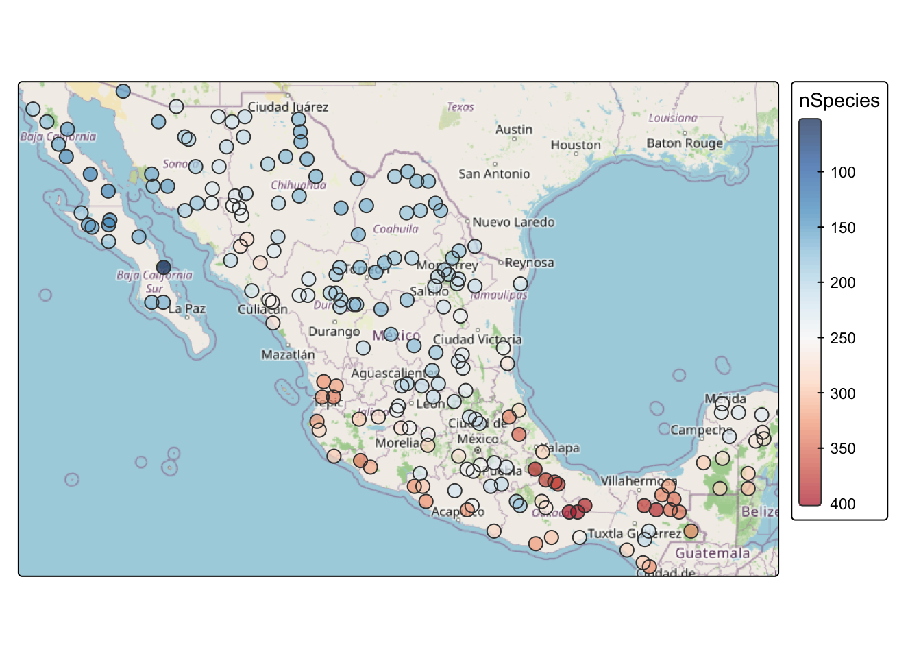
Take a minute to look at the patterns. Some areas are hotspots of richness, like southern Veracruz. Others, like northern Baja, are less rich. This is the same static tmap setup we used for the Meuse map: an OpenStreetMap basemap with the points drawn on top.
Look at spatial autocorrelation in the bird data using Moran’s I and fit a variogram.
A few notes on the data handling:
birdsSf out of sf into a plain data frame for use with correlog:birdsDF <- data.frame(st_coordinates(birdsSf), nSpecies = birdsSf$nSpecies)correlog, watch edge effects. Limit your interpretation to about 1/3 of the maximum distance between points:max(dist(st_coordinates(birdsSf))) / 3[1] 1037.547That puts the safe limit around 1000 km.
What can you learn by comparing the two approaches? More importantly, what are we missing with this global view? Where does understanding pattern help us reason about process, and where does it fall short? That question comes up directly in the next chapter.
Everything above treats spatial structure as direction-independent (isotropic). That isn’t always a safe assumption. Pollution plumes move downwind; species distributions follow latitudinal gradients. The variogram function can calculate directional variograms with the alpha argument. Try north-south vs. east-west for the bird data:
birdVar <- variogram(nSpecies ~ 1, data = birdsSf, alpha = c(0, 90))Think about gradients and what biogeographic processes might be driving any anisotropy you find.
Hijmans’s Spatial autocorrelation is a free online resource with good worked examples in R, including Moran’s I and variograms on familiar data. Fortin et al. (2016) covers spatial autocorrelation coefficients concisely and is worth reading alongside this chapter. Bivand (2008) chapter 8 through section 8.4.2 goes deeper on variogram fitting, cutoff selection, lag width, and directional effects. For the conceptual side, Urban (2023) develops the pattern-process paradigm. It’s worth the effort.