Code
library(tidyverse)
library(sf)
library(gstat)
library(terra)
library(tidyterra)We often want to estimate phenomena at locations where we do not have measurements. Geostatistics is the field that we use to make (hopefully) accurate and reliable models of spatial data. We will use these models for prediction. We can use both deterministic and probabilistic models. This chapter focuses on deterministic methods.
The gstat(Pebesma and Graeler 2026) package is your friend. And I’m going to plot in ggplot via tidyverse(Wickham 2023) with sf(Pebesma 2026), terra(Hijmans 2026) and tidyterra(Hernangómez 2023).
library(tidyverse)
library(sf)
library(gstat)
library(terra)
library(tidyterra)The term “geostatistics” is big and vague. Like “statistics” it covers both descriptive and inferential approaches. The difference, somewhat tautologically, is the “geo”: we use the spatial structure in the data to aid our understanding.
So far we’ve been mostly describing spatial patterns and sometimes using those patterns to make inferences about processes. Now we’re going to predict. Collecting data is expensive and time consuming, so we often sample and then hope to say something about unsampled locations. In geostatistics, because we know how to measure spatial structure (autocorrelation, remember?), we can use that structure to produce predictions for locations we never visited. And with probabilistic methods, we get uncertainty estimates on those predictions too. We’ll come back to that last part in the later chapters.
We are going to tackle the broader theory and application of geostatistics (which did indeed develop from the desire to get more gold out of the ground in South Africa) but we are going to start with a conceptual application that predates geostatistics as a discipline. We have already introduced the idea of inverse distance weights (IDW) with our matrix \(W\) from the Moran’s I calculation where \(w_{ij}=d_{ij}^{-1}\).
Using distance as a predictor implements the so-called first law of geography “Everything is related to everything else, but near things are more related than distant things.” IDW uses this assumption to predict a variable at unmeasured locations by using nearby measurements. The closer the measured values are to the prediction location, the more influence (weight) they have. With IDW, influence diminishes as a function of distance.
We are now going to use IDW as a way to get an estimate of a variable (\(\hat{Z}\)) at a spatial location \(s_0\) using a weighted spatial average:
\[\hat{Z}(s_0)=\frac{\sum_{i=1}^n w(s_i)Z(s_i)}{\sum_{i=1}^n w(s_i)}\]
where \(w\) is the weights of \(n\) measurements at \(i\) locations (\(s\)). The weight is calculated as a function of inverse distance: \[ w(s_i) = ||s_i - s_0||^{-p} \]
where \(|| \cdot ||\) indicates Euclidean distance and \(p\) is a weighting power (often defaulting to two). The inverse power determines the influence that nearby points have (\(w\) closer to one) as compared to points farther away (\(w\) closer to zero) in the weighted average.
Let’s visualize the function where weight (\(w\)) equals the inverse of distance (\(d\)): \(w=d^{-1}\) as such:
wCurve <- data.frame(d = 1:100, w = (1:100)^-1)
wCurve %>% ggplot(mapping = aes(x = d, y = w)) +
  geom_line() +
  labs(x = "Distance", y = "Weight")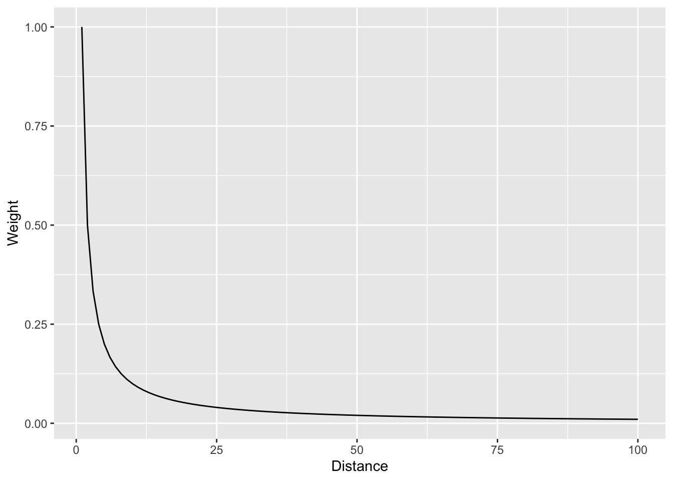
And with a log scale to see more clearly.
wCurve %>% ggplot(mapping = aes(x = d, y = w)) +
  geom_line() +
  labs(x = "Distance", y = "Weight") +
  scale_y_log10()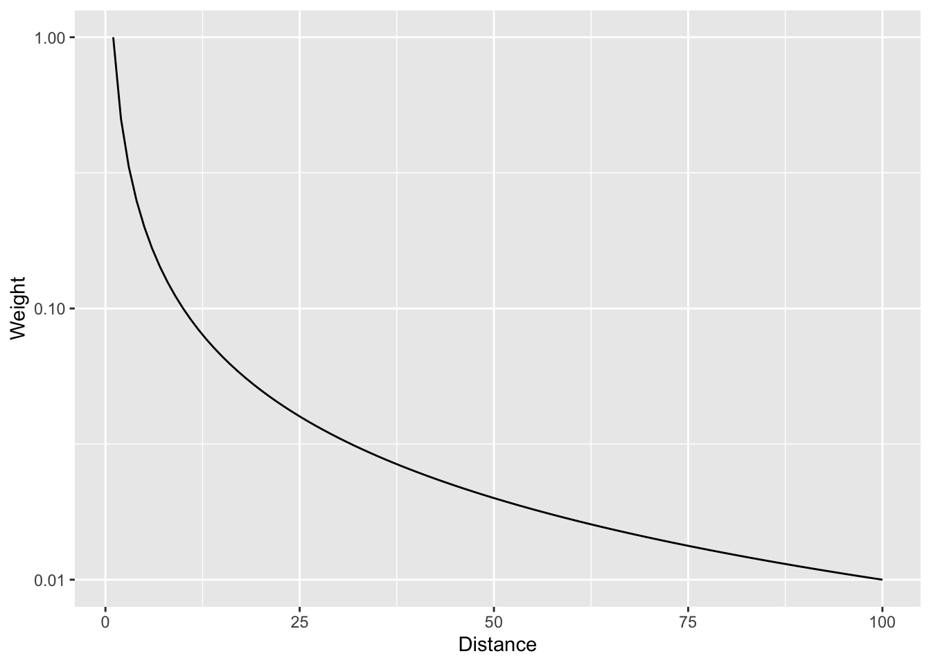
In that case we are using the straight inverse distance as \(w=d^{-1}\) or \(w=d^{-p}\) where \(p=1\). But what if that curve is too steep? Or not steep enough? We can choose a value of \(p\). E.g., the function can be \(w=d^{-2}\) if we set \(p=2\). Let’s look at a range of \(p\) values.
wCurve <- rbind(
  data.frame(d = 1:100, w = (1:100)^0, p = "0"),
  data.frame(d = 1:100, w = (1:100)^-0.5, p = "0.5"),
  data.frame(d = 1:100, w = (1:100)^-1, p = "1"),
  data.frame(d = 1:100, w = (1:100)^-1.5, p = "1.5"),
  data.frame(d = 1:100, w = (1:100)^-2, p = "2"),
  data.frame(d = 1:100, w = (1:100)^-2.5, p = "2.5")
)
wCurve %>% ggplot(mapping = aes(x = d, y = w, color = p)) +
  geom_line() +
  labs(x = "Distance", y = "Weight")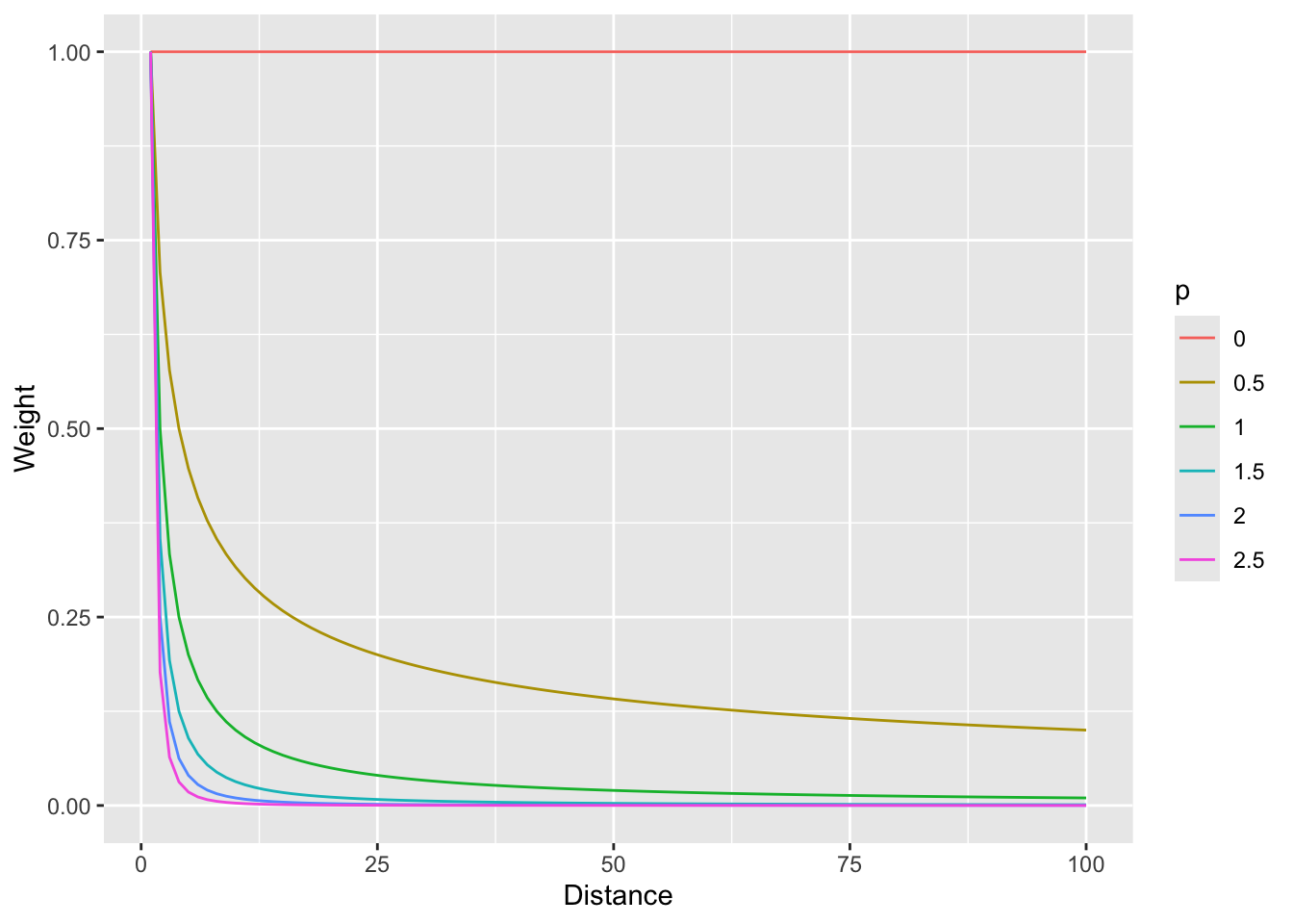
And with a log scale to see more clearly (if you can think in logs; it takes me awhile to wrap my head around it, but then I’m glad I did).
wCurve %>% ggplot(mapping = aes(x = d, y = w, color = p)) +
  geom_line() +
  labs(x = "Distance", y = "Weight") +
  scale_y_log10()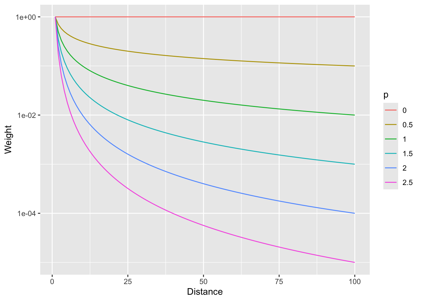
So, \(p=0\) would weight all distances equally and as \(p\) increases, the weights fall off quickly with distance.
Now that we have the information we need on the algorithm, let’s do a quick and dirty example by hand to walk through some of the calculations.
Here is a small data set of five points. We have spatial coordinates (\(x\) and \(y\)) and some measured variable (\(z\)).
toyDat <- data.frame(
  x = c(1, 3, 1, 4, 5),
  y = c(5, 4, 3, 5, 1),
  z = c(100, 105, 105, 100, 115)
)
toyDat
x y z
1 1 5 100
2 3 4 105
3 1 3 105
4 4 5 100
5 5 1 115toyPlot <- toyDat %>% ggplot() +
geom_point(aes(x = x, y = y, size = z)) +
lims(x = c(0, 6), y = c(0, 6)) +
coord_equal() +
theme_minimal()
toyPlot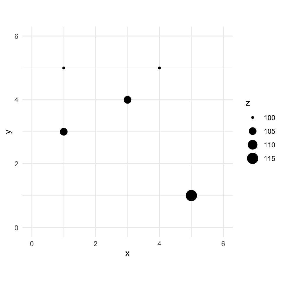
Let’s imagine a point \(x=2\) and \(y=4\) where we don’t know \(z\).
toyPlot +
  # crosshair reticle marking the location we want to predict
  annotate("segment", x = 1.4, xend = 2.6, y = 4, yend = 4, color = "#21908C", linewidth = 0.6) +
  annotate("segment", x = 2, xend = 2, y = 3.4, yend = 4.6, color = "#21908C", linewidth = 0.6) +
  annotate("point", x = 2, y = 4, shape = 1, size = 13, color = "#21908C", stroke = 1) +
  annotate("point", x = 2, y = 4, shape = 21, fill = "#21908C", color = "white", size = 2.5, stroke = 0.6) +
  annotate("text", x = 2.55, y = 4.6, label = "s[0]", parse = TRUE, color = "#21908C", size = 5, hjust = 0, fontface = "italic")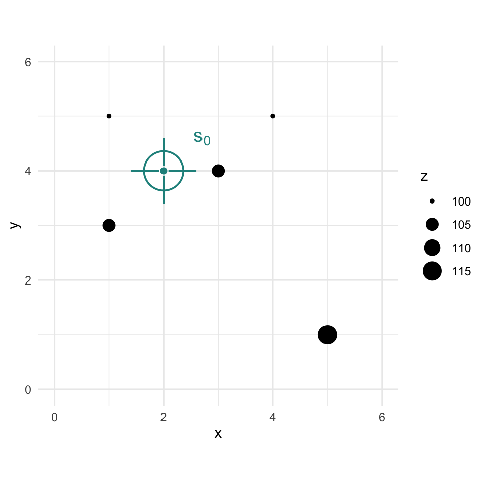
We are now going to use IDW as a way to get an estimate of that point with a missing value of \(z\). Since we are estimating it we call it \(\hat{Z}\) and we know the location as \(s_0\) so we call this \(\hat{Z}(s_0)\). We’ll follow the notation above and set the weight as a function of inverse distance with \(p=2\).
The Euclidean distance to our unknown point from each of the known points is a vector:
\[\mathbf{d_i} = \left[\begin{array} {rr} 1 & 1.414\\ 2 & 1.000\\ 3 & 1.414\\ 4 & 2.236\\ 5 & 4.243 \end{array}\right] \]
If we use a value of \(p=2\) to get weights we have:
\[\mathbf{w(s_i)} = \left[\begin{array} {rr} 1 & 0.500\\ 2 & 1.000\\ 3 & 0.500\\ 4 & 0.200\\ 5 & 0.056 \end{array}\right] \]
Thus the interpolated point:
\[\hat{Z}(s_0)=\frac{0.500(100)+1.000(105)+0.500(105)+0.200(100)+0.056(115)}{0.500+1.000+0.500+0.200+0.056} = 103.7\]
# stack the five known points with the unknown point s0 at (2, 4)
coords <- cbind(c(toyDat$x, 2), c(toyDat$y, 4))
# full pairwise distance matrix, then pull each known point's distance to s0 (column 6)
dmat <- as.matrix(dist(coords))
d2s0 <- dmat[1:5, 6]
# power
p <- 2
# weights
w <- d2s0^-p
# and the estimation itself
zhatS0 <- sum(w * toyDat$z) / sum(w)
zhatS0
[1] 103.6946# add it to the plot
toyPlot + geom_point(aes(x = 2, y = 4, size = zhatS0))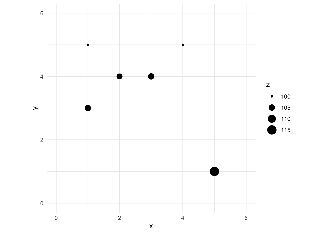
You can see how we interpolated (estimated) one point using inverse distance weighting. And you could imagine then how we’d do that for any point we could imagine.
If you need a refresher in dist(), work through the Distance Matrices aside.
Now that we’ve done a toy example, let’s give this a shot with the lead data from the Meuse River. Because the lead data are pretty skewed, we will log transform it. First we’ll load, then log the lead column, make it into a sf object and then plot.
We use meuse2, a trimmed and updated version of the classic Meuse dataset, rather than the older sp::meuse. See the appendix for how it was built. First we load it and make it into an sf object.
meuse2 <- readRDS("data/meuse2.Rds")
glimpse(meuse2)
Rows: 164
Columns: 7
$ x <dbl> 181072, 181025, 181165, 181298, 181307, 181390, 181165, 181027…
$ y <dbl> 333611, 333558, 333537, 333484, 333330, 333260, 333370, 333363…
$ cadmium <dbl> 11.7, 8.6, 6.5, 2.6, 2.8, 3.0, 3.2, 2.8, 2.4, 1.6, 1.4, 1.8, 1…
$ copper <dbl> 85, 81, 68, 81, 48, 61, 31, 29, 37, 24, 25, 25, 93, 31, 27, 86…
$ lead <dbl> 299, 277, 199, 116, 117, 137, 132, 150, 133, 80, 86, 97, 285, …
$ zinc <dbl> 1022, 1141, 640, 257, 269, 281, 346, 406, 347, 183, 189, 251, …
$ om <dbl> 13.6, 14.0, 13.0, 8.0, 8.7, 7.8, 9.2, 9.5, 10.6, 6.3, 6.4, 9.0…class(meuse2)[1] "data.frame"meuse2$logLead <- log(meuse2$lead)
# or for the tidyverse fans this is the same output
meuse2 <- meuse2 %>% mutate(logLead = log(lead))
# make into sf
meuseSf <- st_as_sf(meuse2, coords = c("x", "y")) %>%
st_set_crs(value = 28992)
class(meuseSf) # note change in class from data.frame to sf and data.frame[1] "sf" "data.frame"p2 <- ggplot(data = meuseSf) +
geom_sf(aes(fill = logLead),
size = 4,
shape = 21, color = "white", alpha = 0.8
) +
scale_fill_continuous(type = "viridis", name = "log(ppm)") +
labs(title = "Lead concentrations")
p2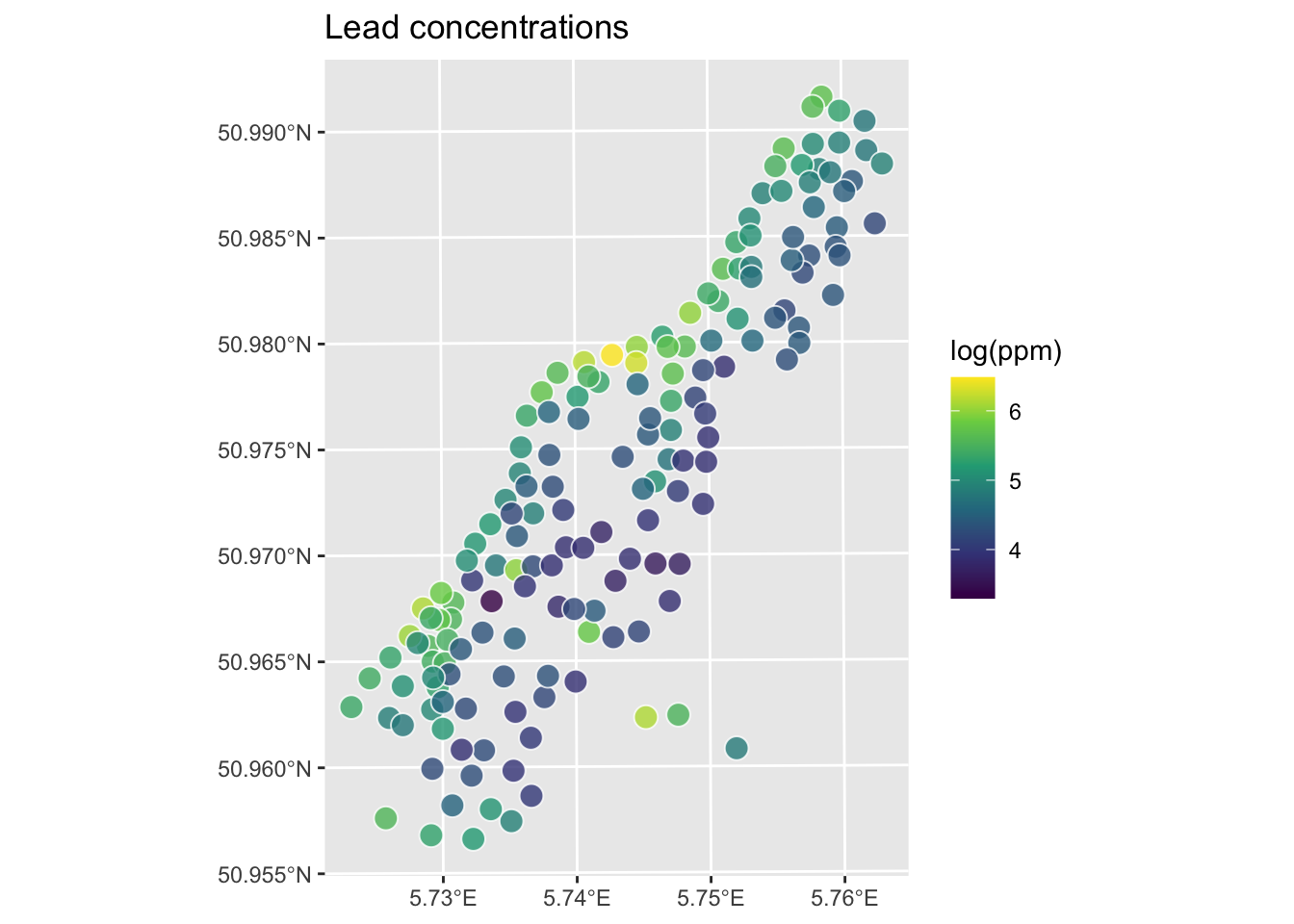
Let’s interpolate those measurements to an empty grid that covers the whole study site. We will use meuse.grid2, a 40 x 40 m prediction grid covering the study area with 3089 cells. It includes elevation, terrain derivatives, land cover, and distance to the river from modern open data sources. See the appendix for full variable descriptions and provenance.
meuse.grid2 <- readRDS("data/meuse.grid2.Rds")
head(meuse.grid2)
x y soil ffreq elev_m slope_deg aspect_deg tpi twi
2 181140 333700 1 1 31.77303 2.9904907 298.57710 0.010360479 6.548735
3 181180 333700 1 1 31.48208 0.4433831 38.99447 -0.002334118 9.436335
4 181220 333700 1 1 31.49518 0.8556243 337.61689 -0.002106190 10.007915
5 181100 333660 1 1 32.66366 5.4758474 287.62243 0.018269539 5.671510
6 181140 333660 1 1 32.47068 1.3287795 55.89479 0.001054287 8.017003
7 181180 333660 1 1 31.88524 0.7232355 15.40584 -0.004028082 12.395674
landcover river_dist_m
2 40 47.48153
3 30 72.94615
4 30 98.41078
5 40 52.86416
6 10 78.32878
7 40 103.79340This has several fields that overlap with meuse2 (e.g., soil, ffreq), plus the new terrain and land cover variables. We will use those later for regression-based interpolation. Right now we just want the coordinates to predict onto. Let’s make an sf object from it.
meuseGridSf <- st_as_sf(meuse.grid2,
  coords = c("x", "y"),
  crs = st_crs(meuseSf)
)
meuseGridSf
Simple feature collection with 3089 features and 9 fields
Geometry type: POINT
Dimension: XY
Bounding box: xmin: 178500 ymin: 329660 xmax: 181500 ymax: 333700
Projected CRS: Amersfoort / RD New
First 10 features:
soil ffreq elev_m slope_deg aspect_deg tpi twi landcover
2 1 1 31.77303 2.9904907 298.57710 0.0103604794 6.548735 40
3 1 1 31.48208 0.4433831 38.99447 -0.0023341179 9.436335 30
4 1 1 31.49518 0.8556243 337.61689 -0.0021061897 10.007915 30
5 1 1 32.66366 5.4758474 287.62243 0.0182695389 5.671510 40
6 1 1 32.47068 1.3287795 55.89479 0.0010542870 8.017003 10
7 1 1 31.88524 0.7232355 15.40584 -0.0040280819 12.395674 40
8 1 1 32.36620 2.2267571 310.21836 -0.0041952133 7.633476 30
9 1 1 33.22409 4.1998876 286.46689 0.0206255913 6.431416 40
10 1 1 33.20650 0.8437299 61.19775 0.0001220703 8.316219 40
11 1 1 32.86385 0.9081502 57.88412 0.0022110939 9.335344 40
river_dist_m geometry
2 47.48153 POINT (181140 333700)
3 72.94615 POINT (181180 333700)
4 98.41078 POINT (181220 333700)
5 52.86416 POINT (181100 333660)
6 78.32878 POINT (181140 333660)
7 103.79340 POINT (181180 333660)
8 129.25803 POINT (181220 333660)
9 56.16095 POINT (181060 333620)
10 83.71141 POINT (181100 333620)
11 109.17603 POINT (181140 333620)So the idea here is that we will model a value for lead at each of the locations in meuseGridSf. Rather than do this by hand as we did above, we will use the very powerful gstat library.
We can use the coordinates in meuseGridSf as the locations to predict using IDW. We don’t care about the data in meuseGridSf like soil type or distance to river. We just want the locations. To do this, we will use the gstat function which creates an object that holds all the information necessary for prediction. Here we tell gstat that we want an IDW model with a power of 2 using the idp parameter. The formula logLead~1 tells gstat there are no covariates, just an intercept. The spatial weighting by distance is what makes this IDW. That’s handled by idp, not by the formula. This distinction will matter when we add covariates in regression kriging.
Note that we’re calling predict() here which is a generic function that will dispatch to a different method under the hood because idwP2Model is a gstat object. That’s generics doing their job. Look back at the Understanding Methods and Generics in R aside.
idwP2Model <- gstat(
  formula = logLead ~ 1,
  locations = meuseSf,
  set = list(idp = 2)
)
logLeadIDWP2Sf <- predict(idwP2Model, meuseGridSf)
[inverse distance weighted interpolation]logLeadIDWP2SfSimple feature collection with 3089 features and 2 fields
Geometry type: POINT
Dimension: XY
Bounding box: xmin: 178500 ymin: 329660 xmax: 181500 ymax: 333700
Projected CRS: Amersfoort / RD New
First 10 features:
var1.pred var1.var geometry
2 5.251238 NA POINT (181140 333700)
3 5.177608 NA POINT (181180 333700)
4 5.113610 NA POINT (181220 333700)
5 5.451866 NA POINT (181100 333660)
6 5.320075 NA POINT (181140 333660)
7 5.209441 NA POINT (181180 333660)
8 5.127611 NA POINT (181220 333660)
9 5.666344 NA POINT (181060 333620)
10 5.583003 NA POINT (181100 333620)
11 5.352941 NA POINT (181140 333620)Now, we are going to look at the interpolated data and assess if it’s a “good” interpolation in a bit. But first, let’s look at the logLeadIDWP2Sf object we made. This is a sf object returned by predict. The interpolated lead levels are accessed via logLeadIDWP2Sf$var1.pred (we will turn a blind eye to the logLeadIDWP2Sf$var1.var column of NA values for now. Those NAs are there because IDW is deterministic; there’s no probability model underneath it and therefore no variance to estimate. When we get to kriging, that column will actually mean something). All the gstat functions we are going to use follow this convention so the good news is that you only have to get used to it once.
But first, the gstat predict function returned a sf point object. We want it to be a SpatRaster. You’d think there would be an elegant way to convert an evenly spaced point object into a SpatRaster object but there isn’t at the moment so we will brute force it. This is a little irksome but whatever. I’ll write a little function to do this just because we’ll have to do it a few times.
R can’t do everything out of the box. Sometimes the conversion or calculation you need just doesn’t exist as a clean packaged solution, and you have to write it yourself. That’s fine. The basic structure is simple: pick a name, declare your inputs with function(...), and return something.
A good example is standard error. R has sd() built in but no se(). If you wanted one, you’d write it:
se <- function(x){
  sd(x) / sqrt(length(x))
}
Now se() works just like any other R function. Call it on a vector, get a number back. The payoff is that you can use it as many times as you need without copy-pasting the same three-part calculation everywhere. That’s exactly why we’re writing sf2Rast below. We’re going to need it more than once.
sf2Rast <- function(sfObject, variableIndex = 1) {
  # coerce sf to a data.frame
  dfObject <- data.frame(st_coordinates(sfObject),
    z = as.data.frame(sfObject)[, variableIndex]
  )
  # coerce data.frame to SpatRaster
  rastObject <- rast(dfObject, crs = crs(sfObject))

  names(rastObject) <- names(sfObject)[variableIndex]

  return(rastObject)
}

logLeadIDWP2Rast <- sf2Rast(logLeadIDWP2Sf)
logLeadIDWP2Rast
class : SpatRaster
size : 102, 76, 1 (nrow, ncol, nlyr)
resolution : 40, 40 (x, y)
extent : 178480, 181520, 329640, 333720 (xmin, xmax, ymin, ymax)
coord. ref. : Amersfoort / RD New (EPSG:28992)
source(s) : memory
name : var1.pred
min value : 3.517233
max value : 6.444424# and plot
ggplot() +
geom_spatraster(data = logLeadIDWP2Rast, mapping = aes(fill = var1.pred), alpha = 0.8) +
scale_fill_continuous(type = "viridis", name = "log(ppm)", na.value = "transparent") +
labs(title = "Lead concentrations", subtitle = "IDW with p=2") +
theme_minimal()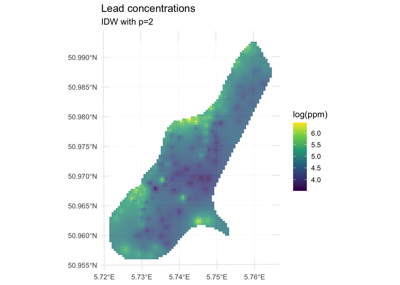
We’ve made a prediction. Is it any good? It kind of looks funny, especially all those craters in the middle. Let’s take another look at it with a more extreme visualization.
ggplot() +
geom_spatraster_contour_filled(
data = logLeadIDWP2Rast,
breaks = seq(from = 3.5, to = 6.5, by = 0.25),
alpha = 0.9
) +
scale_fill_discrete(name = "log(ppm)", na.value = "transparent") +
labs(title = "Lead concentrations", subtitle = "IDW with p=2") +
theme_minimal()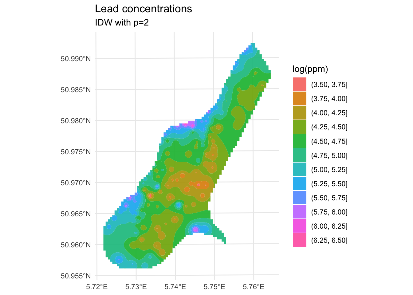
Are those bumps and craters real? Or an artifact? Would the surface be better if we changed the value of \(p\)? What does “better” even mean? Would we know “better” if we saw it?
Those craters are artifacts of IDW, not real structure in the data. Here’s why they happen: in areas where sample points are sparse, IDW has very little to work with. Any location in a gap between widely-spaced points ends up being pulled hard toward the one or two nearest observations, creating bullseye patterns around each isolated point. The center of the Meuse study area is sampled more thinly than the edges near the river, which is why that’s where the craters are worst. No interpolation method handles sparse data well, but IDW is particularly vulnerable to this because its weighting scheme has no concept of the broader spatial structure of the data. It just sees distance. Keep this in mind as we look at skill.
Now that we are making predictions we need to assess how good they are. The Model Skill and Cross Validation aside covers all of this in detail and is worth reading before going further. The short version is: we’ll use R\(^2\), RMSE, and the observed-vs-predicted plot throughout the interpolation chapters, and we always care more about out-of-sample skill than in-sample fit. Here’s the in-sample picture first, just to show why:
obs <- meuseSf$logLead
preds <- extract(logLeadIDWP2Rast, meuseSf) %>% pull(var1.pred)
rsq <- cor(obs, preds)^2
rmse <- sqrt(mean((preds - obs)^2))
rsq[1] 0.9936209rmse[1] 0.07119863ggplot() +
geom_abline(slope = 1, intercept = 0) +
geom_point(aes(x = obs, y = preds)) +
coord_cartesian() +
labs(
x = "Observed Values",
y = "Predicted Values",
title = "Lead log(ppm)"
)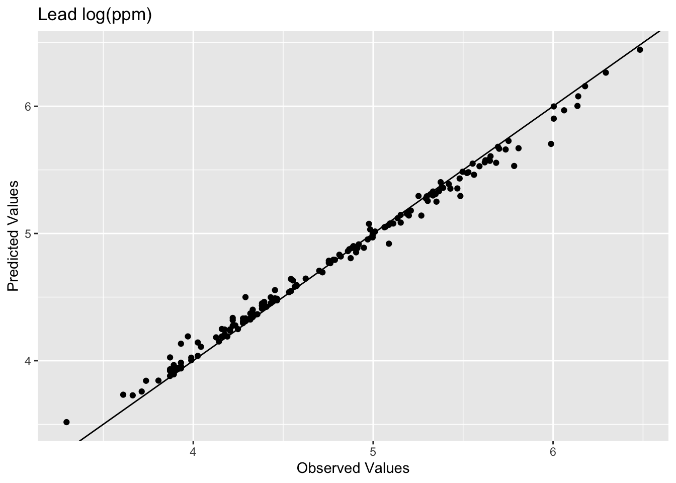
The model does an excellent job of predicting the observed values with 99% variance explained and a low RMSE. It’s 99% rather than 100% because we’re extracting predictions from a raster grid, not from the exact observation coordinates. There’s a little rounding from the discretization. IDW is actually exact at data locations in theory (the weight to itself would be infinite, overwhelming everything else). Which is precisely why this in-sample comparison is kind of a lame test. The model knew about all those points when it made the predictions. Typically when assessing skill we withhold some portion of the data and then use that to test the model. When we test the model using the withheld data we are calculating the out-of-sample error by giving the model a chance to predict some data it hasn’t seen before. E.g., let’s withhold 25% of the data (38 points), do the interpolation, and then look at how well the model predicted the withheld points.
n <- nrow(meuseSf)
rows4test <- sample(x = 1:n, size = n * 0.25)
meuseTest <- meuseSf[rows4test, ]
meuseTrain <- meuseSf[-rows4test, ]
# note that we build the model with meuseTrain
idwP2Model <- gstat(
formula = logLead ~ 1,
locations = meuseTrain,
set = list(idp = 2)
)
logLeadIDWP2Sf <- predict(idwP2Model, meuseGridSf)[inverse distance weighted interpolation]logLeadIDWP2Rast <- sf2Rast(logLeadIDWP2Sf)
# and plot
ggplot() +
  geom_spatraster(data = logLeadIDWP2Rast, mapping = aes(fill = var1.pred), alpha = 0.8) +
  scale_fill_continuous(type = "viridis", name = "log(ppm)", na.value = "transparent") +
  labs(title = "Lead concentrations", subtitle = "IDW with p=2") +
  theme_minimal()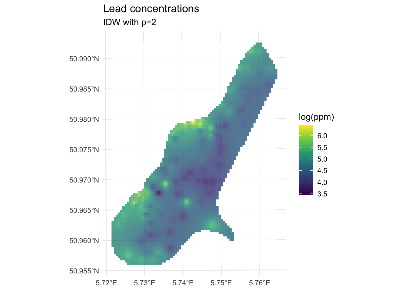
We built the model with the training data meuseTrain which had 75% of the original data. We kept 25% of the data hidden from the model in meuseTest. By comparing the predictions from the training data to the withheld values from the testing data we can assess the out-of-sample skill.
# note use of meuseTest here
obs <- meuseTest$logLead
preds <- extract(logLeadIDWP2Rast, meuseTest) %>% pull(var1.pred)
rsq <- cor(obs, preds)^2
rmse <- sqrt(mean((preds - obs)^2))
rsq
[1] 0.4448072rmse[1] 0.5127379ggplot() +
geom_abline(slope = 1, intercept = 0) +
geom_point(aes(x = obs, y = preds)) +
coord_fixed(ratio = 1, xlim = range(preds, obs), ylim = range(preds, obs)) +
labs(
x = "Observed Values",
y = "Predicted Values",
title = "Lead log(ppm)"
)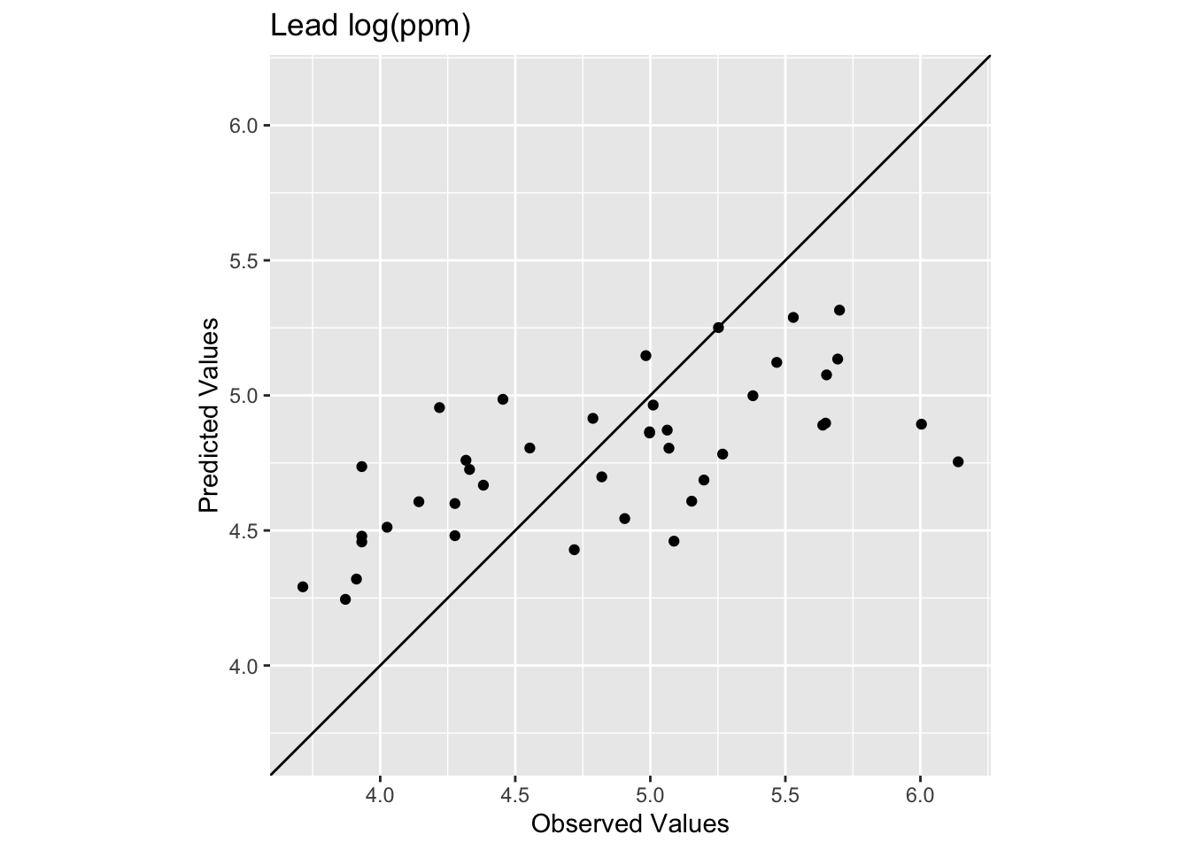
Oooof. Looking at that plot and the code we see now that the skill of the model is greatly decreased with R\(^2\) = 0.445 and RMSE = 0.513. We can also see that the predicted values are less than the observed values for these points.
How does that RMSE look against the simplest possible baseline, predicting the training mean everywhere?
rmseNULL <- sqrt(mean((mean(meuseTrain$logLead) - obs)^2))
rmseNULL
[1] 0.65405511 - (rmse / rmseNULL)[1] 0.2160632For a full treatment of the null model and how to interpret these skill scores, see the Model Skill and Cross Validation aside.
So we have to ask, “How can we improve this model in a responsible way?”
Improving a model’s skill (without overfitting it) is an art. In this case, IDW is a pretty blunt tool. In fact it is completely deterministic. I.e., there is no probability theory underlying the method, which limits how much we can do.
What can we do right now? We could start trying to “tune” the model using parameters we can adjust. The power function is the easiest to mess with but we could also specify a minimum or maximum number of points used for the interpolation (arguments nmax and nmin) or a maximum distance that can influence the interpolation (maxdist).
For example, here is the same data as above with \(p=3\) instead of \(p=2\).
idwP3Model <- gstat(
  formula = logLead ~ 1,
  locations = meuseTrain,
  set = list(idp = 3)
)

logLeadIDWP3Sf <- predict(idwP3Model, meuseGridSf)
[inverse distance weighted interpolation]logLeadIDWP3Rast <- sf2Rast(logLeadIDWP3Sf)
# and plot
ggplot() +
geom_spatraster(data = logLeadIDWP3Rast, mapping = aes(fill = var1.pred), alpha = 0.8) +
scale_fill_continuous(type = "viridis", name = "log(ppm)", na.value = "transparent") +
labs(title = "Lead concentrations") +
theme_minimal()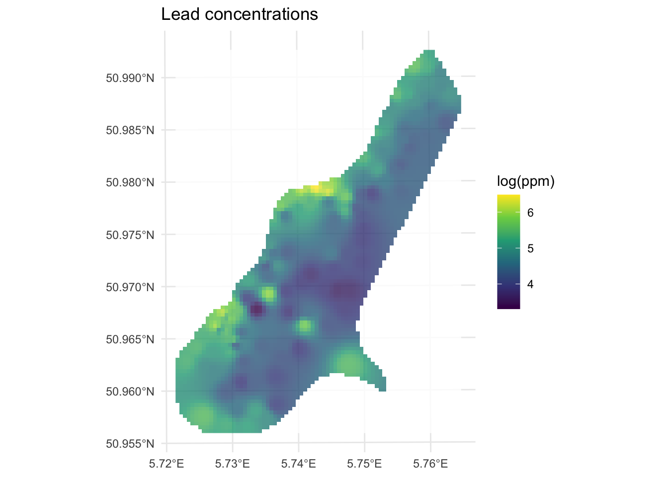
How does this surface differ? Here is the skill on the withheld data:
# note use of meuseTest here
obs <- meuseTest$logLead
preds <- extract(logLeadIDWP3Rast, meuseTest) %>% pull(var1.pred)
rsq <- cor(obs, preds)^2
rmse <- sqrt(mean((preds - obs)^2))
rsq
[1] 0.4196382rmse[1] 0.4935361ggplot() +
geom_abline(slope = 1, intercept = 0) +
geom_point(aes(x = obs, y = preds)) +
coord_fixed(ratio = 1, xlim = range(preds, obs), ylim = range(preds, obs)) +
labs(
x = "Observed Values",
y = "Predicted Values",
title = "Lead log(ppm)"
)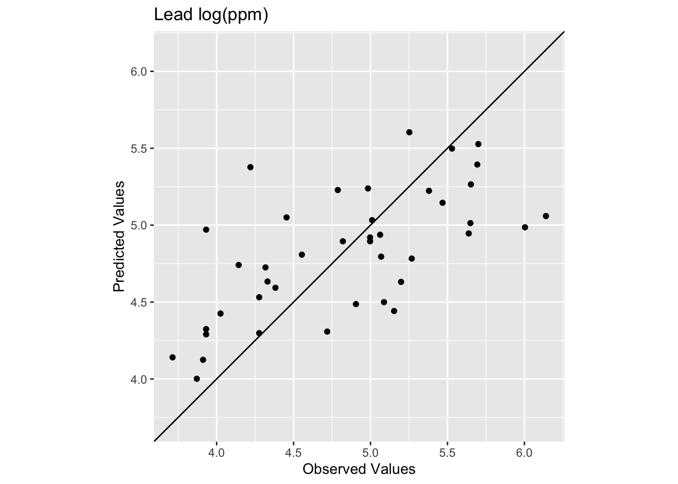
The R\(^2\) is higher and the RMSE is lower. It’s a better fit but not much better. Against the same null, the skill score for \(p=3\) is:
1 - (rmse / rmseNULL)[1] 0.2454213That’s a better model all around but not by much. Tuning \(p\) only gets you so far with IDW. The method just isn’t well-suited to that sparse center of the study area, and no value of \(p\) is going to fix thin data.
IDW is a reasonable starting point for spatial interpolation. It’s fast, intuitive, and has no assumptions beyond Tobler’s first law. But it is purely deterministic, so you get a surface but no uncertainty estimate. It’s sensitive to the choice of \(p\) but there’s no principled way to pick it other than tuning by eye and cross-validation. And it has no way to account for spatial structure beyond distance: it can’t know that lead decreases consistently with distance from the river, for instance. It just sees nearby points and weights them.
After a detour into thin-plate splines we’ll tackle these problems. Kriging uses the variogram to model the spatial structure explicitly and, crucially, returns a variance estimate alongside the prediction. That var1.var column that was full of NAs? Kriging fills it in. After that, regression kriging incorporates covariates like distance to river directly into the model, and that’s where the formula logLead~1 vs. logLead~dist distinction will make sense.
The California precipitation dataset gives you a chance to apply IDW to a different kind of environmental variable. There are two files:
prcpCA.rds: 432 long-term precipitation station records. Columns X and Y are coordinates in California Albers (EPSG:3310) with units in meters. The ANNUAL column is total annual precipitation in mm.
gridCA.rds: an empty 10x10 km prediction grid covering California.
# precip point data
prcpCA <- readRDS("data/prcpCA.rds")
# empty grid to interpolate into
gridCA <- readRDS("data/gridCA.rds")

# make as sf
prcpCA <- prcpCA %>%
  st_as_sf(coords = c("X", "Y")) %>%
  st_set_crs(value = 3310)

# simple map
prcpCA %>% ggplot() +
  geom_sf(aes(fill = ANNUAL, size = ANNUAL),
    color = "white",
    shape = 21, alpha = 0.8
  ) +
  scale_fill_continuous(type = "viridis", name = "mm") +
  labs(title = "Total Annual Precipitation") +
  scale_size(guide = "none")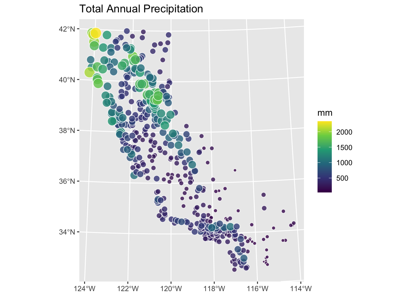
Use IDW to create a surface of total annual precipitation in California. Tune \(p\) and assess out-of-sample skill. Interpret your surface. What patterns do you see, and are they physically plausible? The Model Skill and Cross Validation aside covers the skill metrics in detail.
One practical note: a handful of coastal stations will show up as NA in your predicted surface. The 10x10 km grid is coarse enough that stations very close to the coastline land in ocean cells. This is a common issue when moving from points to rasters. When you assess skill with extract, those stations will return NA and propagate through cor and sqrt(mean(...)). Use cor(obs, preds, use="complete.obs")^2 and sqrt(mean((preds - obs)^2, na.rm=TRUE)) to handle them cleanly.
Hijmans’s Interpolation walks through IDW and other methods with California precipitation examples in R. Bivand (2008) chapter 8 provides deeper geostatistical background for the probabilistic methods that build on IDW in later chapters.